

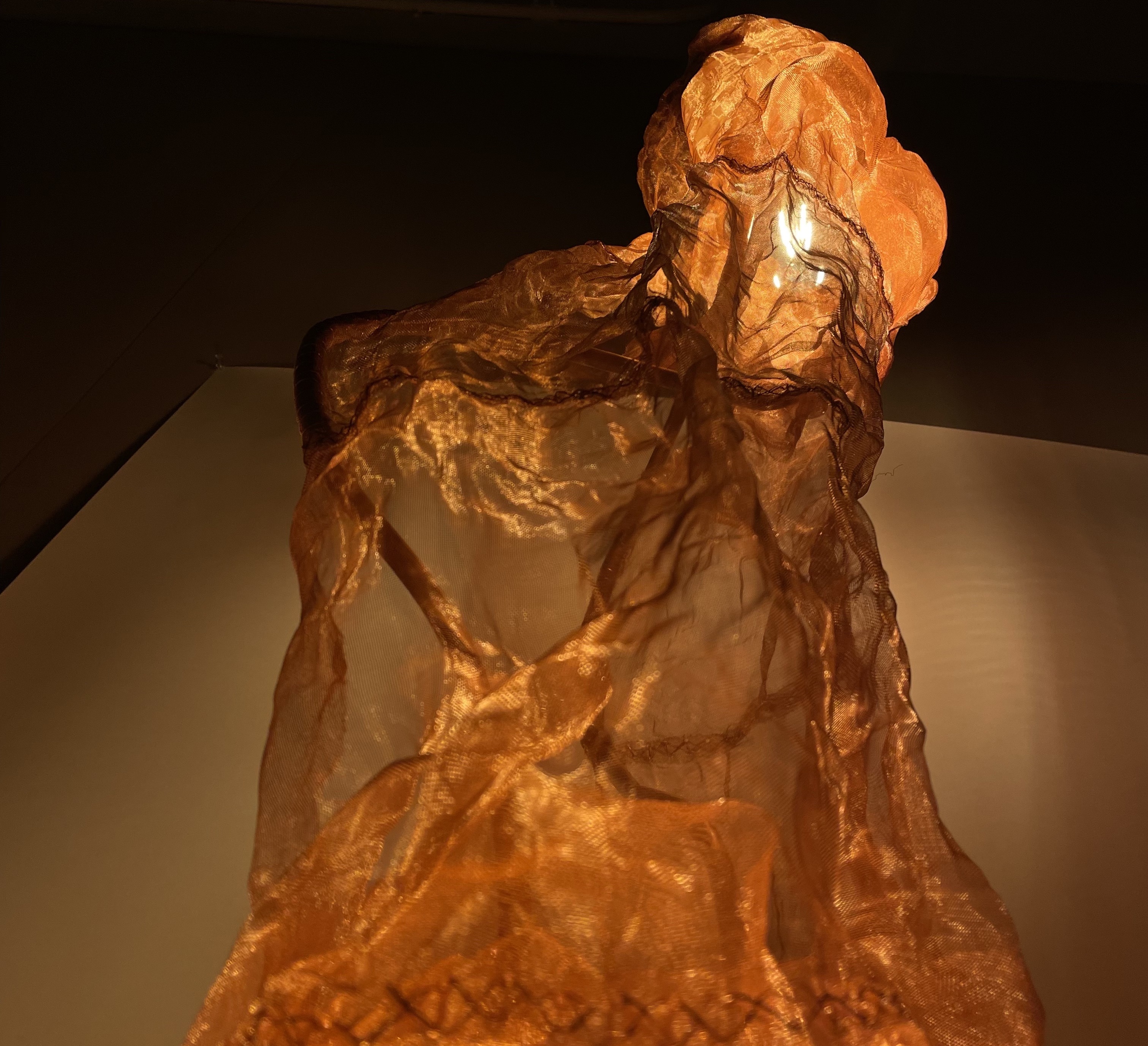
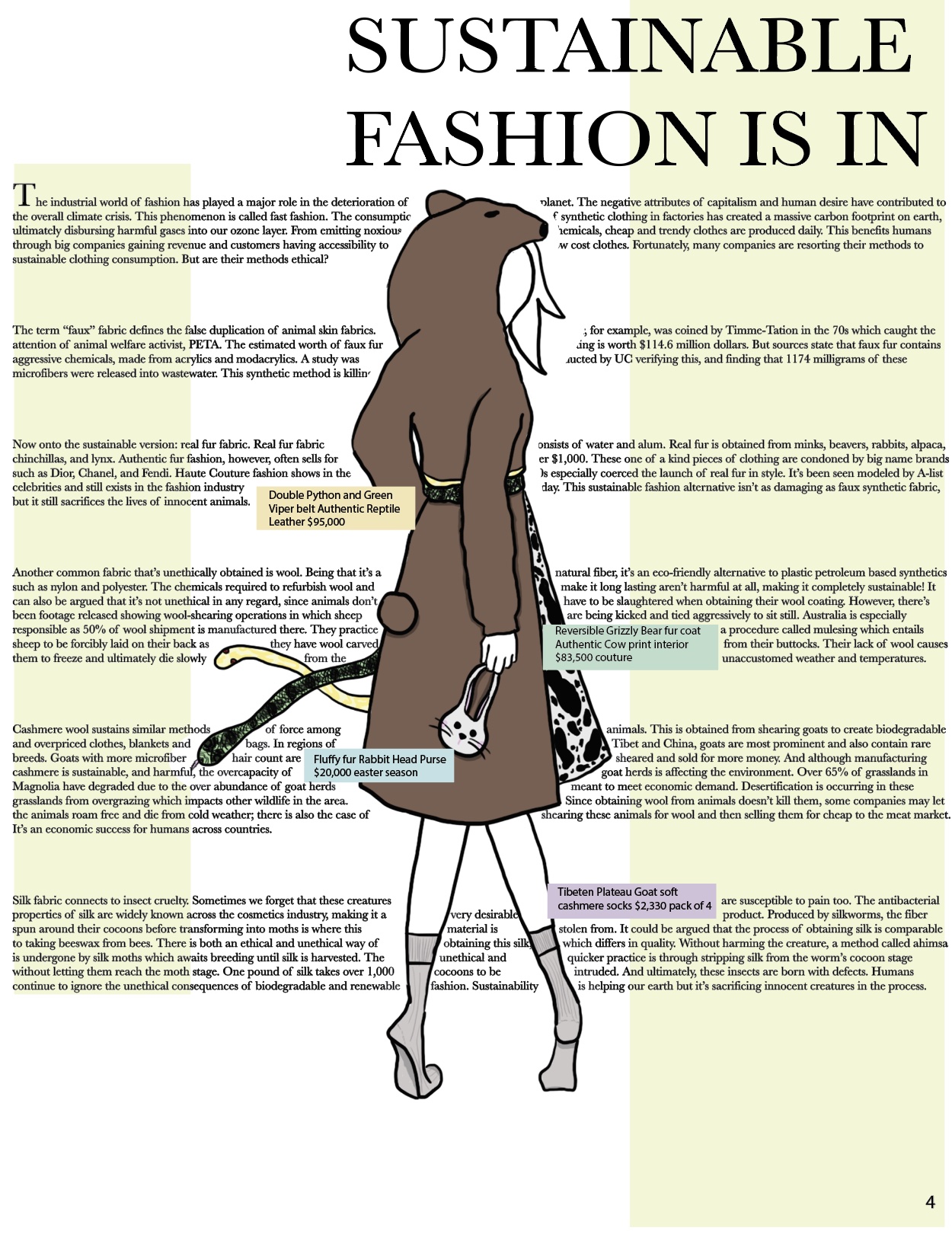
 Blossoming
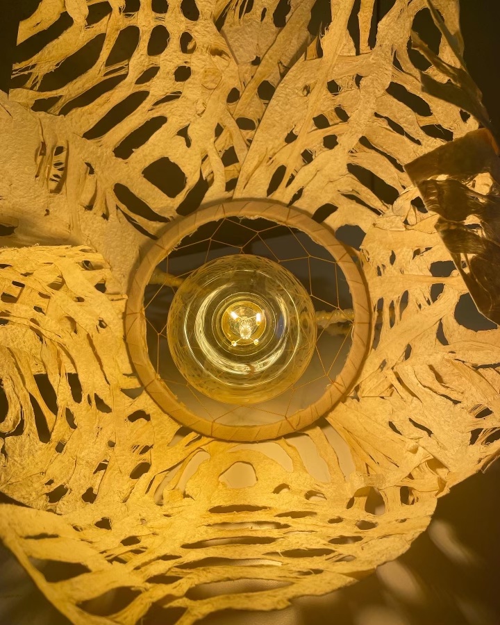 Lunar Phased
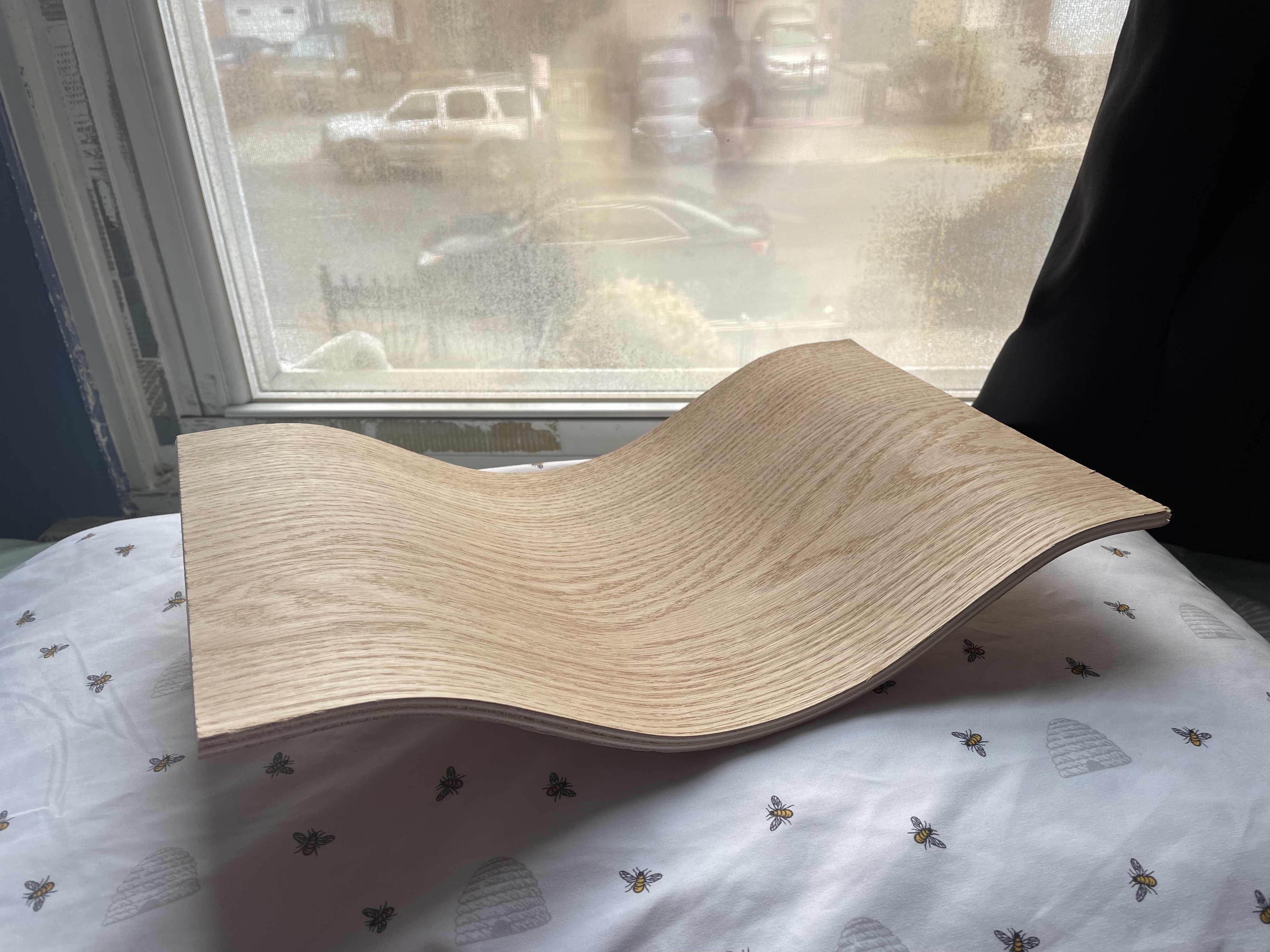 Wavy Tray
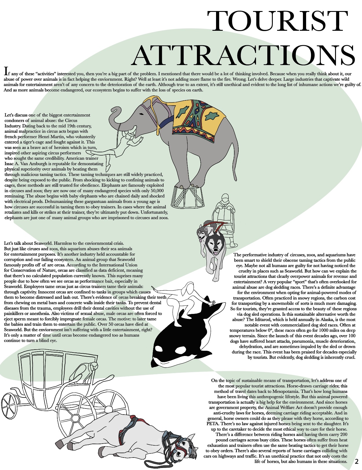
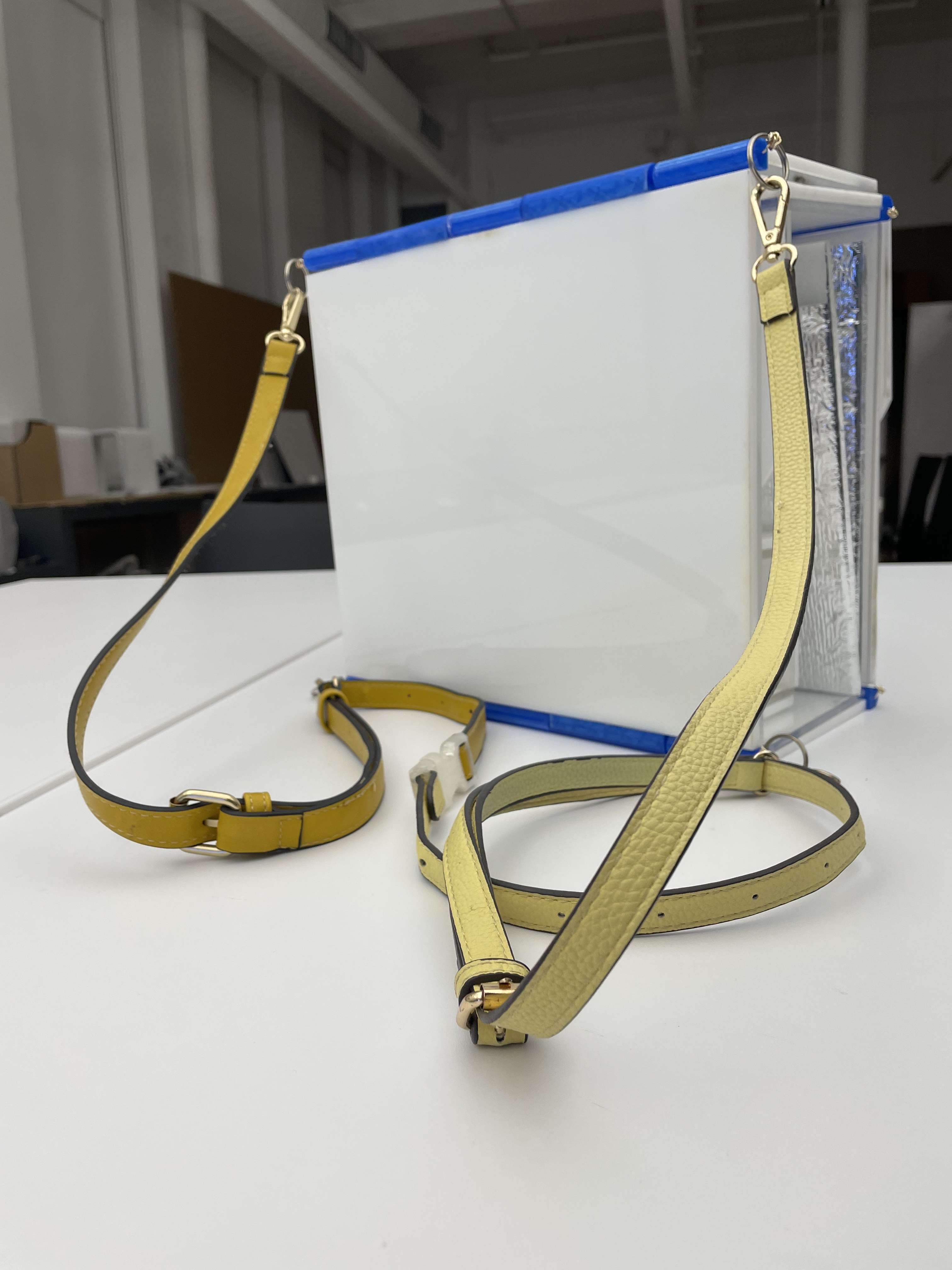 Flipping TableBag
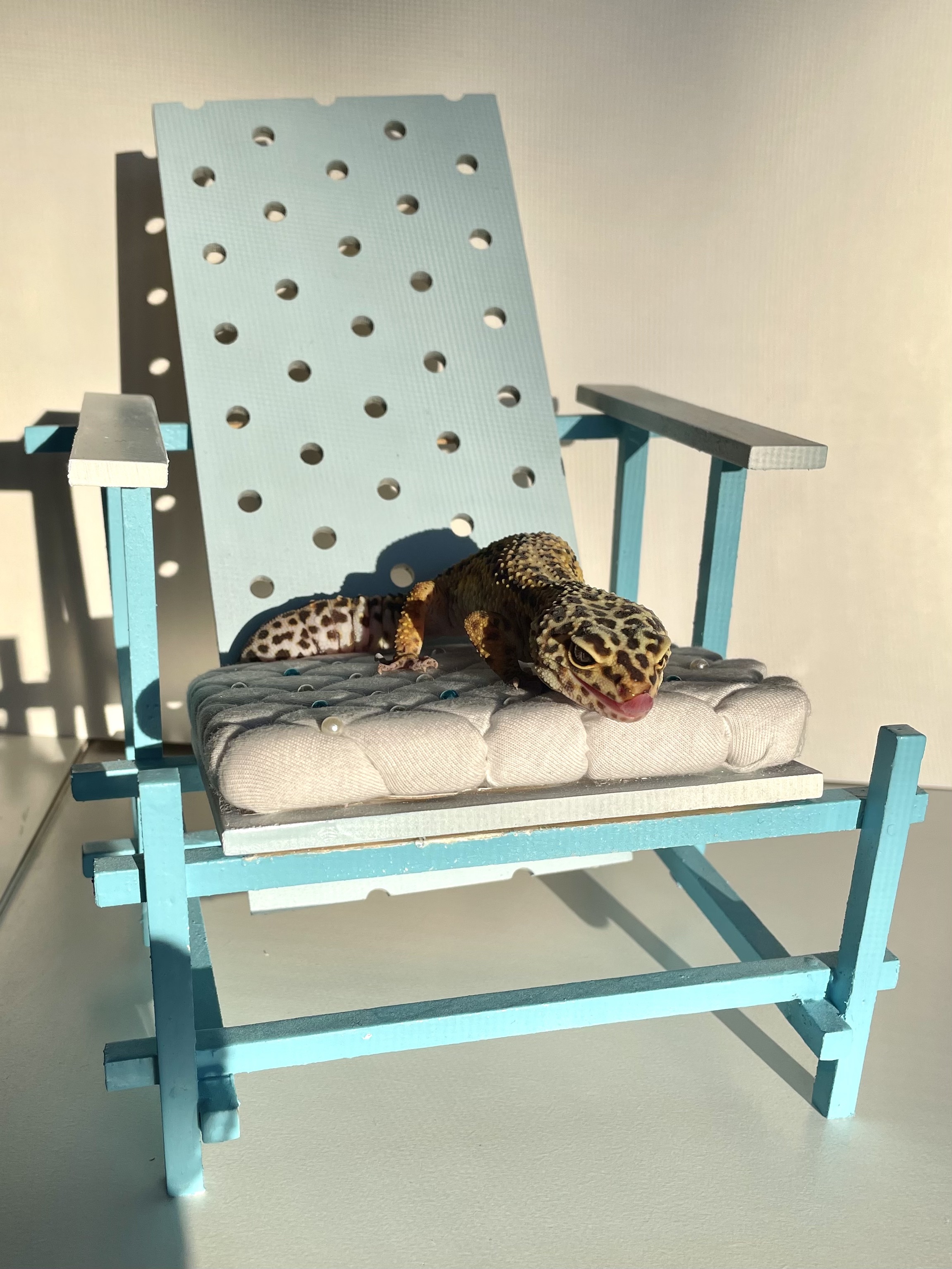 Sitting on Clouds
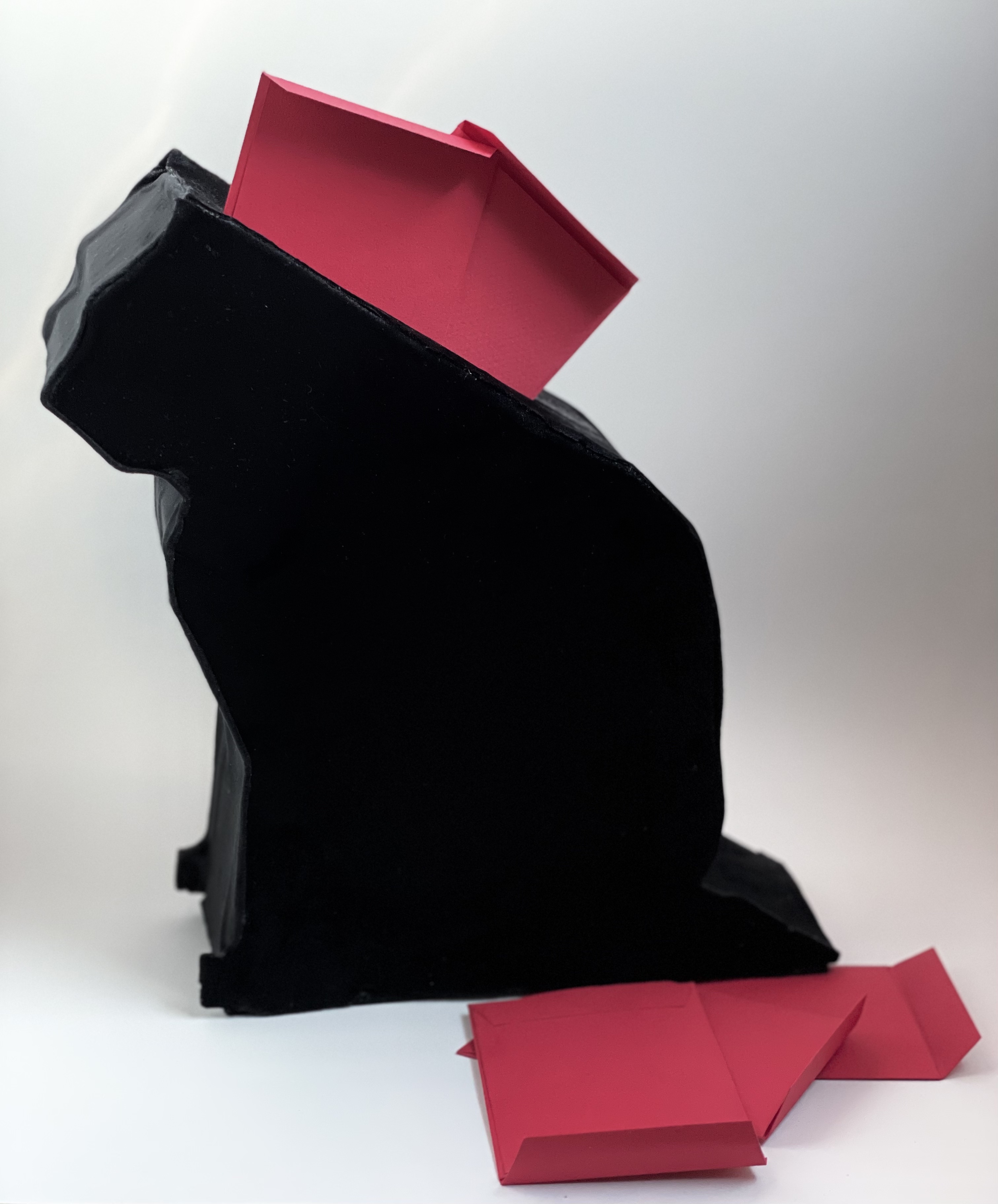 Lucky Kitty Bank
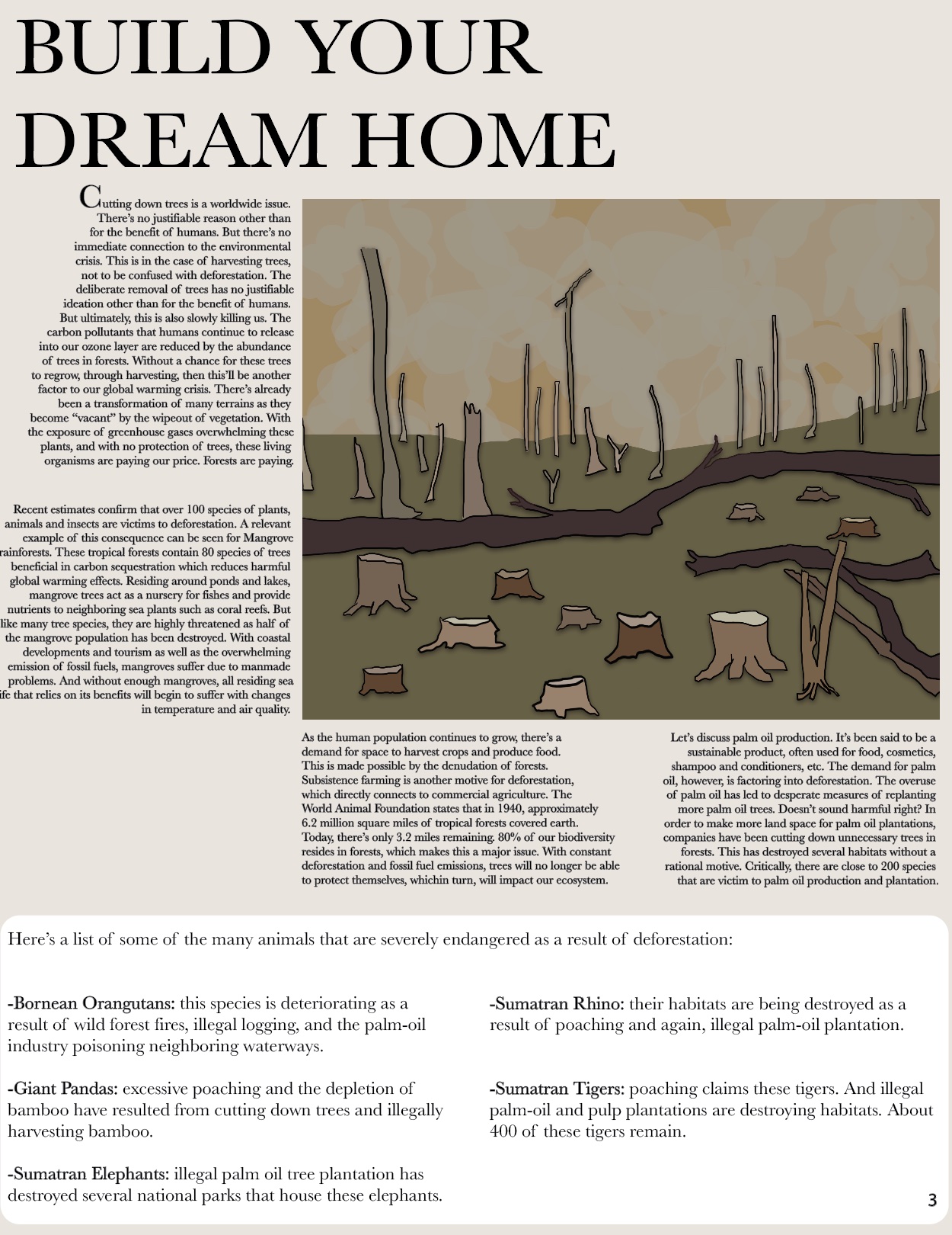
 Basket Case
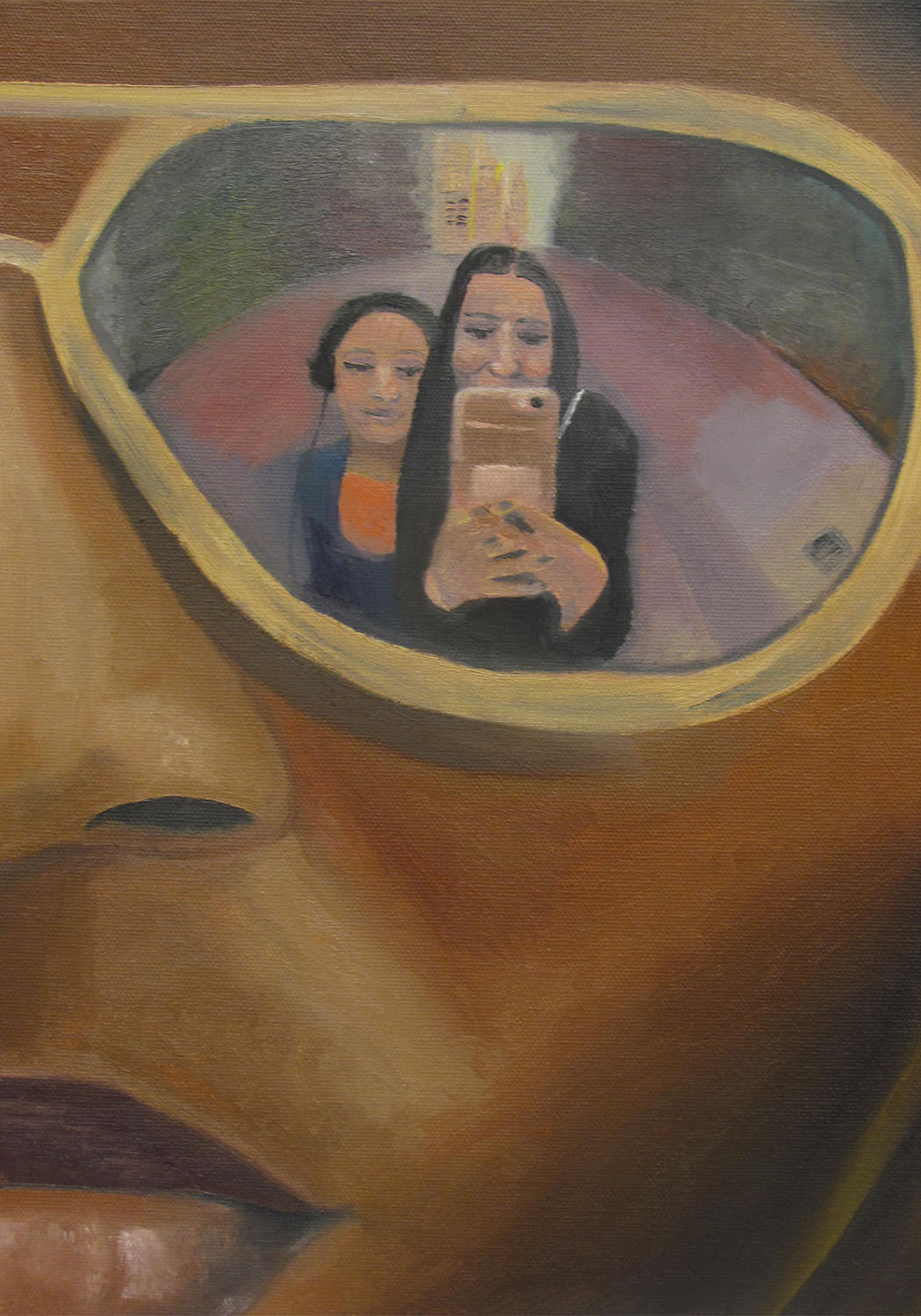
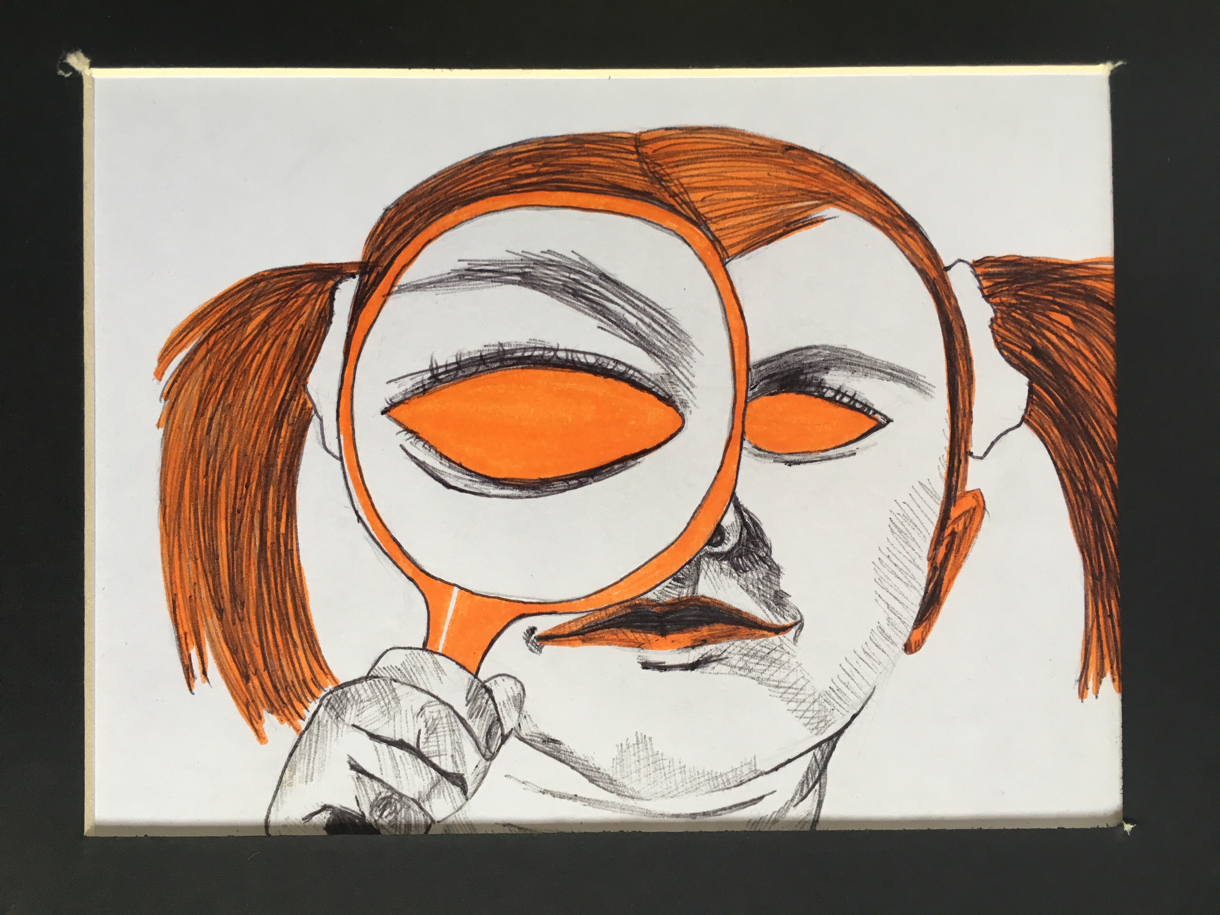
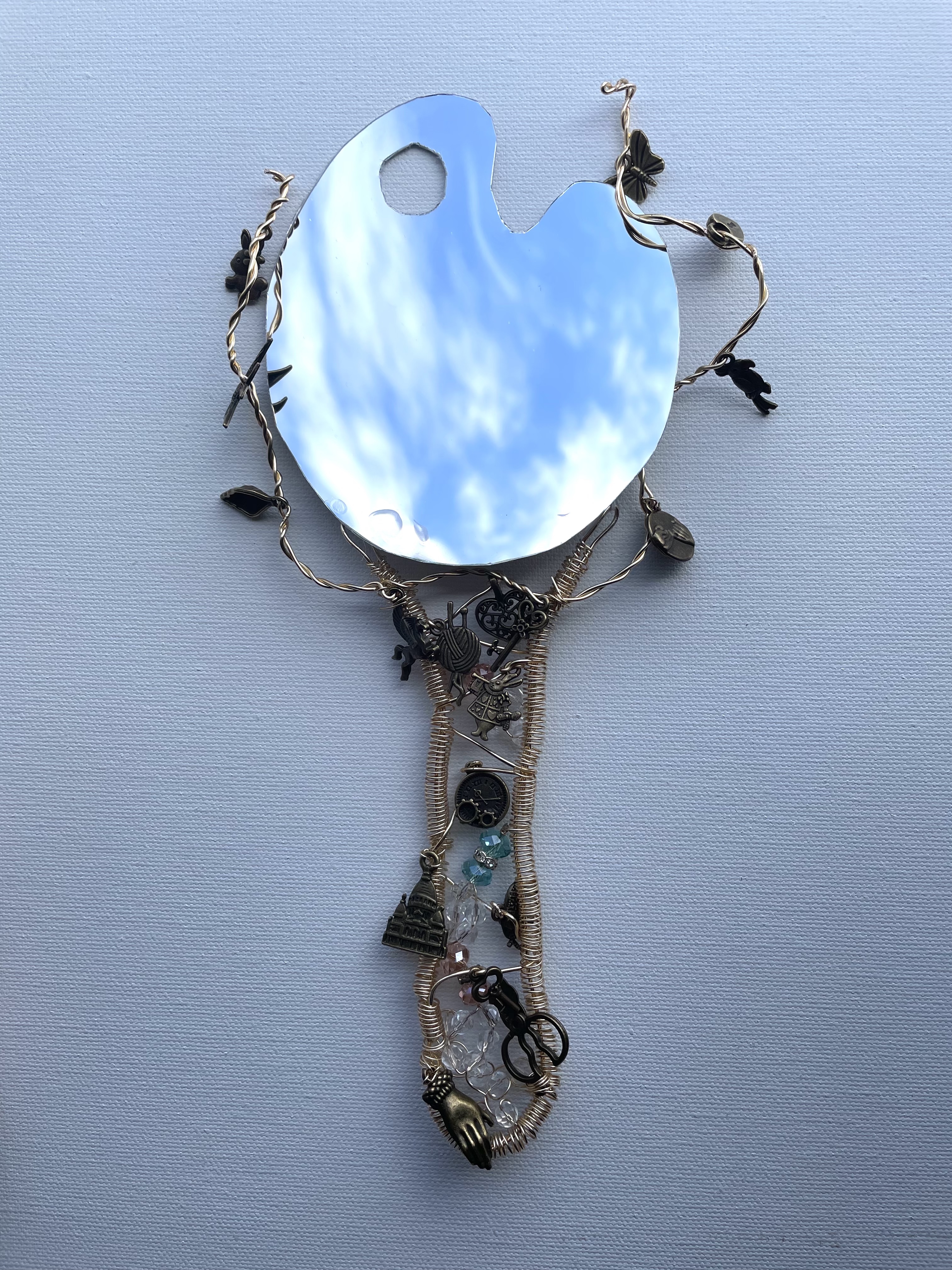 Mirror Mirror in My Hand
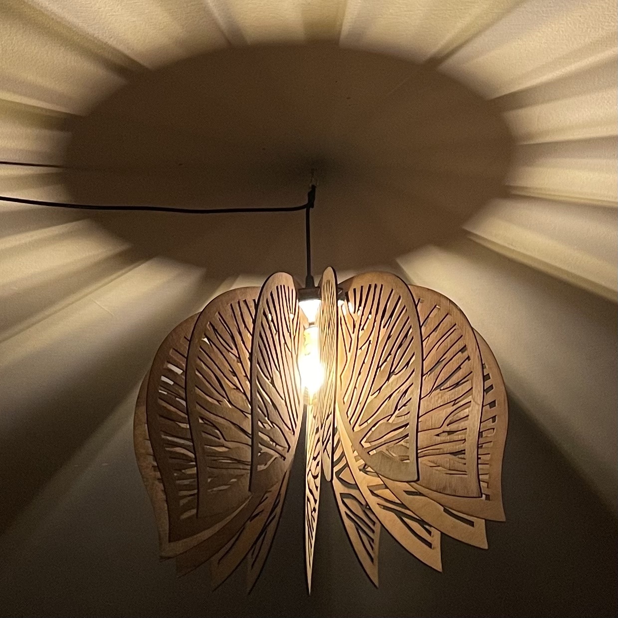
 Spread my Wings
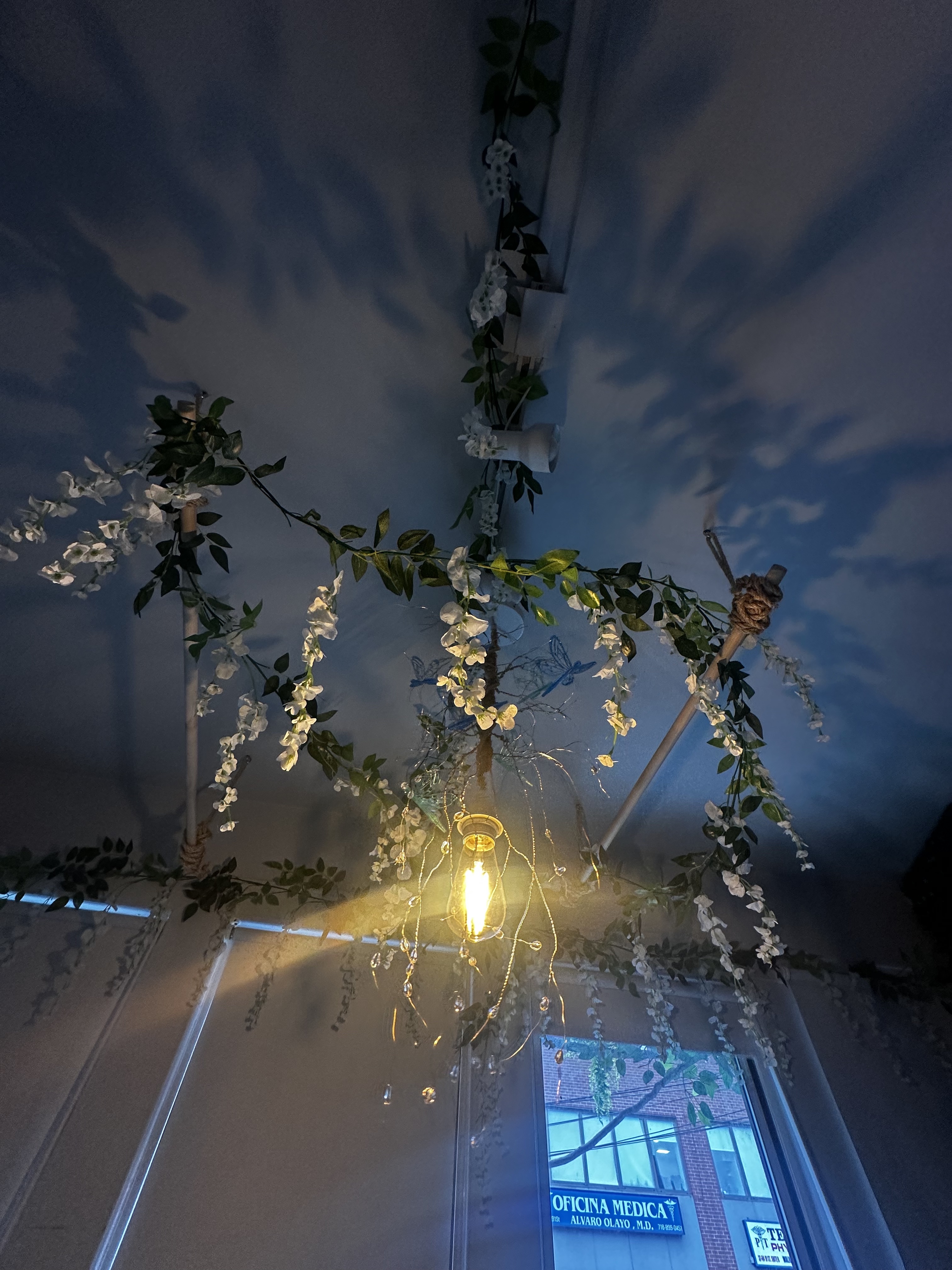
 Branching Out
 Libelulas
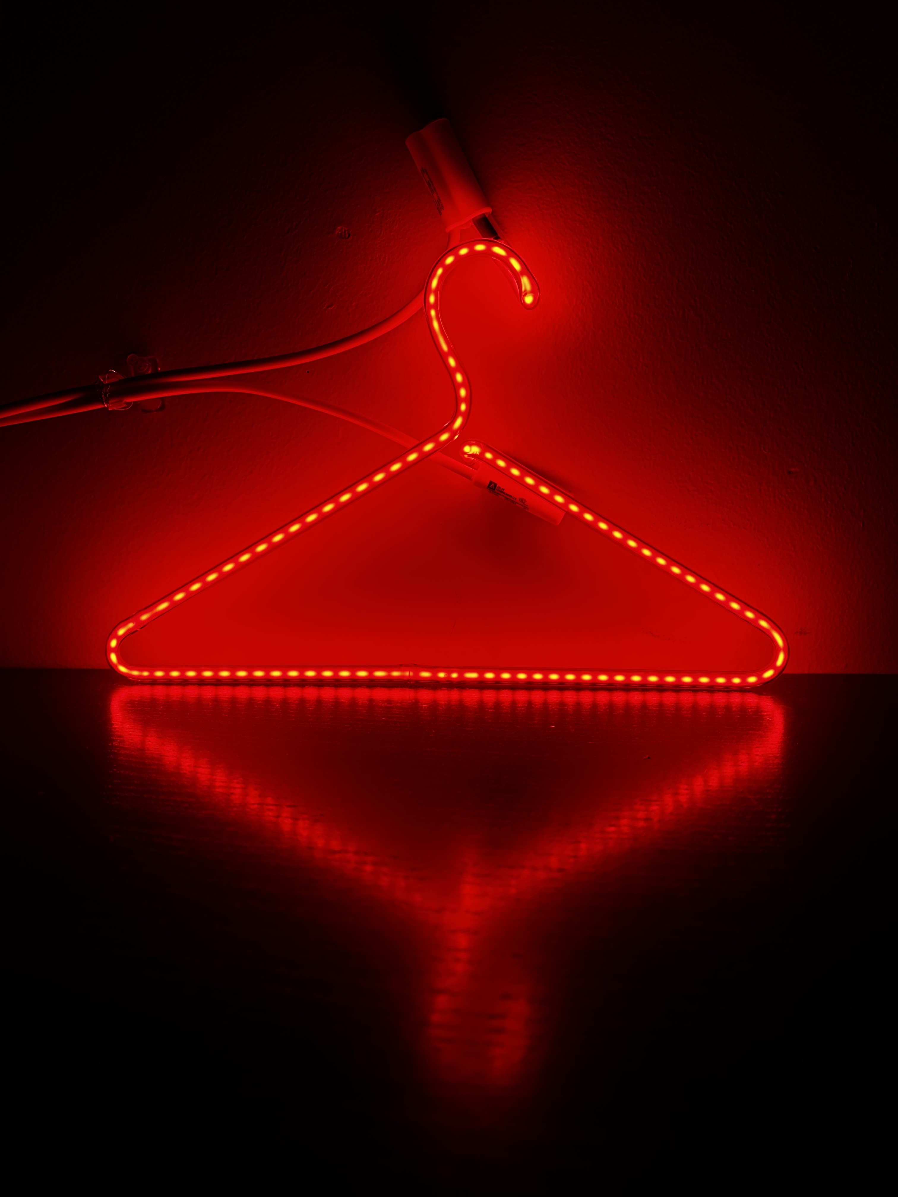 Neon Hanger
 Nimbus Luxe
 Cascading Coral

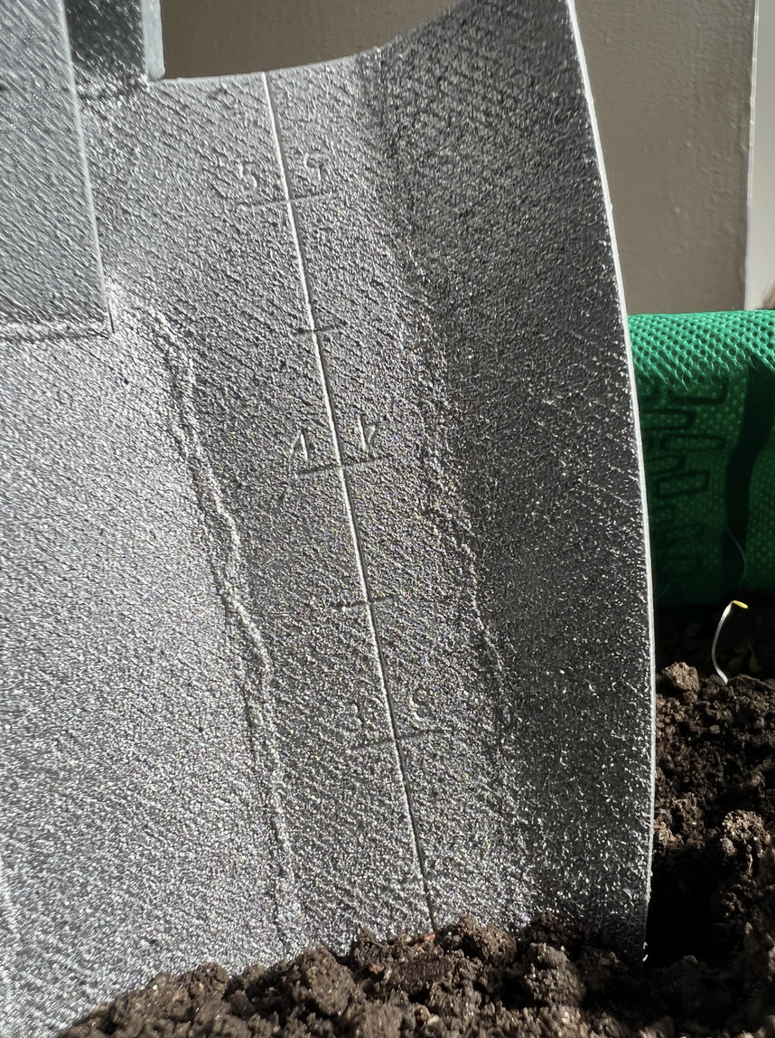
MONO-MATERIAL TROWEL
My team redesigned a gardening trowel that’s a more sustainable, ergonomic, and stylish alternative.
Over the span of three weeks, we created mockups that experimented with different handheld grips. We also did heavy material research and asked people with gardening experience to test our most confident prototypes.
Through feedback and agreement, we chose to create a trowel made of recycled aluminum. It has several gaps and curvatures on the grip for comfort. And it’s lightweight.


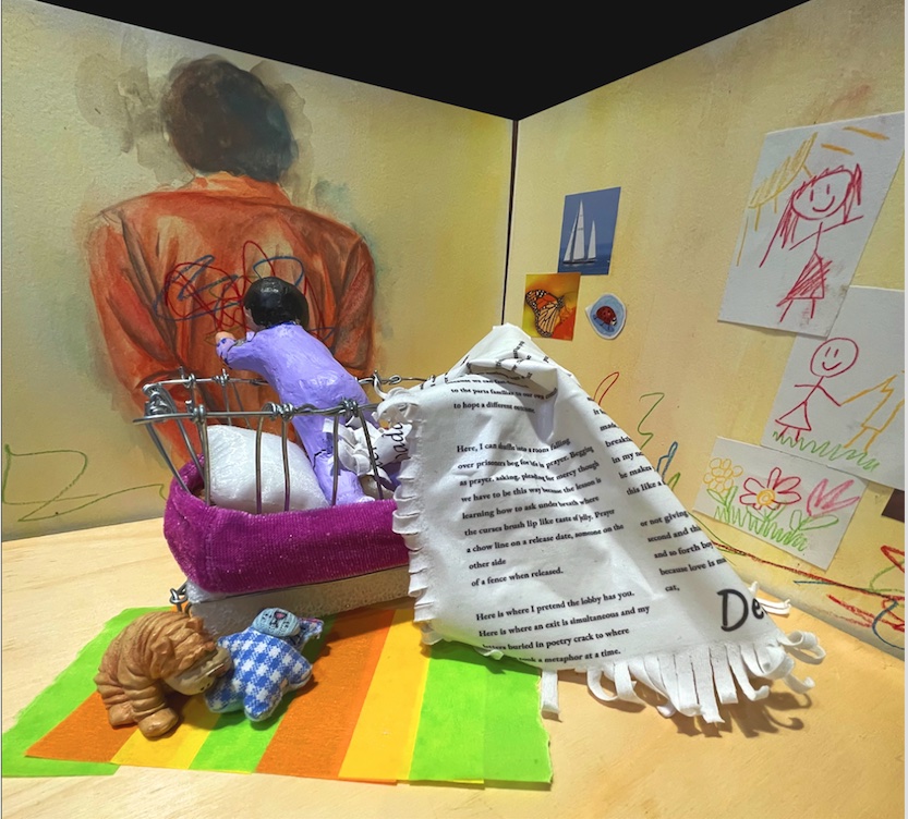
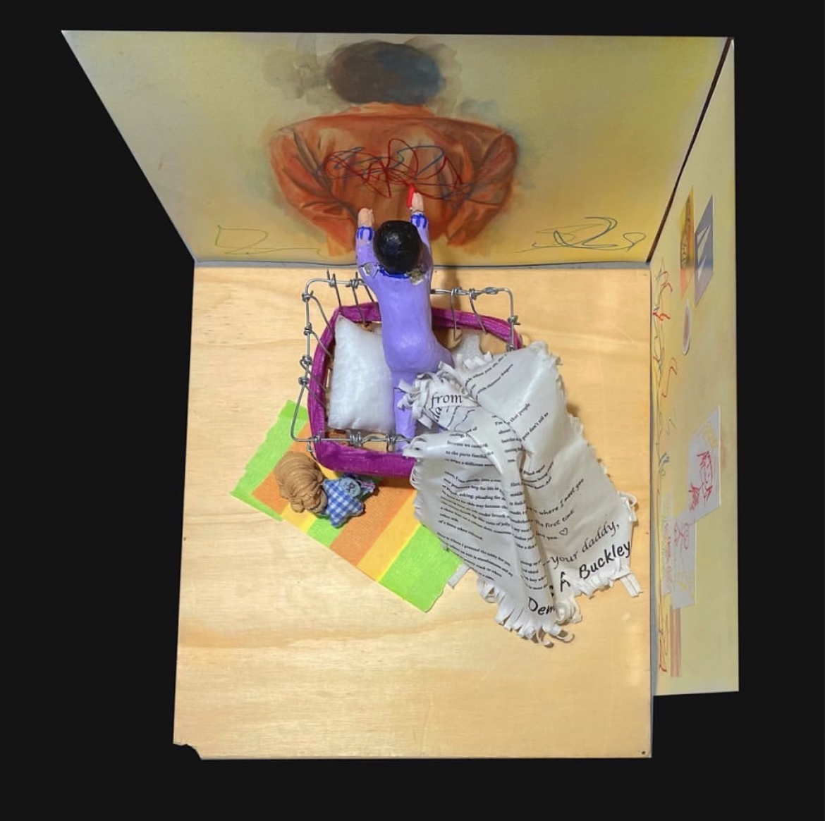
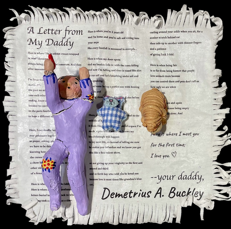
PEN AMERICA: WORKS OF JUSTICE 3D POEM
In collaboration with my classmate, Lauren Lee, we created a 3-Dimensional diorama that illustrates the narrative behind the poem Letters From Daddy by Demetrius A. Buckley
This poem was written by a strong-willed man currently serving time in prison. From his cell, he’s cultivated this powerful poem in the format of a letter. He addresses his daughter, who was a newborn at the time of his detainment.
Although we wanted to redesign this work of art 3-Dimensionally, we were so touched by the story that we chose to perserve the full writing and integrate it subtly into our final presentation.

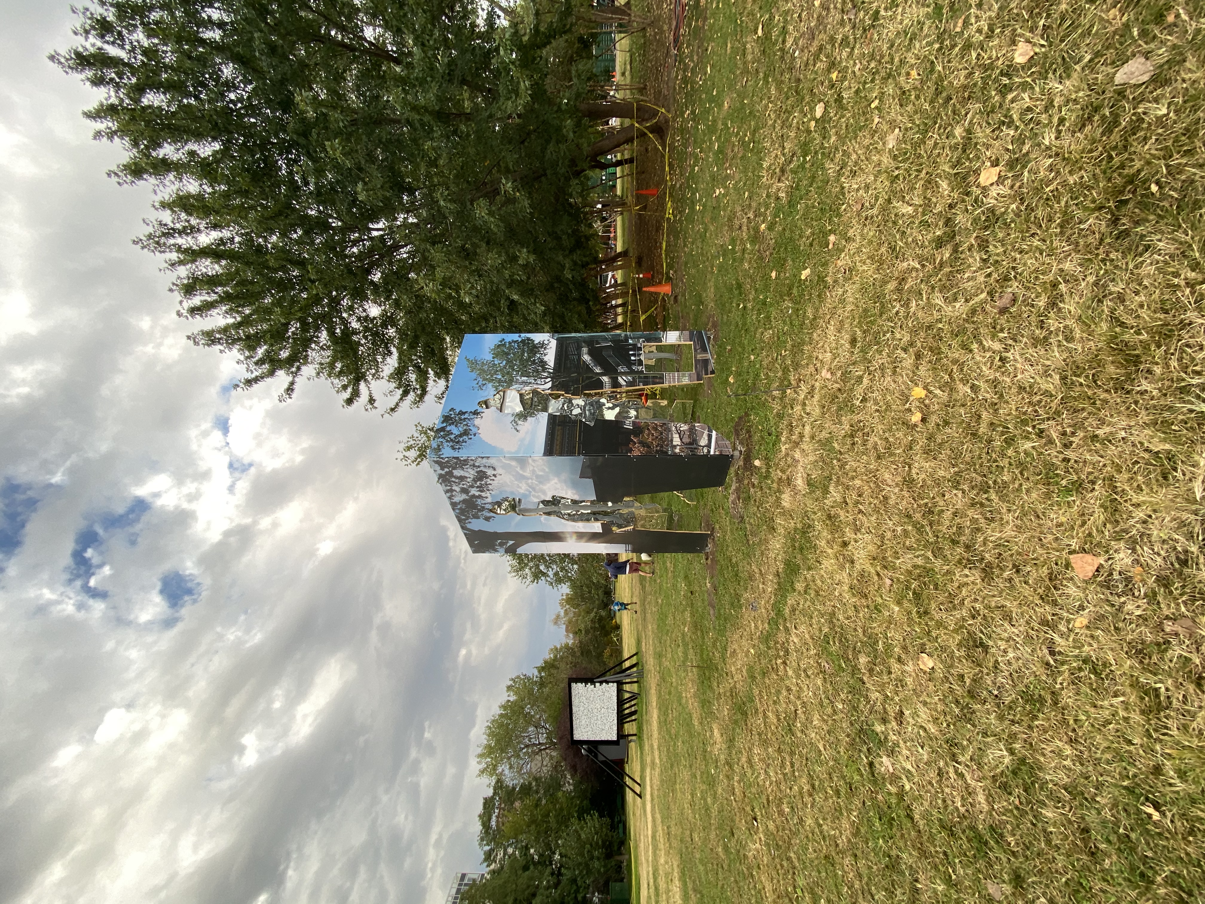
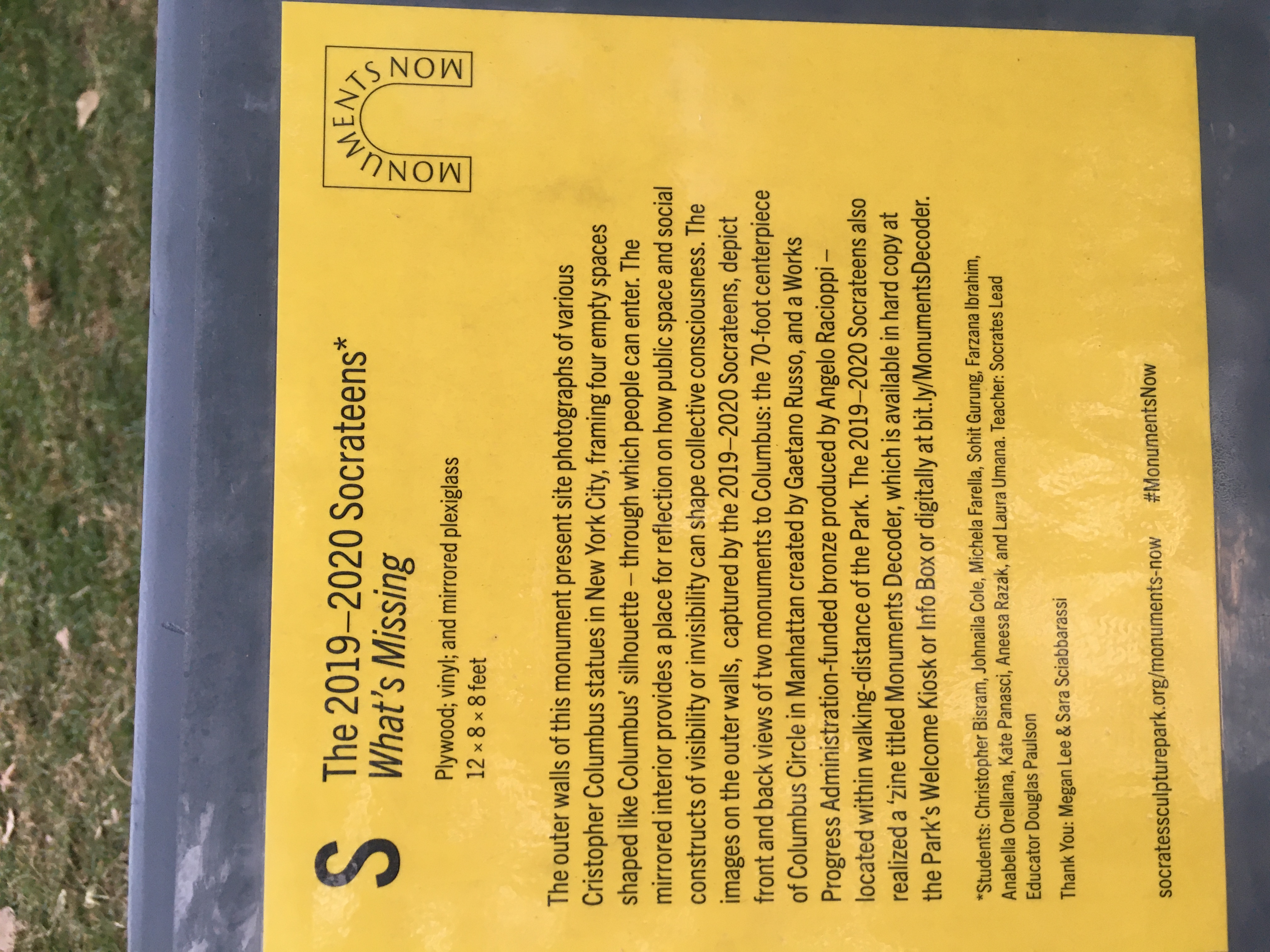
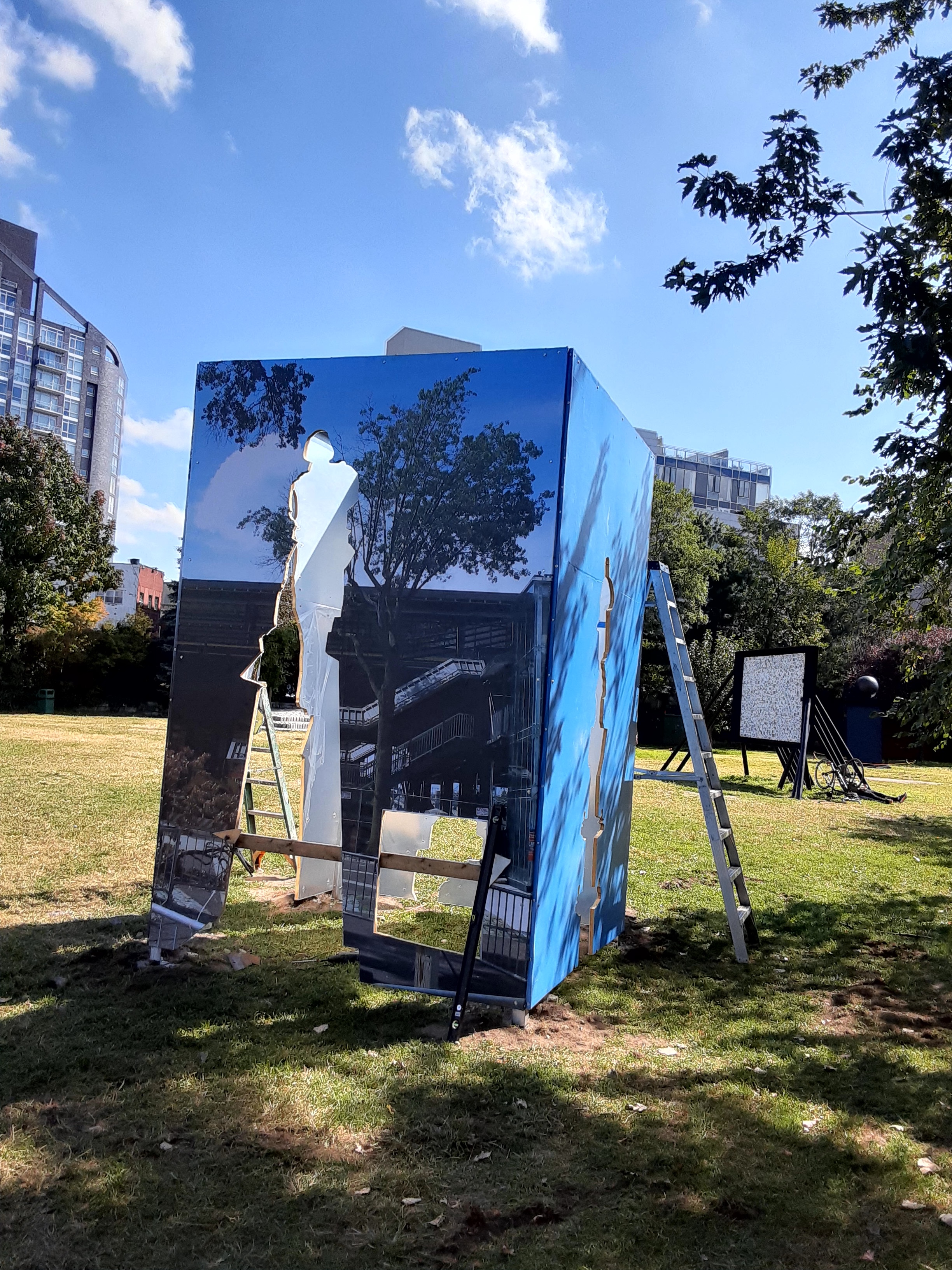
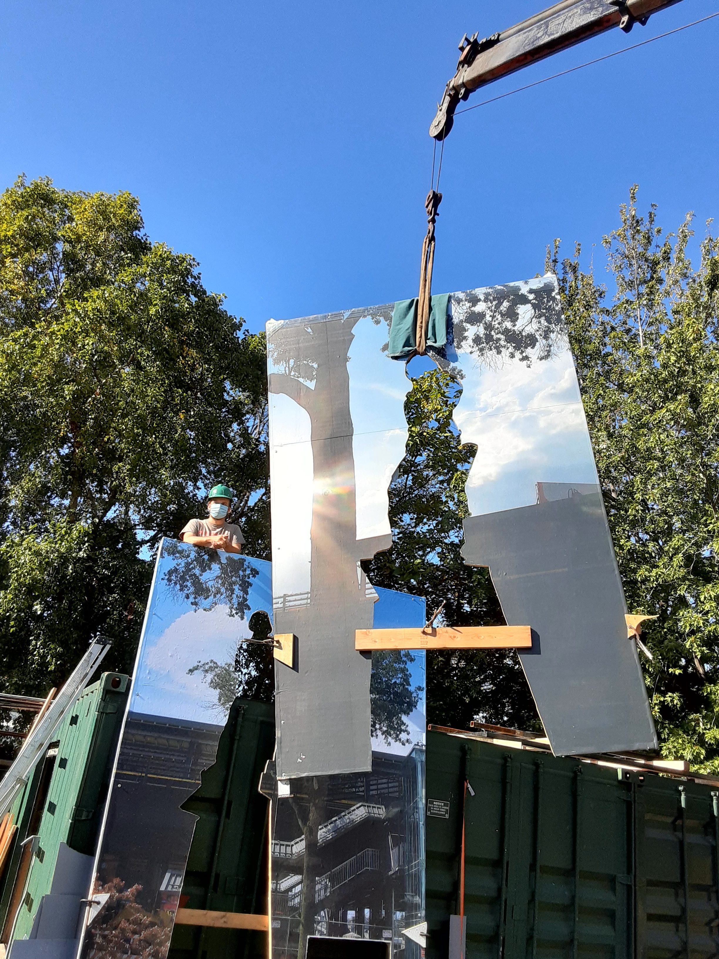
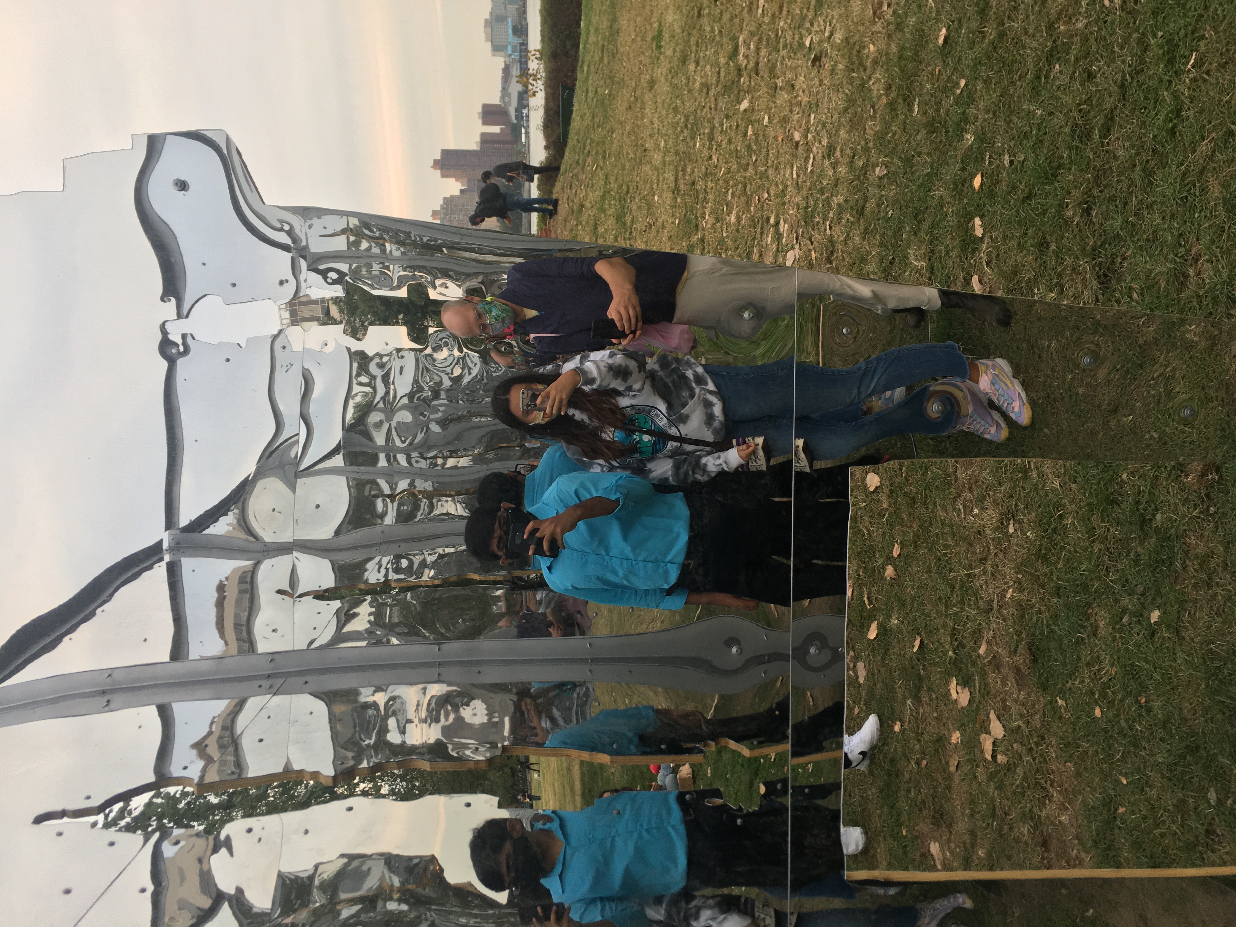
SOCRATES SCULPTURE PARK: WHAT’S MISSING? MONUMENT
My team and I worked for 8 months to develop this gargantuan monument that antagonizes the 3 infamous Christopher Columbus statues displayed publicly across New York City.
We included mirrors in the interior so people can reflect on who Columbus was. And, to see ourselves and think about a world we’d still be a part of; a world where Columbus isn’t worshiped. We named our monument “What’s Missing?” It felt like a phrase that could be posed as a question in many different ways.
It also made you dwell on why we even need these statues when they display one man who did nothing worth praising. Some other states and cities are already ahead of NYC. Chicago, Illinois removed two Columbus statues because they realized the negative energy it displayed. They peacefully and willingly removed these statues.


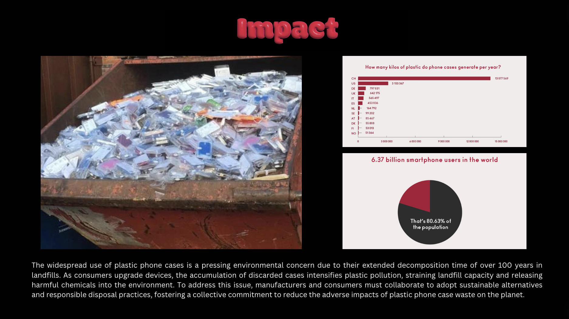
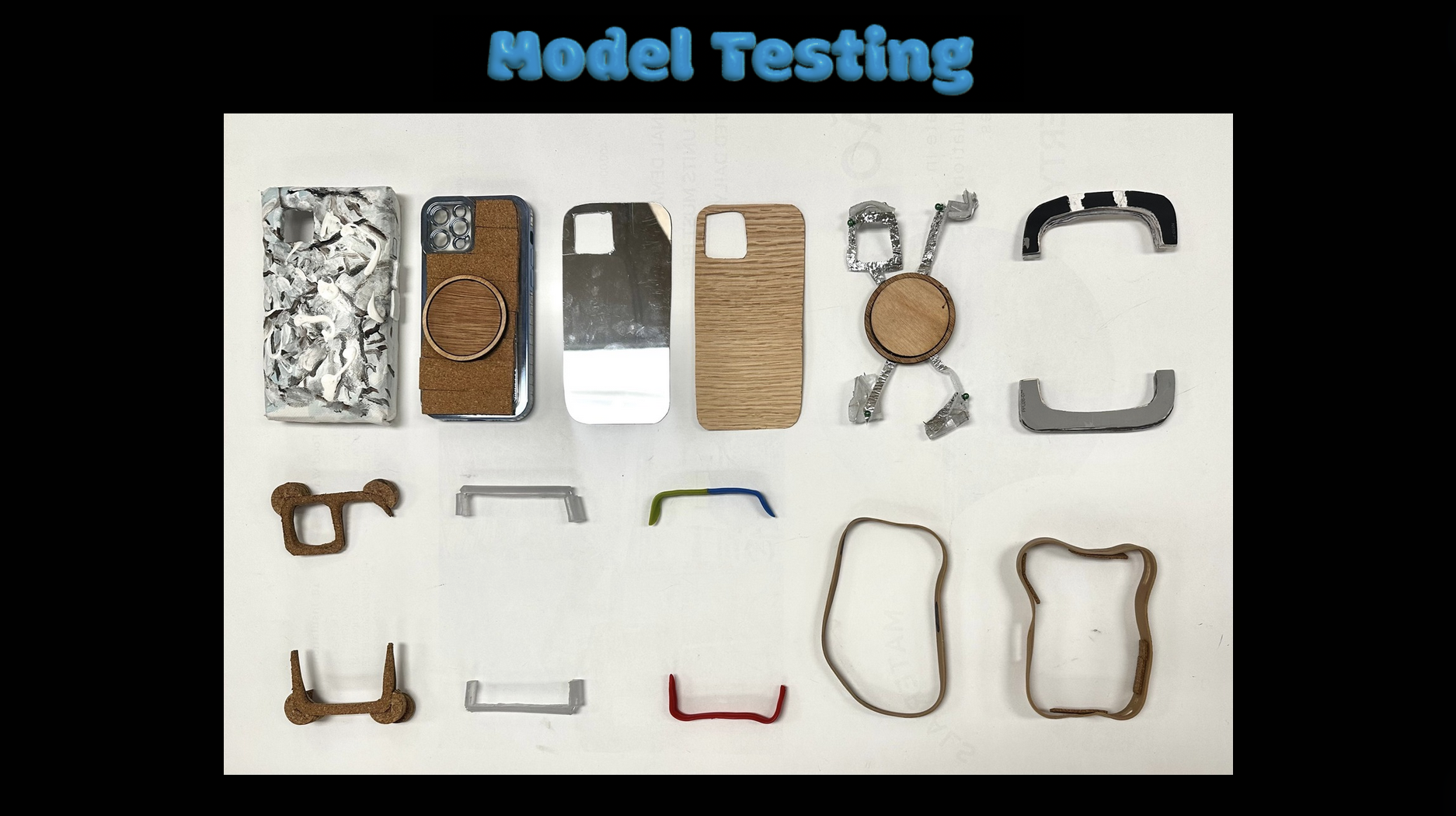
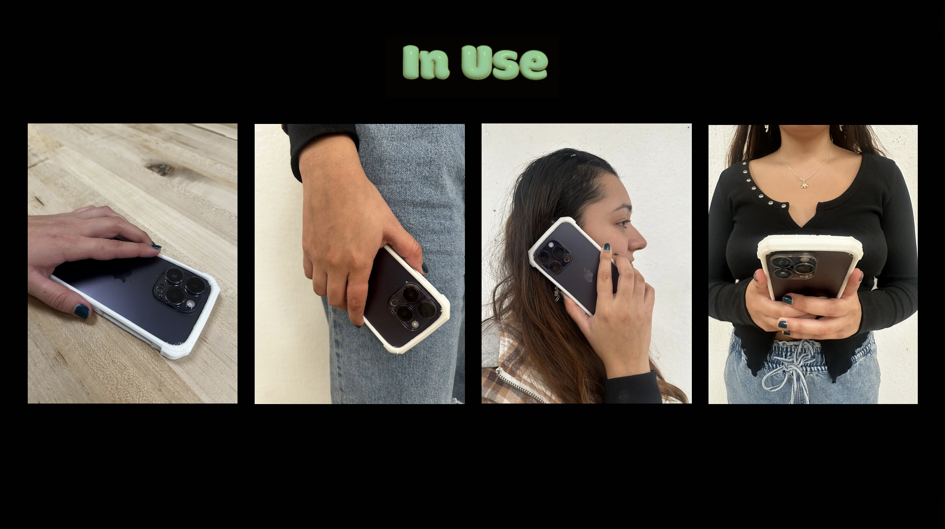
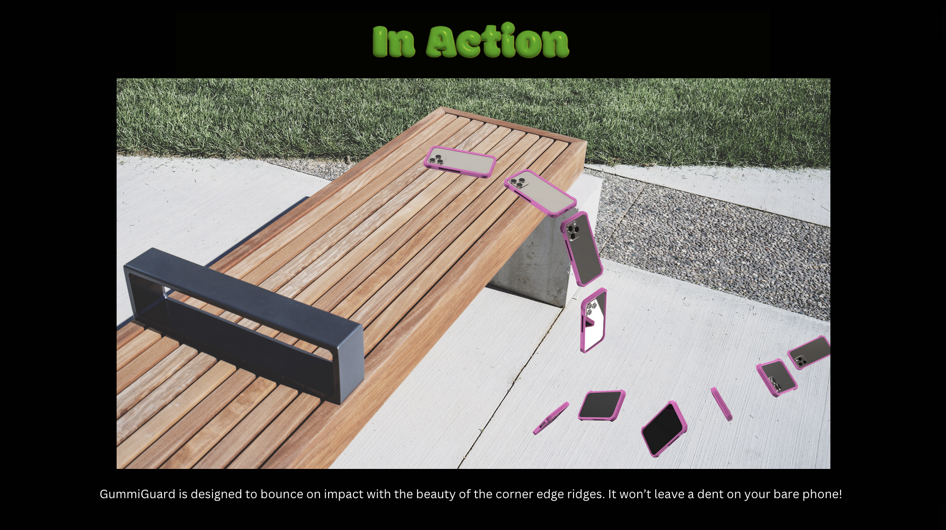
GUMMIGUARD PHONE CASE ADVERTISEMENT
Introducing GummiGuard, the perfect solution to keep your phone protected and fashionably sleek! I created this product that fits the latest Iphone products from the 12-15 standard and pros. Below is a full pitch on the product.


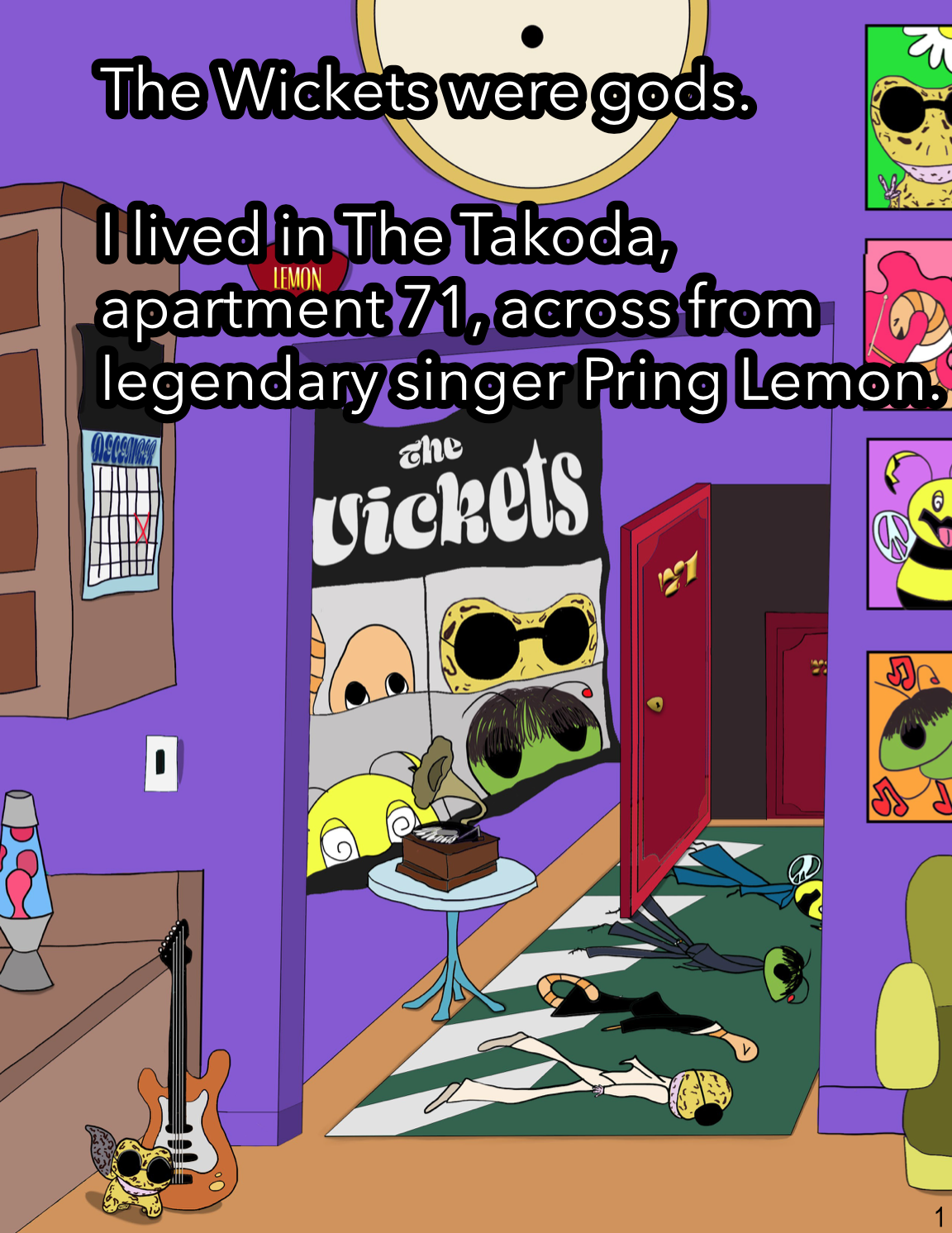
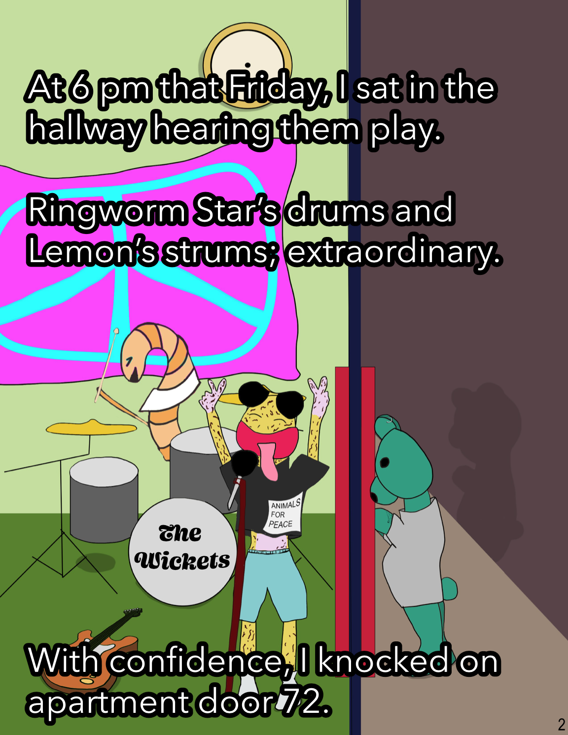
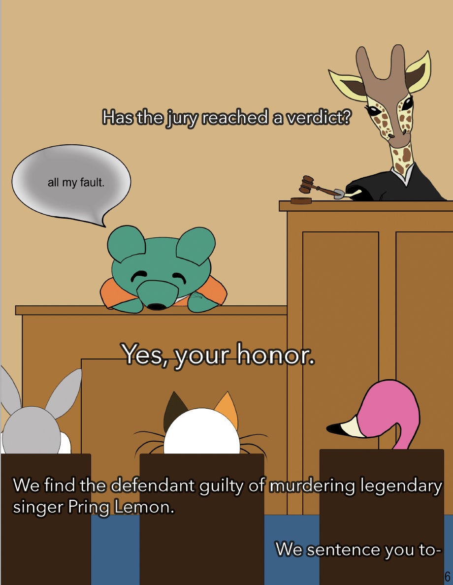
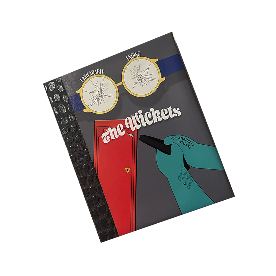
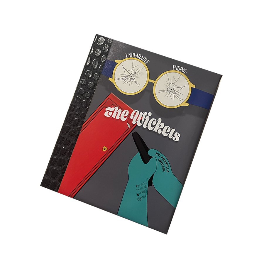
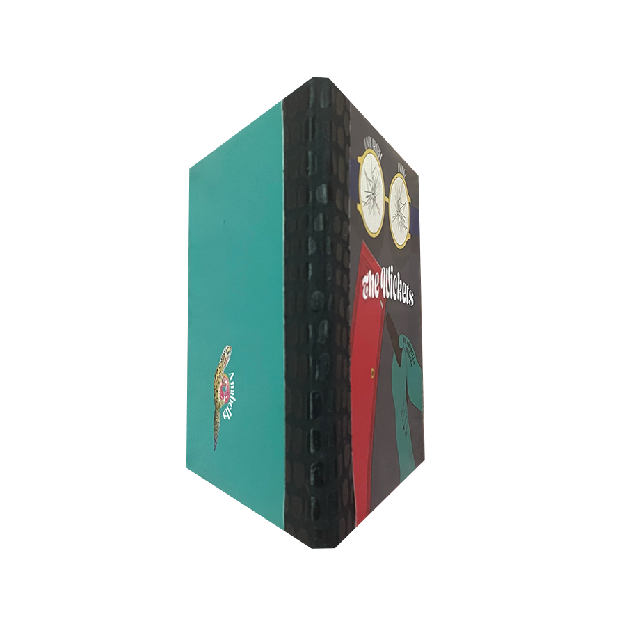
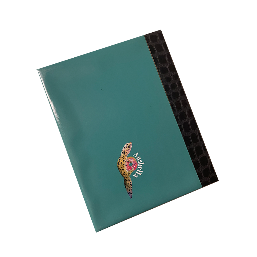
THE WICKETS BOOK
Inspired by the story of John Lennon’s death, this short story genre is mystery and true crime.
Lennon, portrayed by my gecko, Pringle “Pring Lemon” is the rockstar alongside his 3 other bandmates: The Wickets.


︎ Click the copy below to purchase


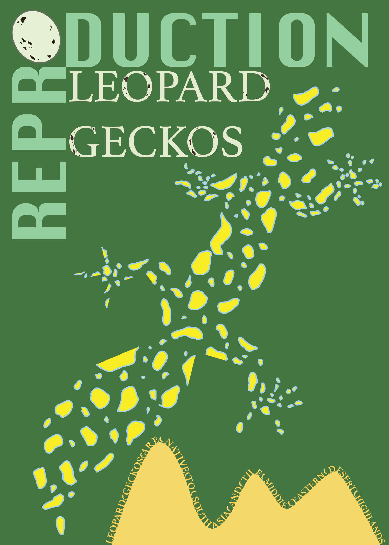
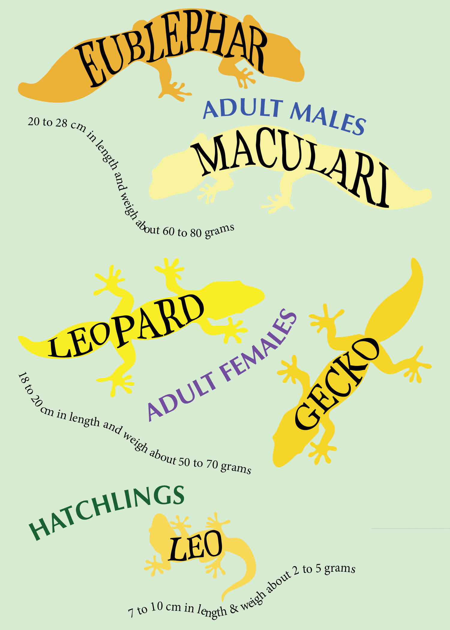
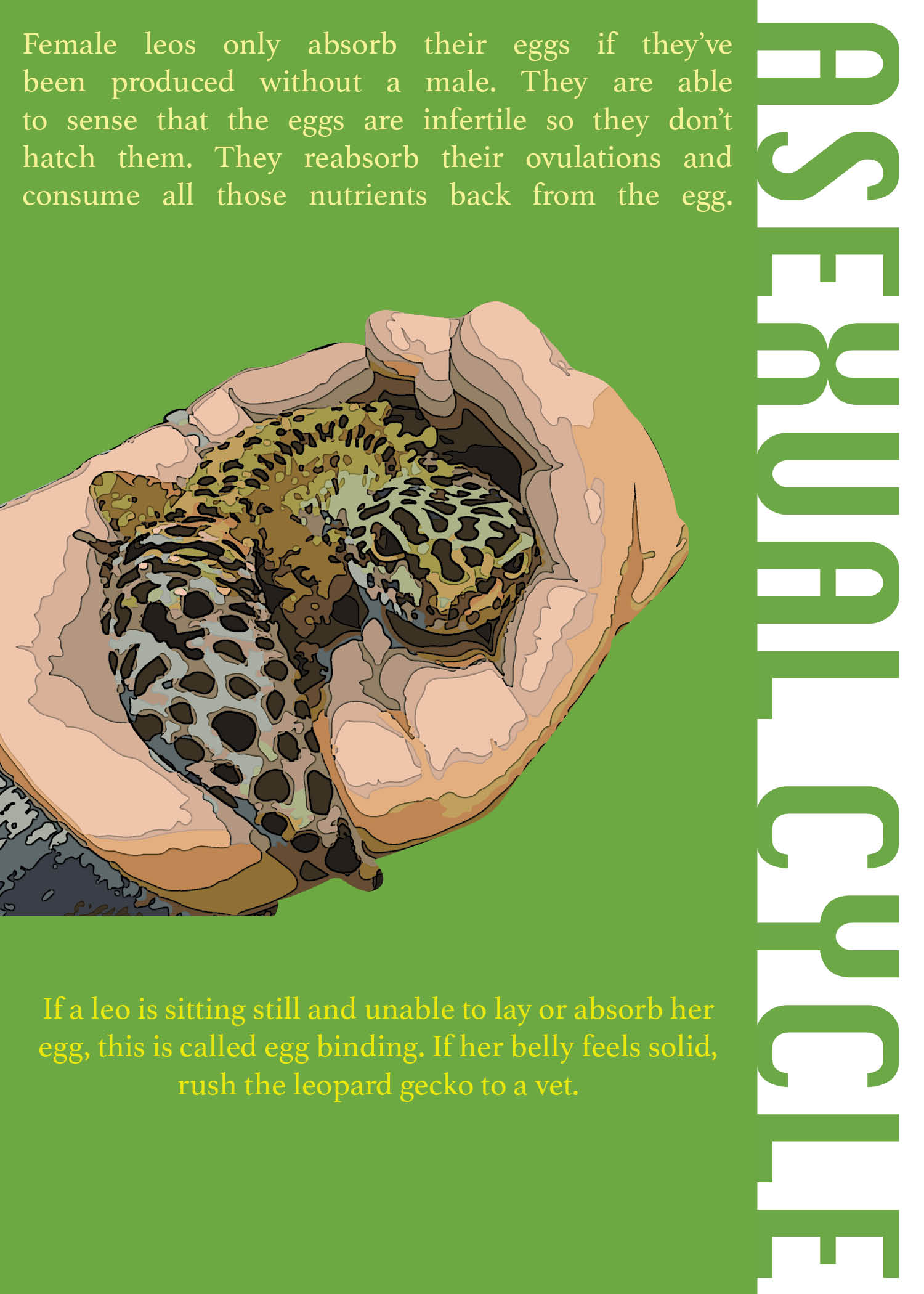
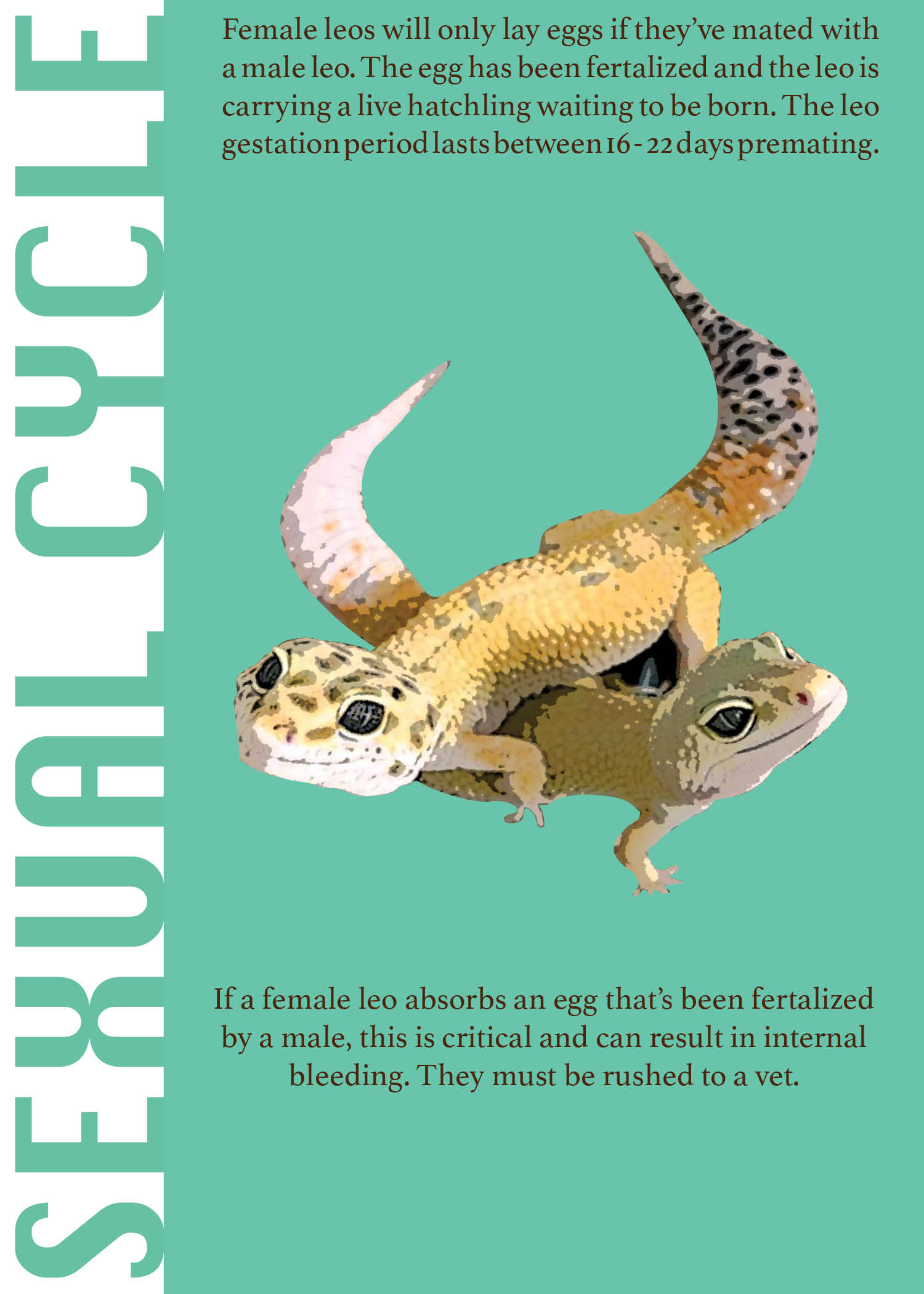
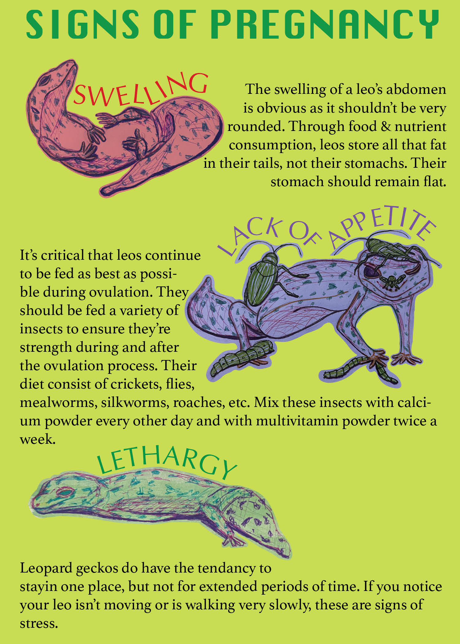
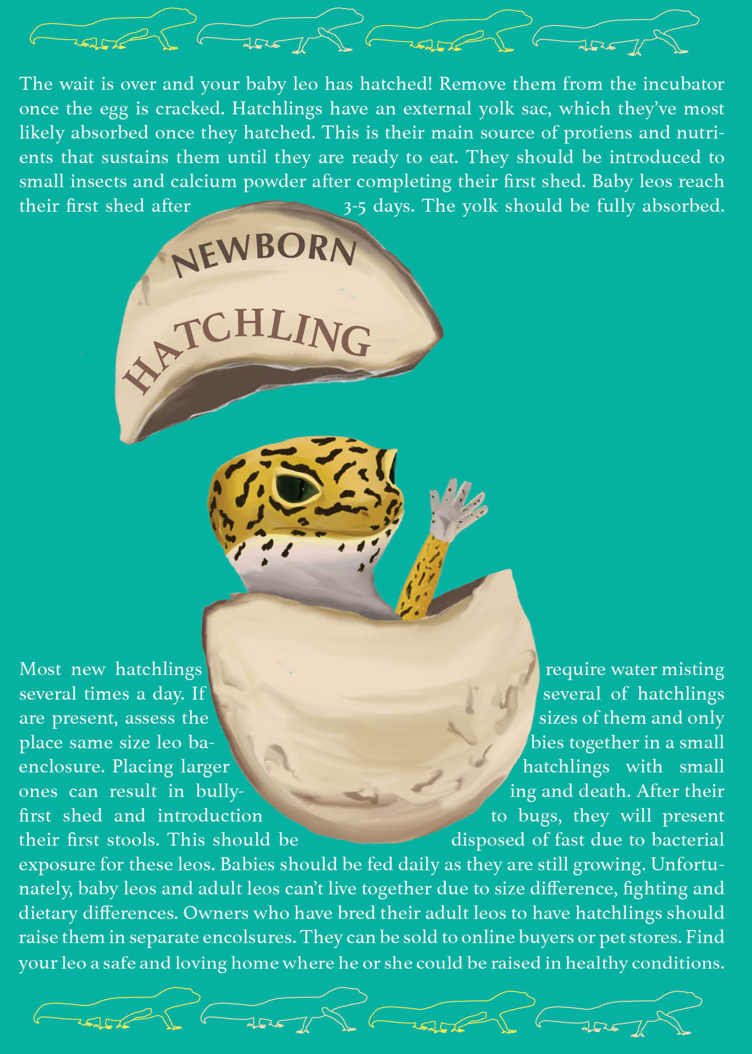
REPRODUCTION LEOPARD GECKOS ZINE
This fun facts book educates the public on the important signs, concerns, and care for female leopard geckos.


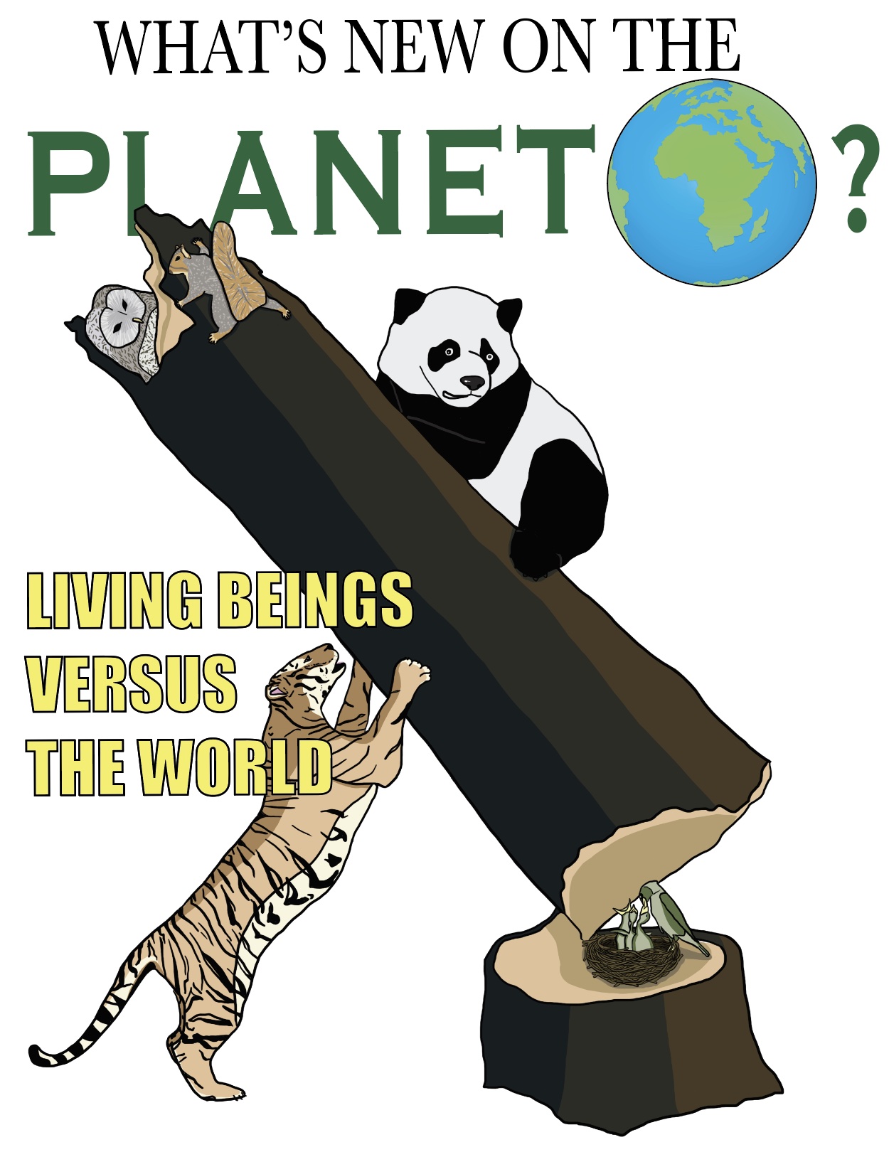
WHAT’S NEW ON THE PLANET? MAGEZINE
This publication shows the terrors caused by humans with visual illustrations of their damage toward innocent creatures.


IMAGINE MANIFESTO POSTER
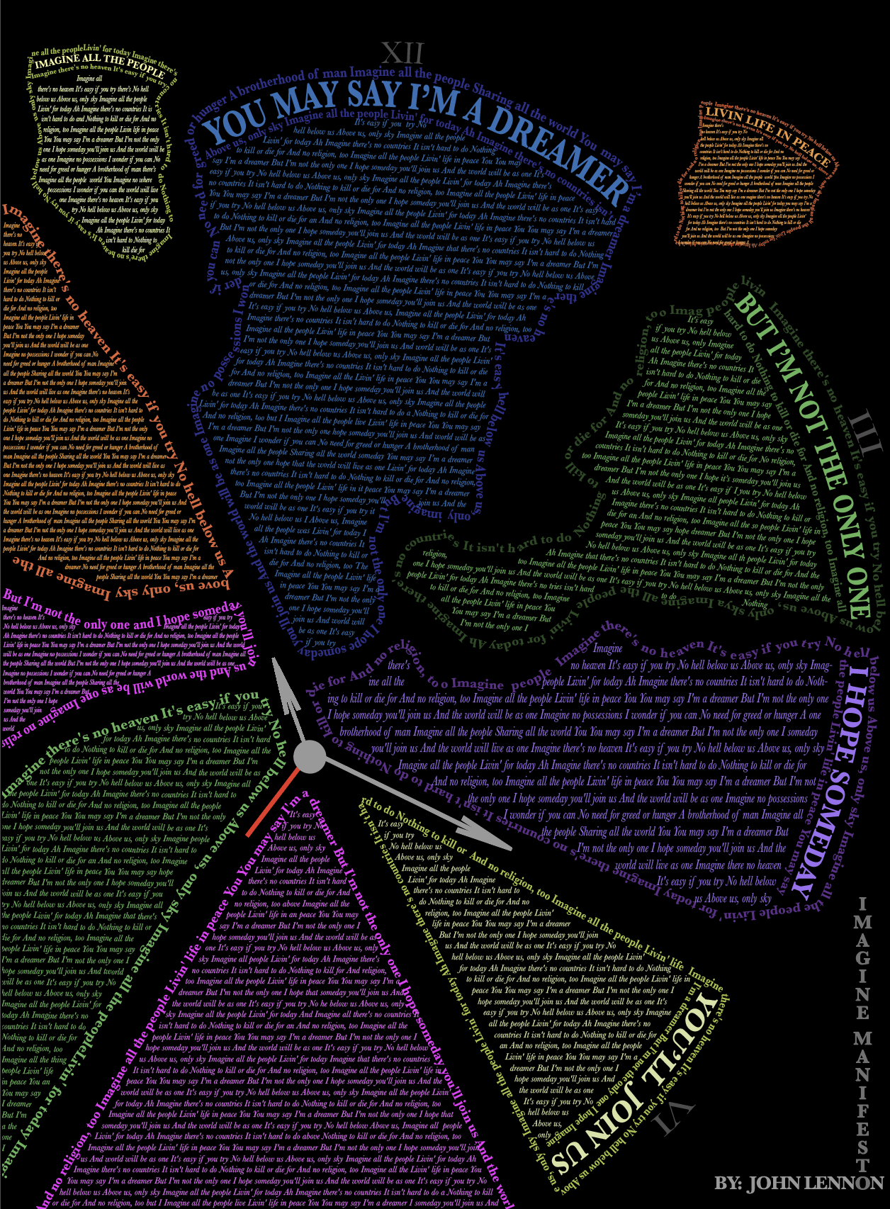 This manifesto is accredited to John Lennon, who sang these profound words as a desire for utopia and peace.
 My take on Lennon’s words is that there is no longer time to achieve a world without evil; the clock shows his words dispersing as pieces of the clock break apart.
The color scheme is meant to be ironic, showing vibrant rainbow colors because the diversity of the world has caused it to collapse rather than persevere.
THE NEW SCHOOL NEWSLETTER
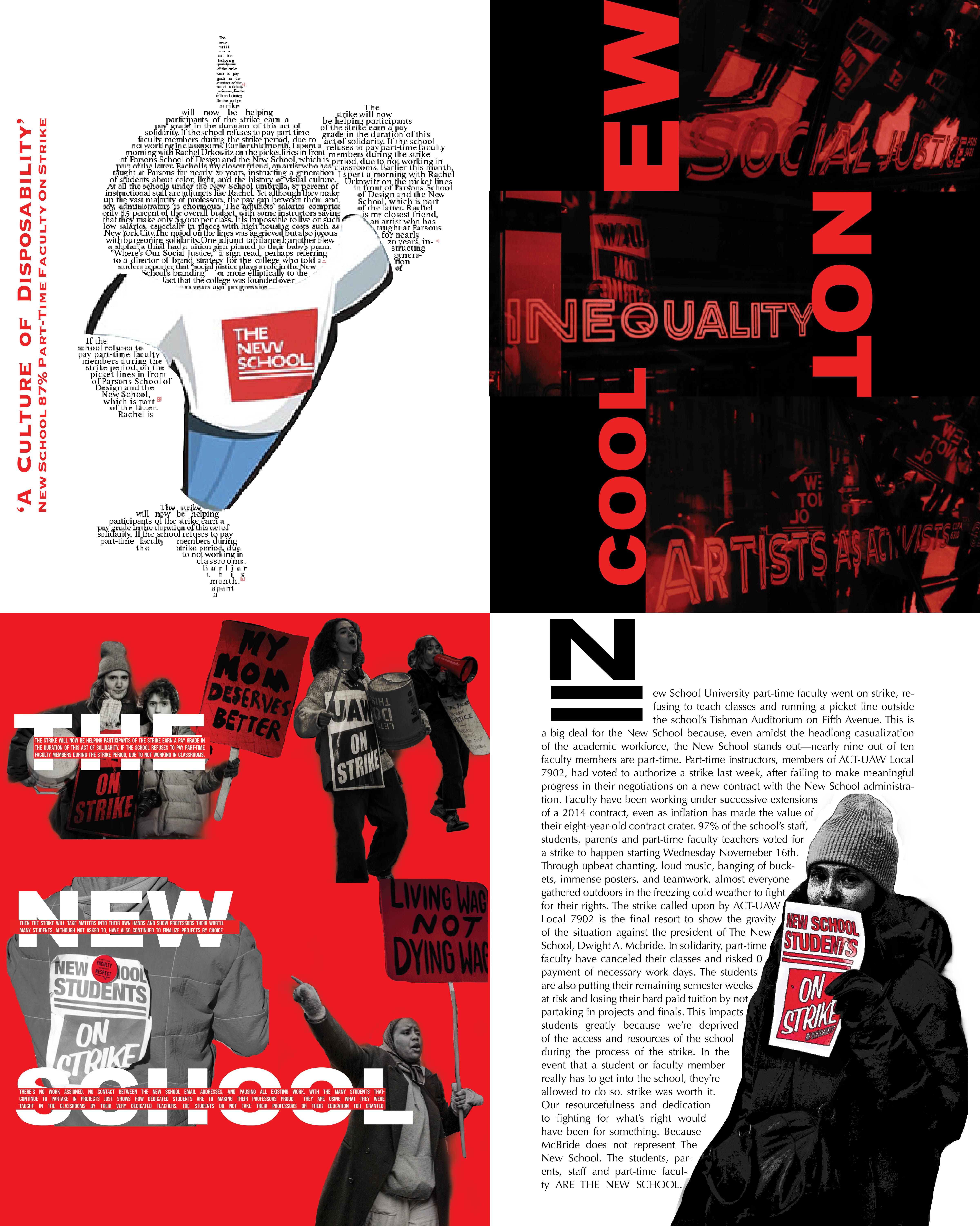 The New School Part-Time faculty and students went on strike for 2 months in hopes for better legislature at the university.
 I created a newsletter that illustrates the the dedicated activists. I also took inspiraation from their chant of disruption and personified that by taking over the school mascot with provoking words.
And the irony on the words reflected on the university windows make them even more antagonizing.
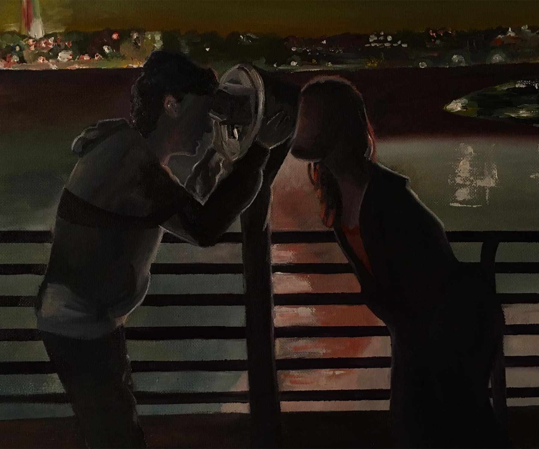
DECIEVED BY 2020 POSTER
 A poster depicts how the quarintine affected students expected to graduate in 2020 amidst a pandemic.
 We see a faceless personification of a student looking through a reflection shaped like the number 2 and angled into the number 0.
Reflected on the other side is a graduate with a diploma, cap and gown. Closest to us is reality; a figure wearing a hazmat suit, gloves and mask suffering from toilet paper shortage.
FLIPPING TABLEBAG PRODUCT AD
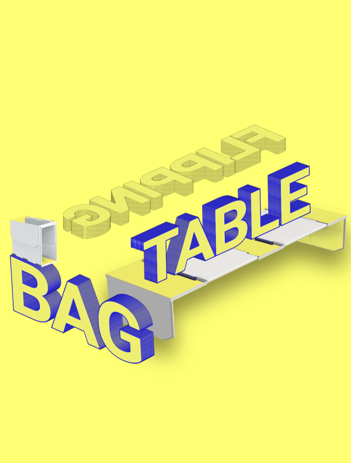 This advertisement coincides with the FLIPPING TABLEBAG product design work.
The letterforms are interacting with the product to show it’s scale, usage, and versatility. The word flipping is flipped to imply what the product is advertising.
And the table is literally used as a table while the bag is upright and balanced on the word bag.

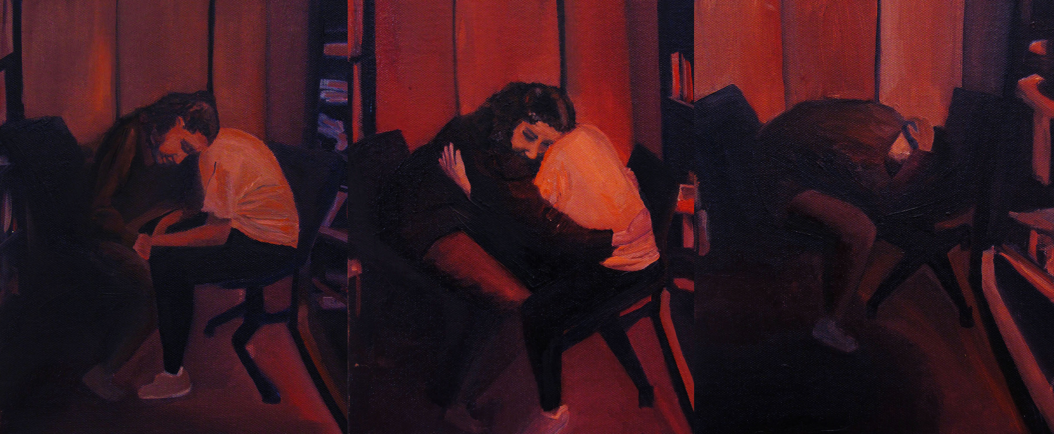
TRUELY FAMILY
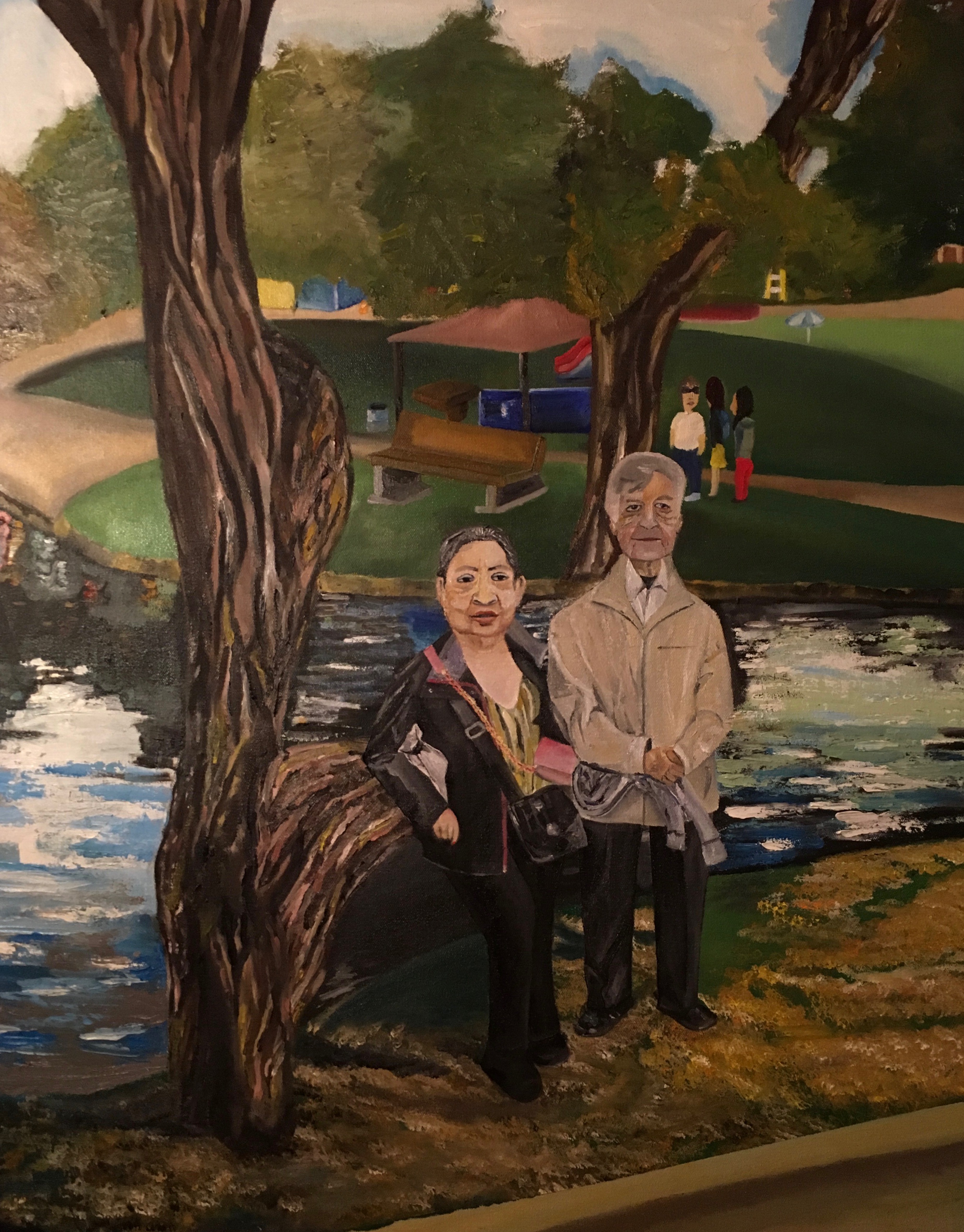
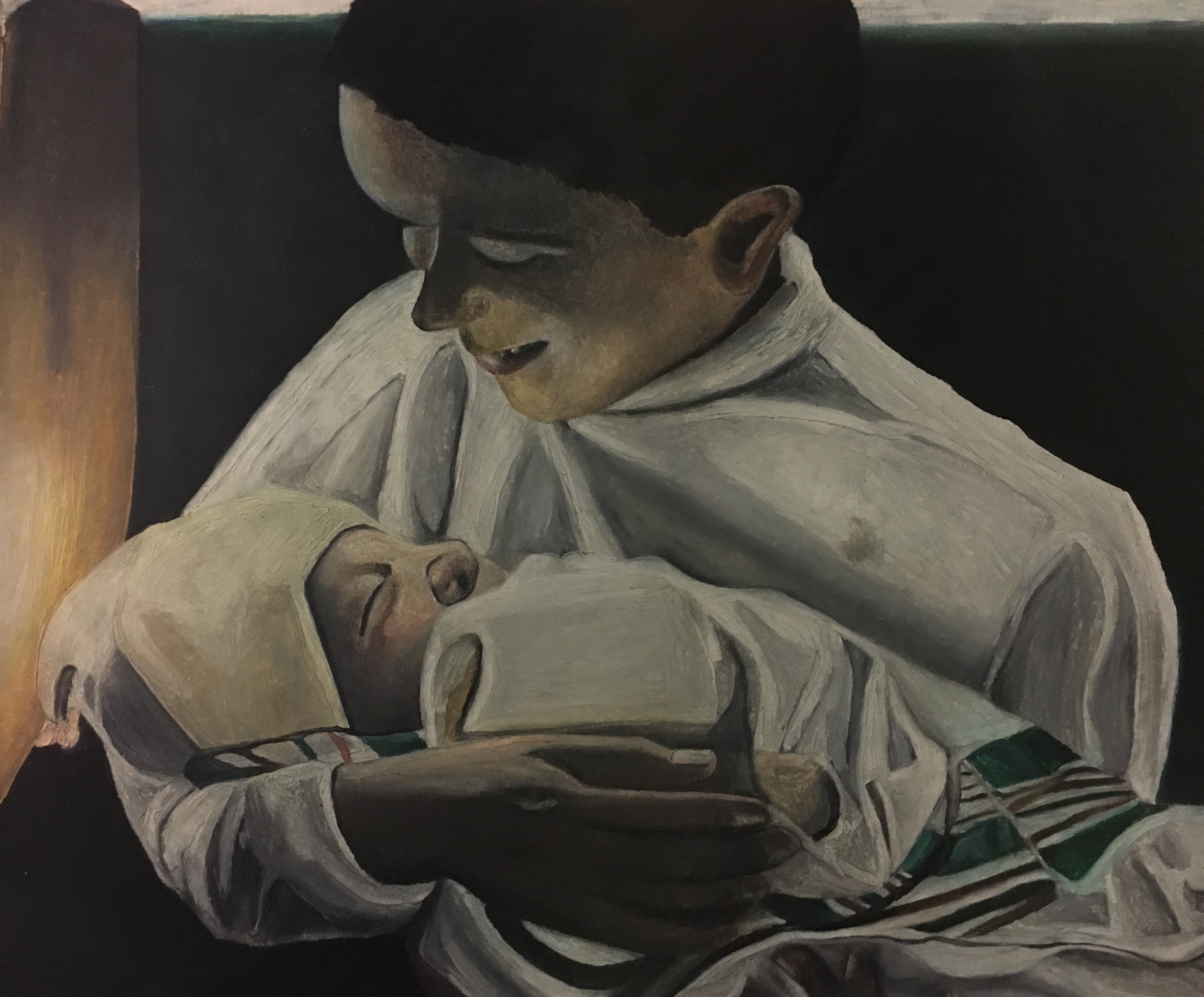

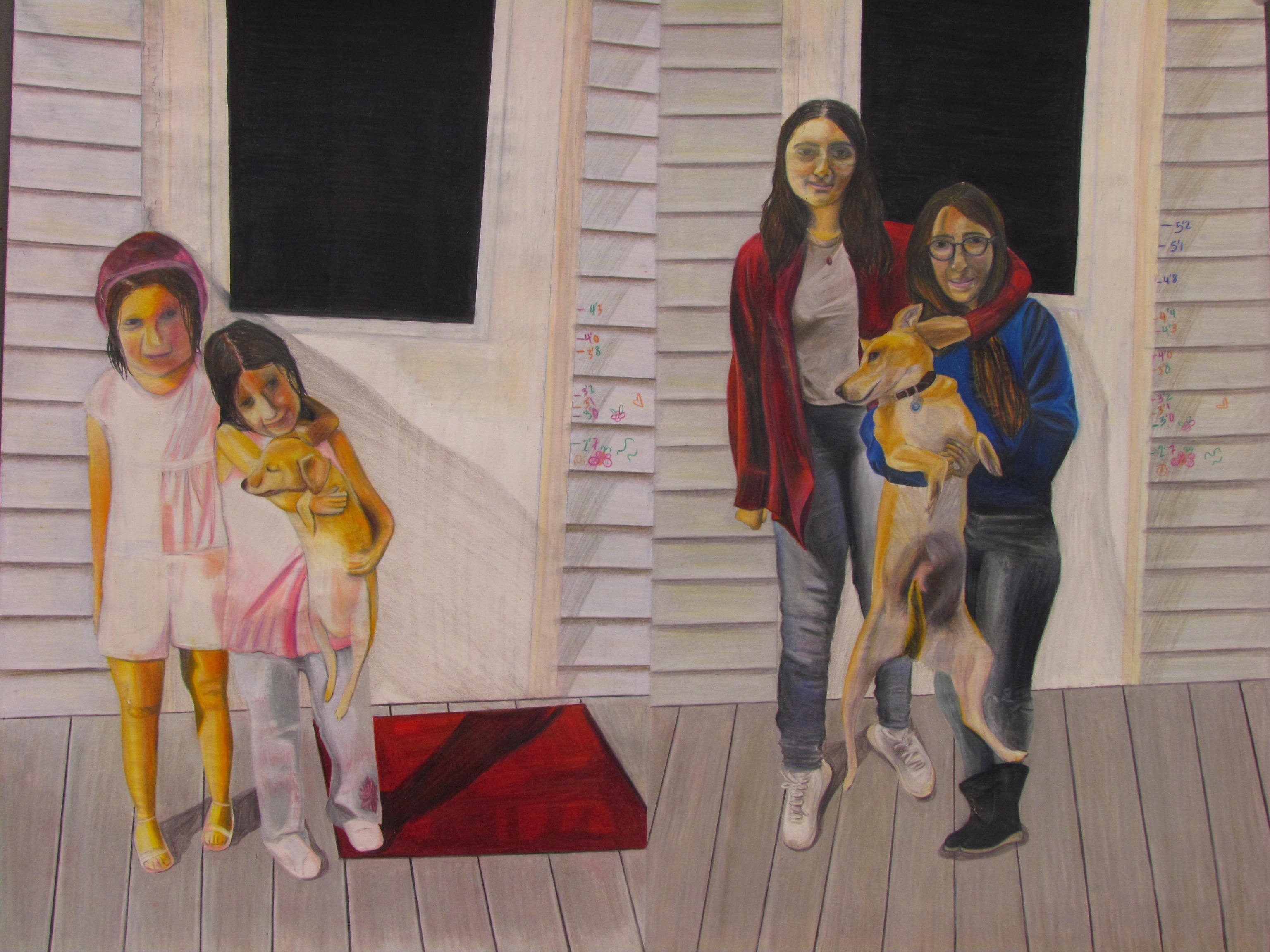
My inquiry visually portrays my emotional relationship and connection with people.
As I progressed, I experimented with the potential impact the inclusion of backgrounds had on my subjects. Can the background imply something, either symbolically, or through enhancing the mood within the subjects? For instance, my third oil painting depicts my grandparents who maintain a cordial relationship for the family. Symbolically, the parting of the tree branches behind them shows how they’ve gone in separate directions.
Can emphasis on objects change the mood of the image and comment on the nature of a relationship between subjects? My fourth piece, in oil pastel, depicts my brother gazing at newborn me happily. The landscape is depicted on the baby blanket illustrating waves personified by the wave of happiness on my brother's face. I then wondered how lighting and composition can affect the emotional tone. My fifth piece, in color pencil, shows me alongside my godsister and her dog as we grow up. The setting is the same, with some deterioration and the poses are similar to show how we’re still just as close, despite the span of 11 years between the images.
TO MOM WITH LOVE

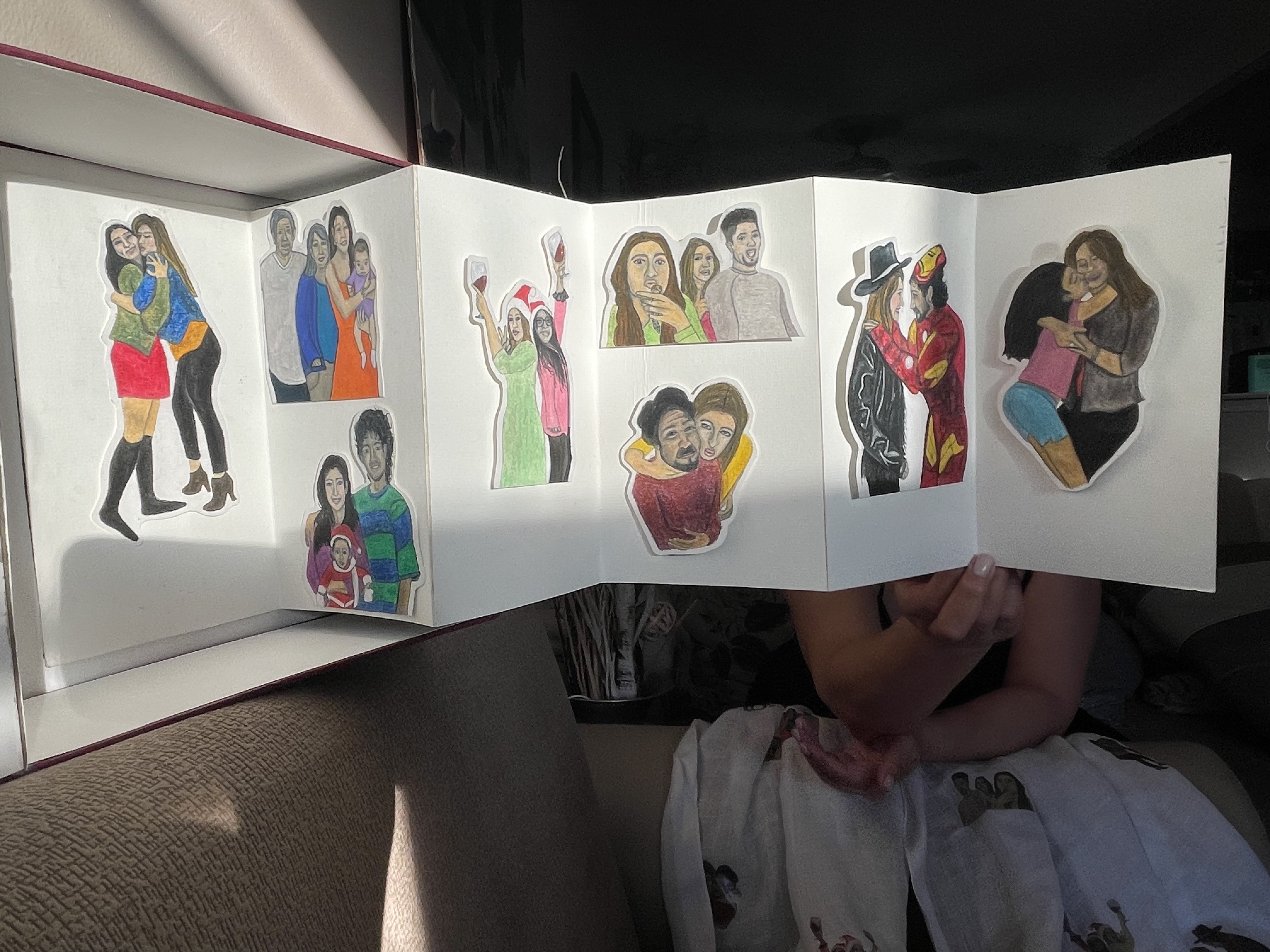
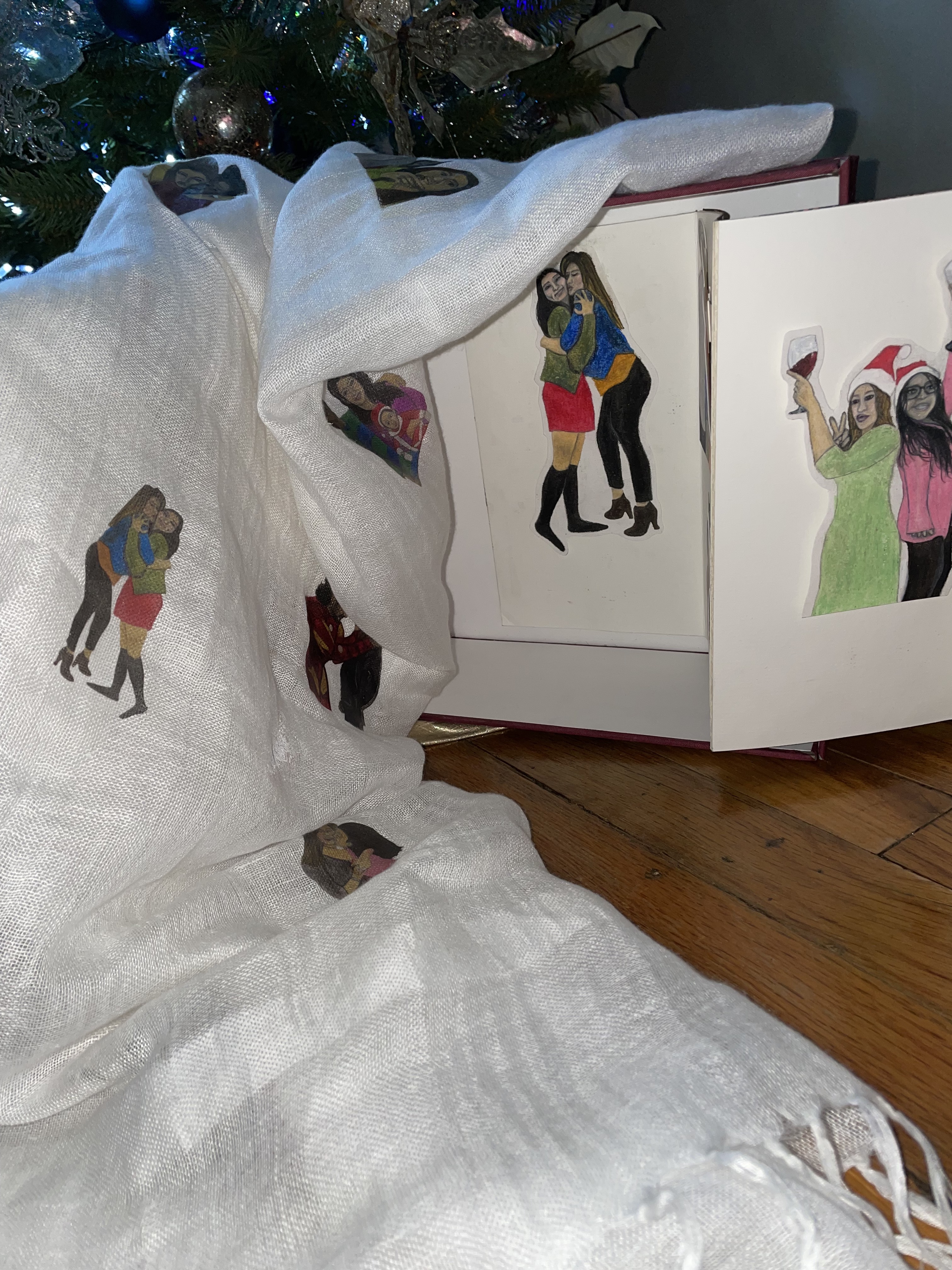

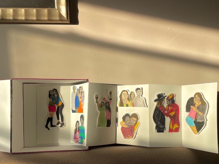
My mom is my best friend and I wanted to create something that would display that love. During this time, my mom was recovering from surgery and had a visible scar on her throat that would make her insecure. This inspired my idea to make a scarf and put it in a homemade box. I hand-drew my family with oil pastel and color pencil to decorate the interior of the box. Then I transfered it onto the scarf randomly to give that vibrant pop of color that I want to bring back to my mom just as she always has for me.
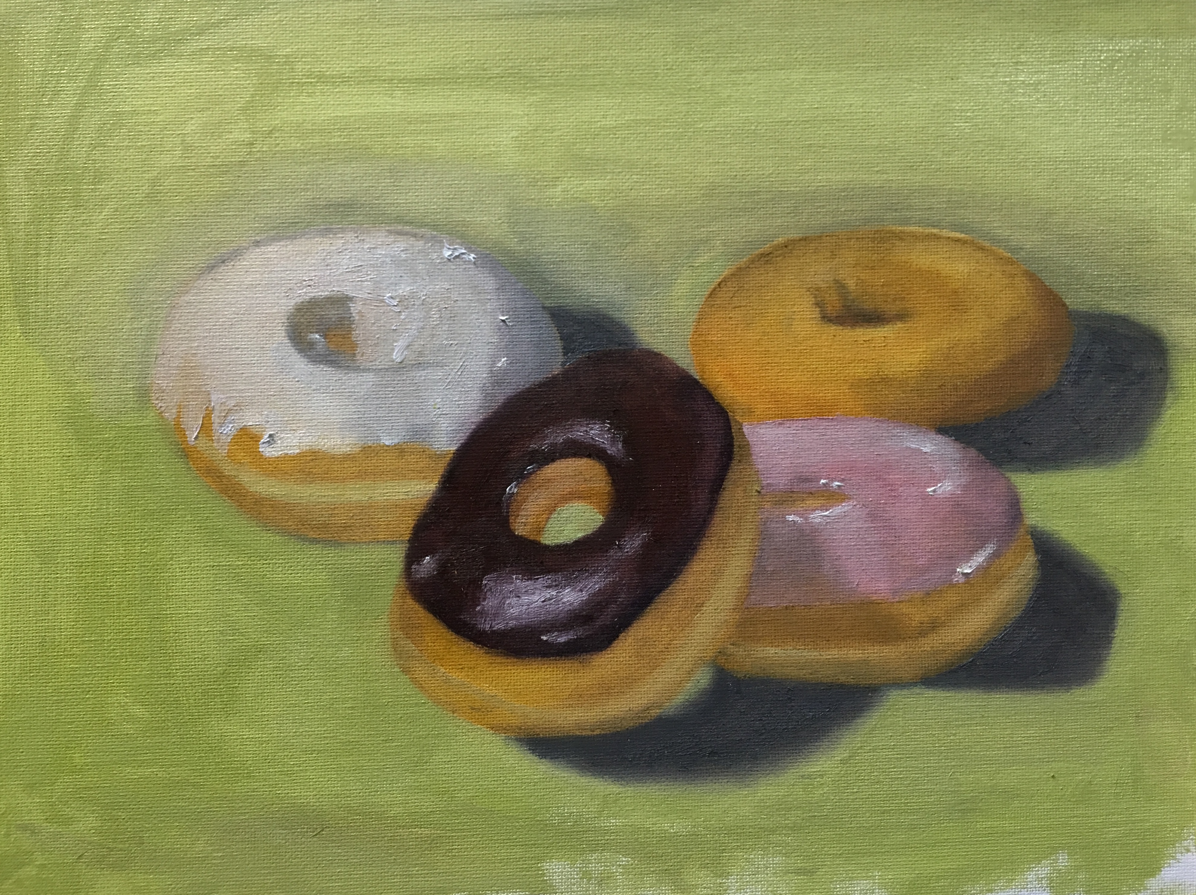
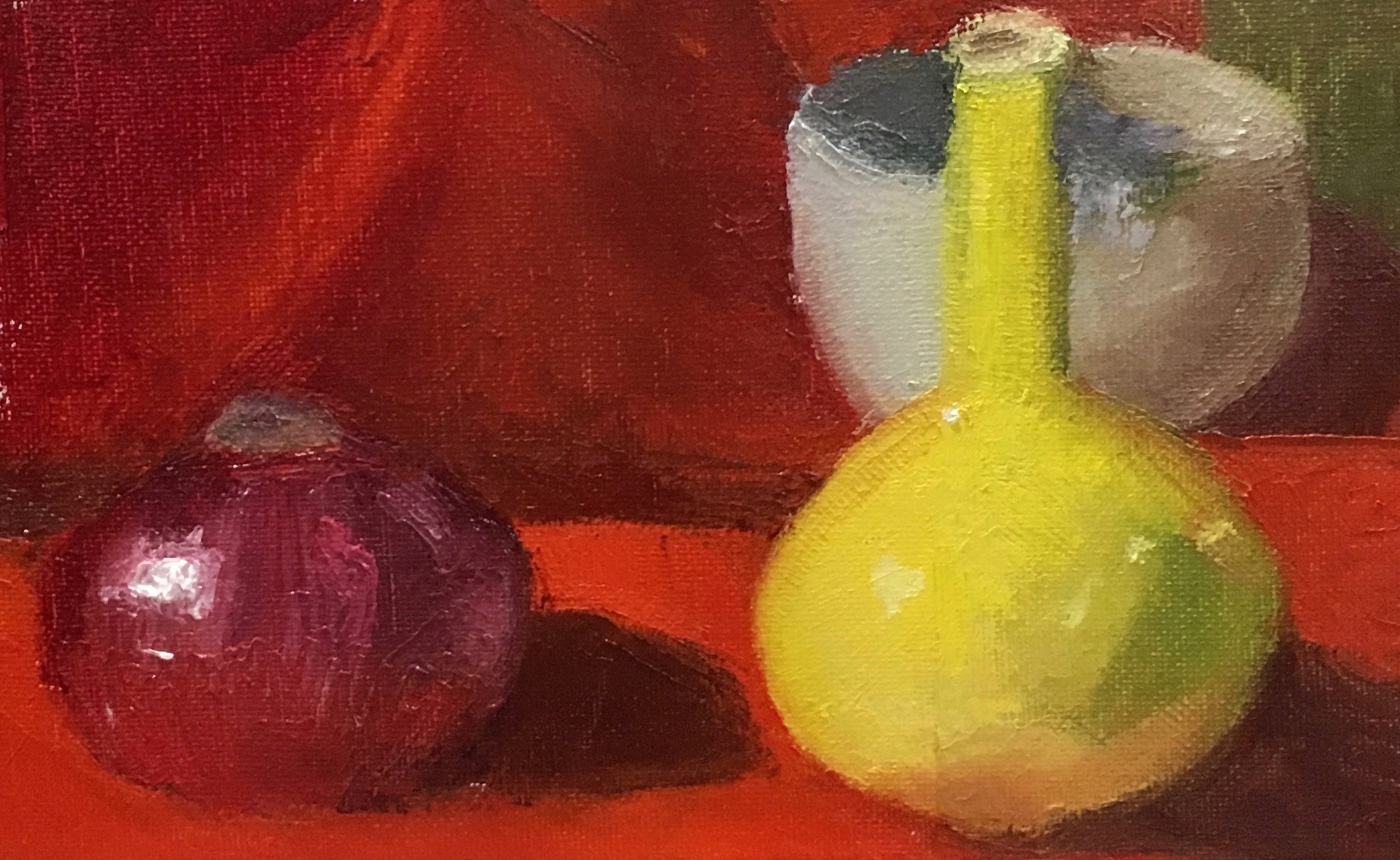
STILL LIFE OIL PAINTINGS

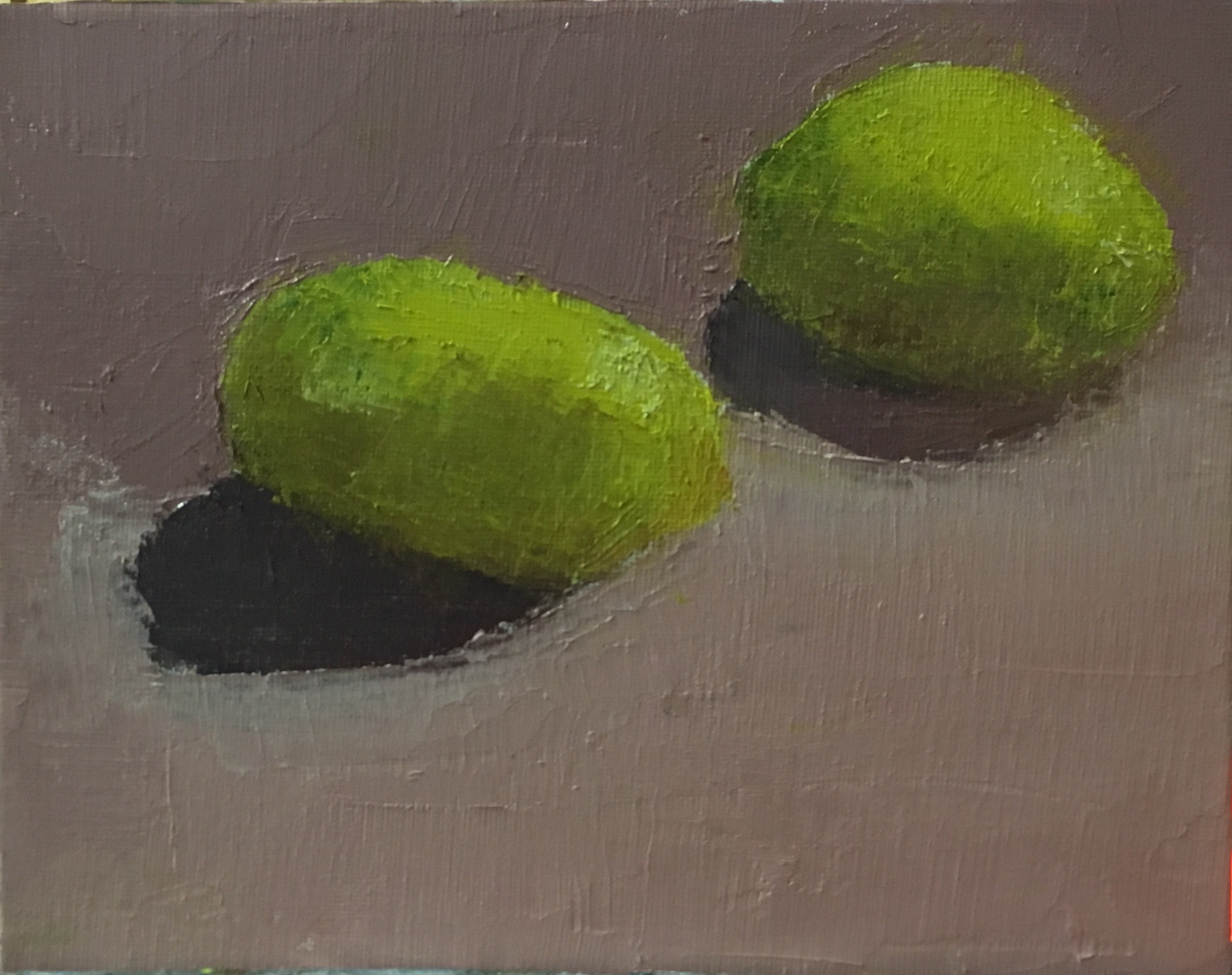


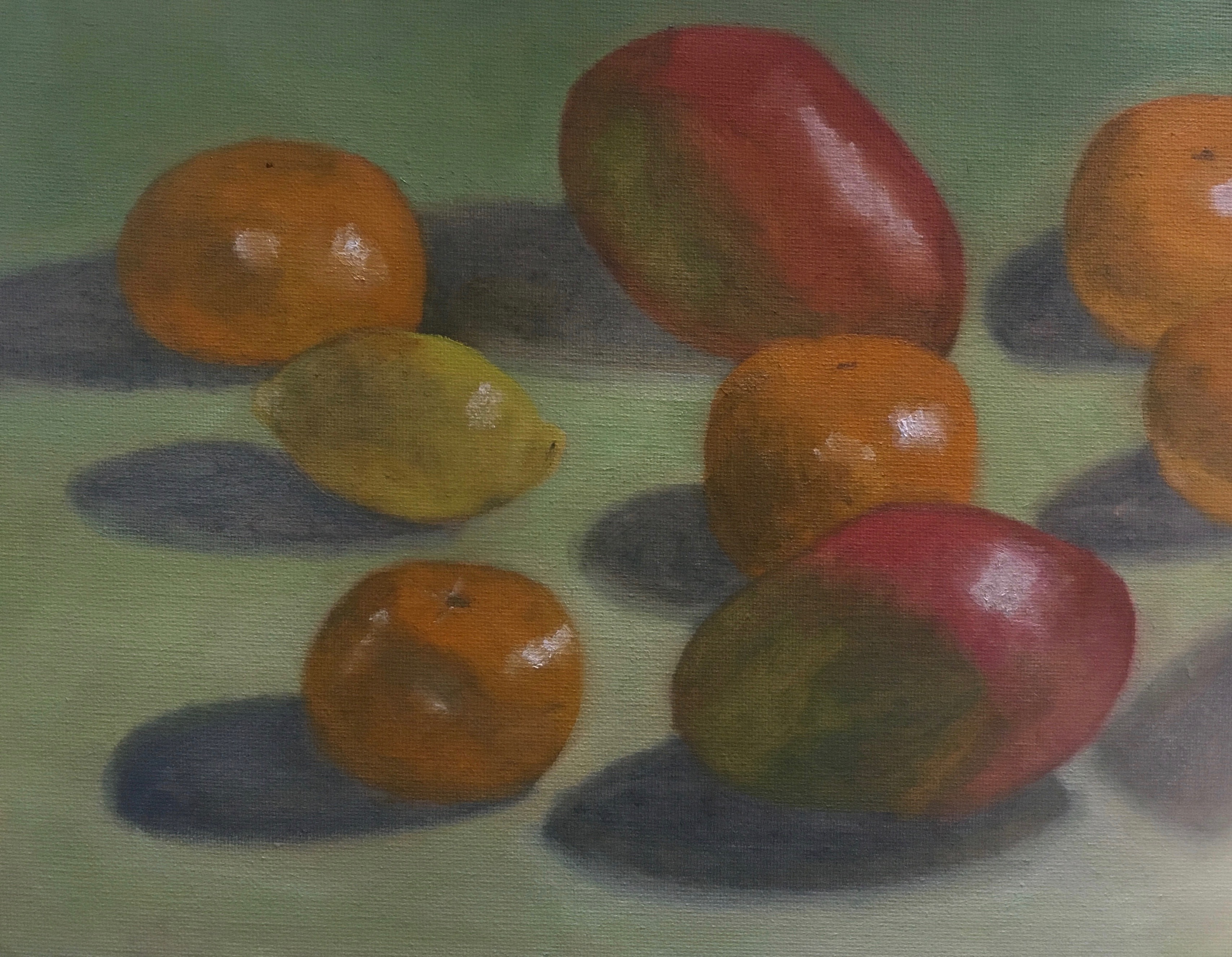


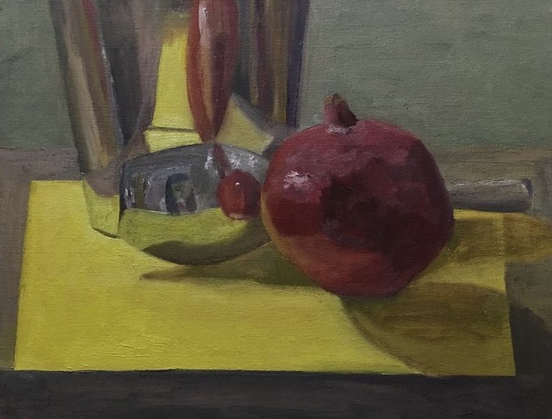

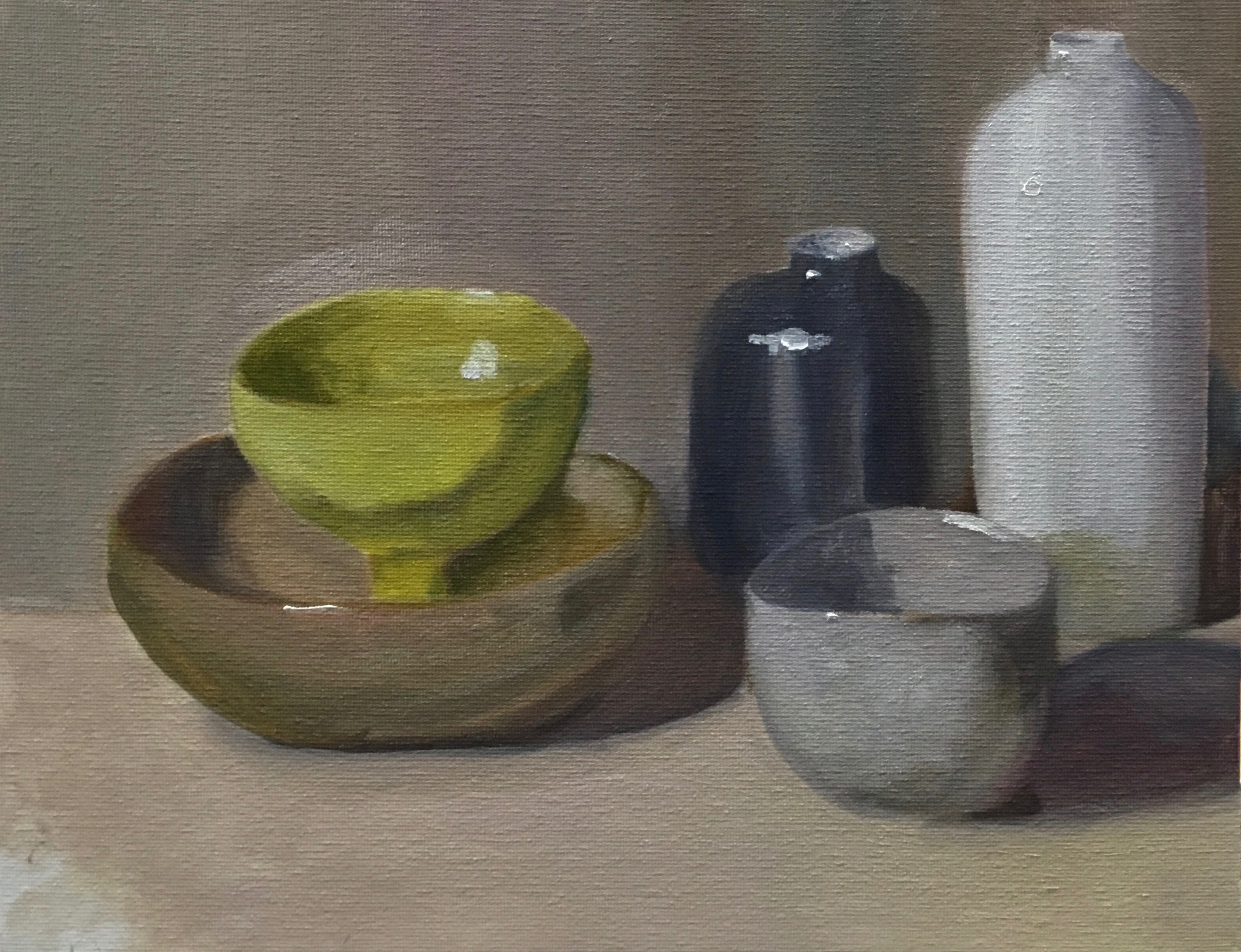
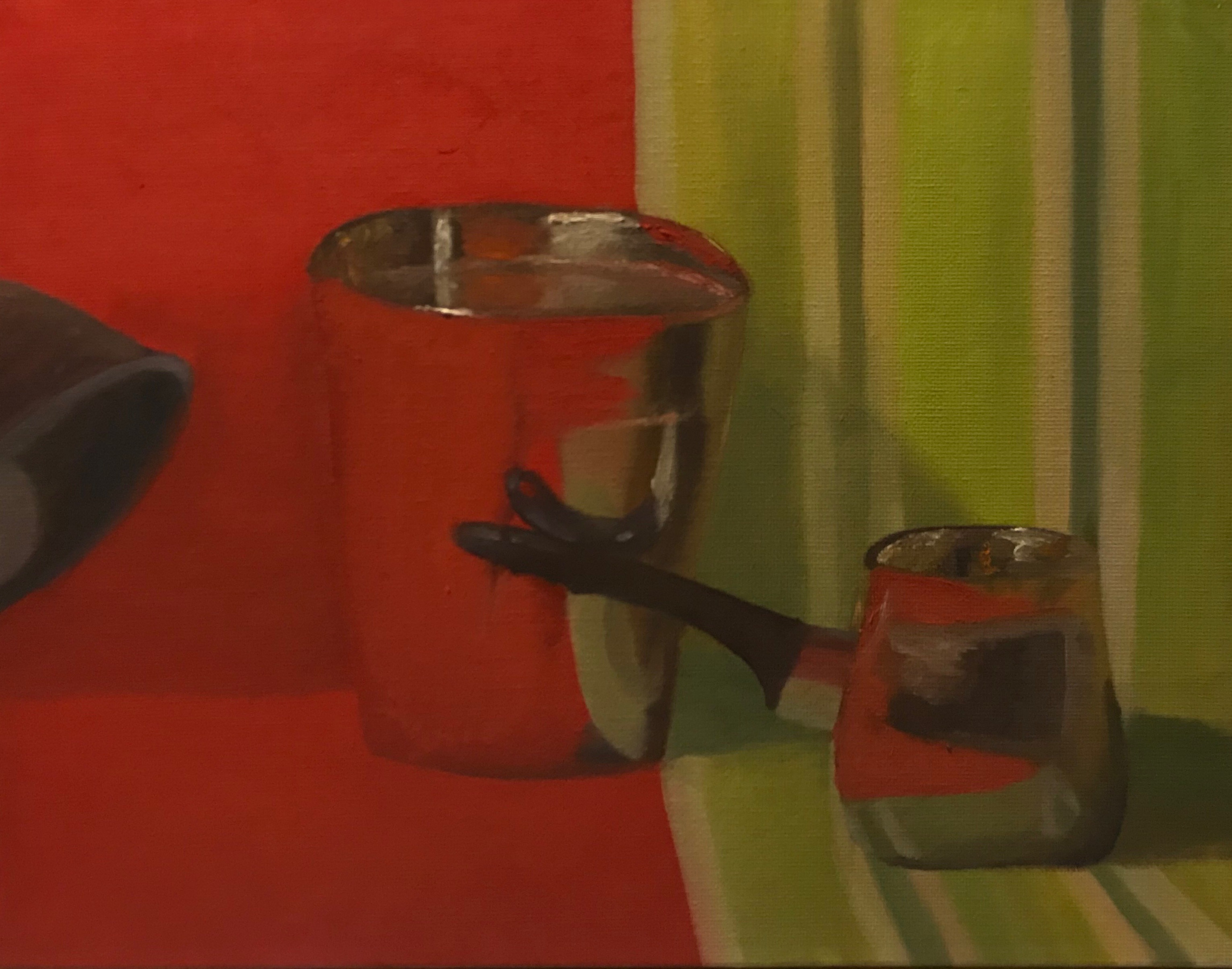
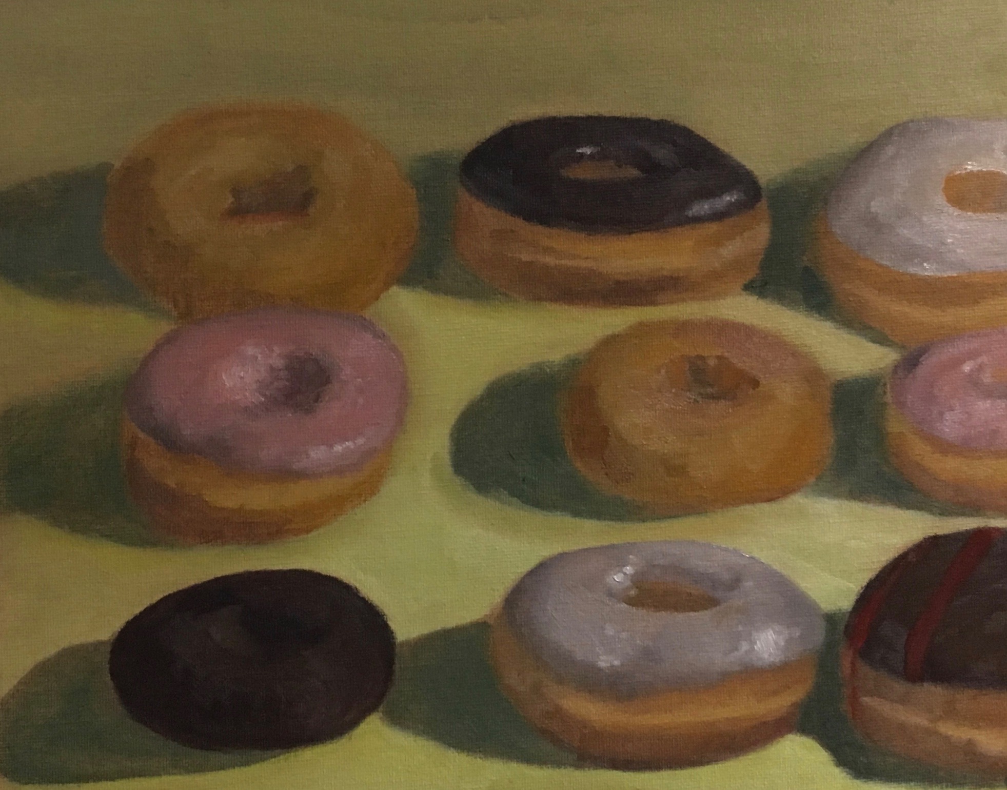
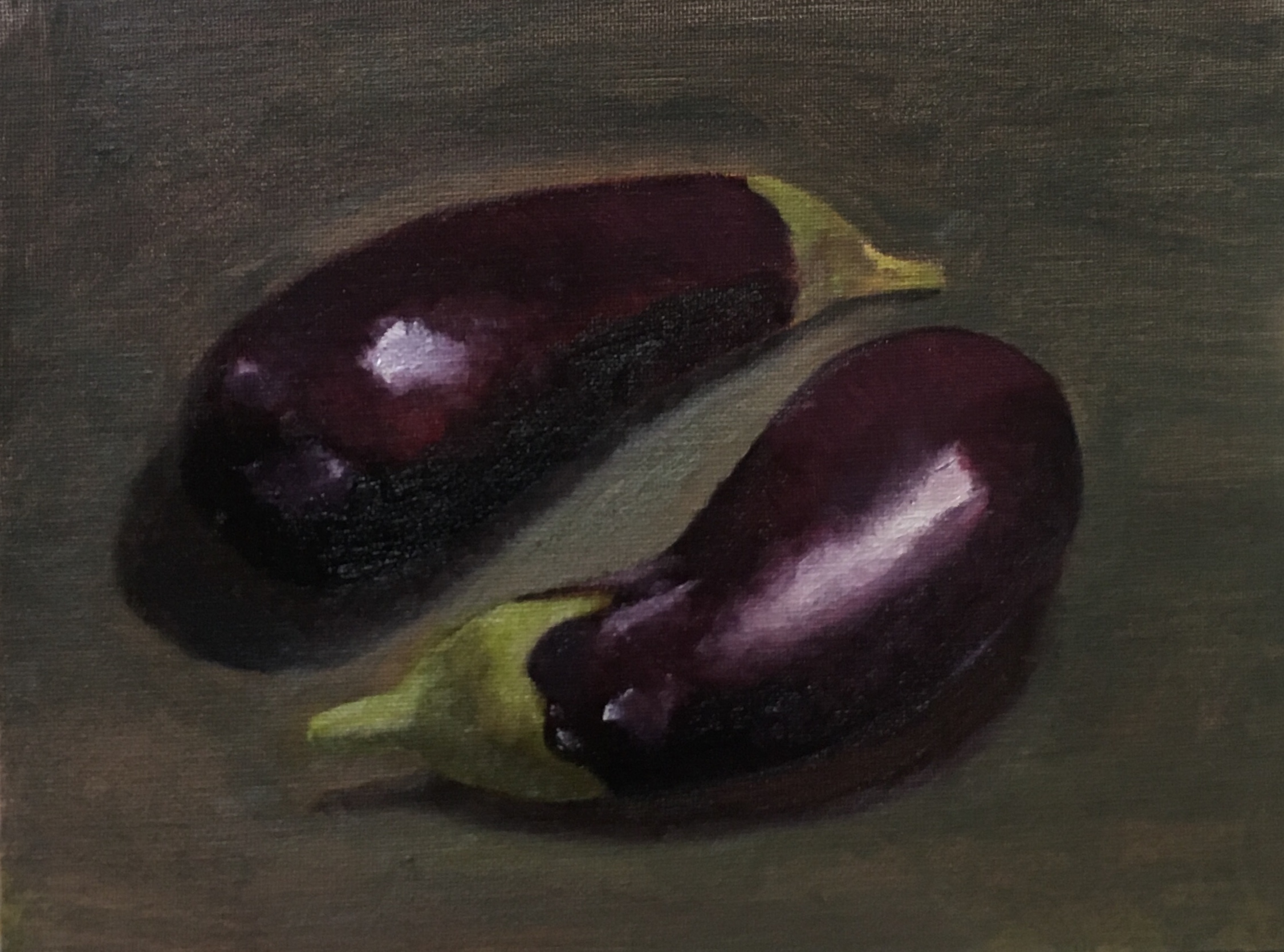
The Art Students League of New York allowed me to test my limits as an illustrator. We did weekly oil paintings that were strictly still lifes and the more practice we had, the more challenging our assignments would get. The first triptych I did were the green apples, lemons, and oranges.
We were immedietally challenged to use a palette knife to test the coloration and break out of the comfort zone of painting with brushes. The. we went from a pair of fruits to doughnuts. And then we started painting vases with more experimental backdrops. We then moved on to painting reflective metal. We studied color for weeks and experimented with untraditional materials.
UNDER THE PANDEMIC MOON
![]()
This series of three scenarios illustrates the impact that can be had on anyone during the COVID-19 pandemic. This pandemic affects the billions of people on earth. One of billions has gotten the virus, now we’re all victims. The loss of a loved one could occur under the circumstances without believing it could happen to you. That’s when the reality finally hits; the world is red. UNDER THE PANDEMIC MOON
EMOTIONS WITH AGE SERIES

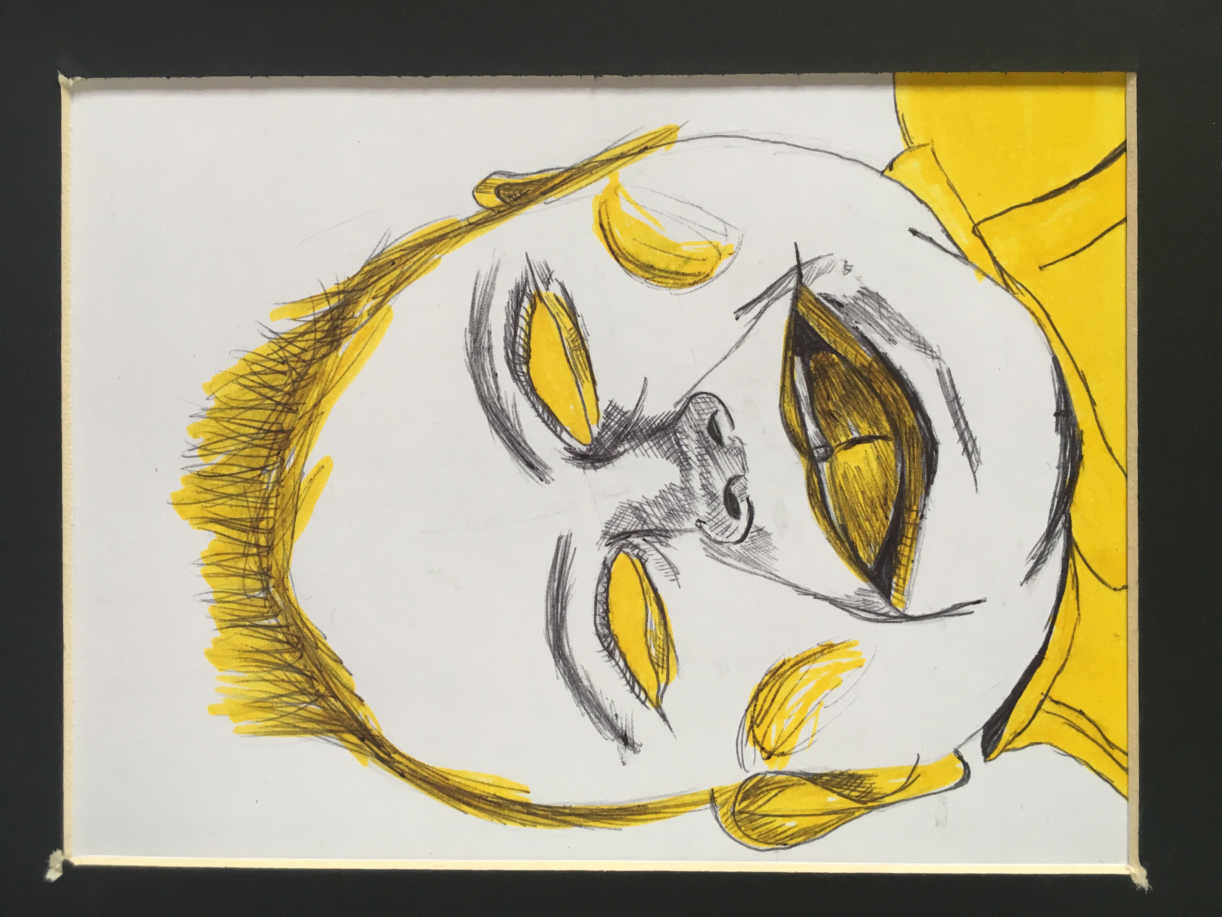
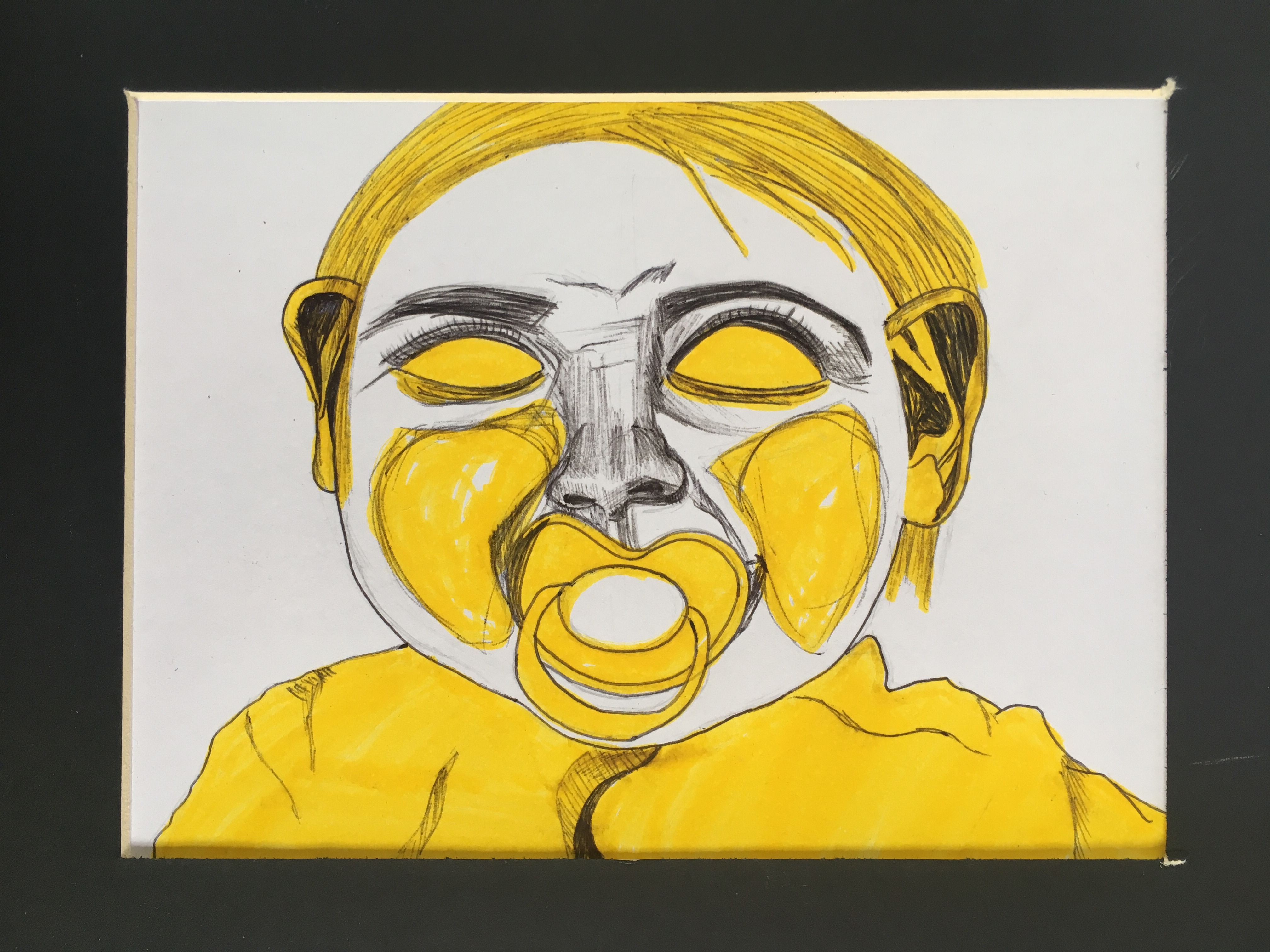
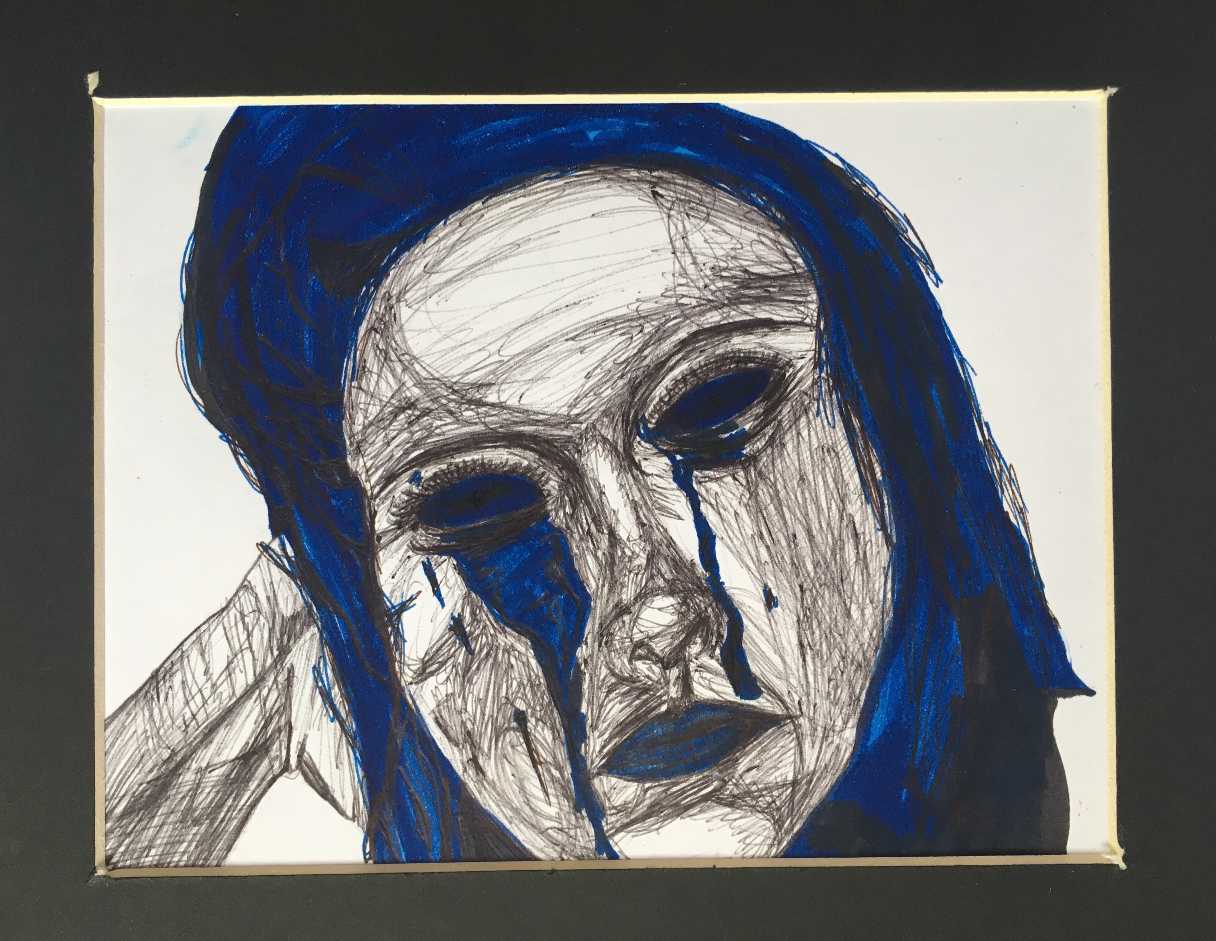


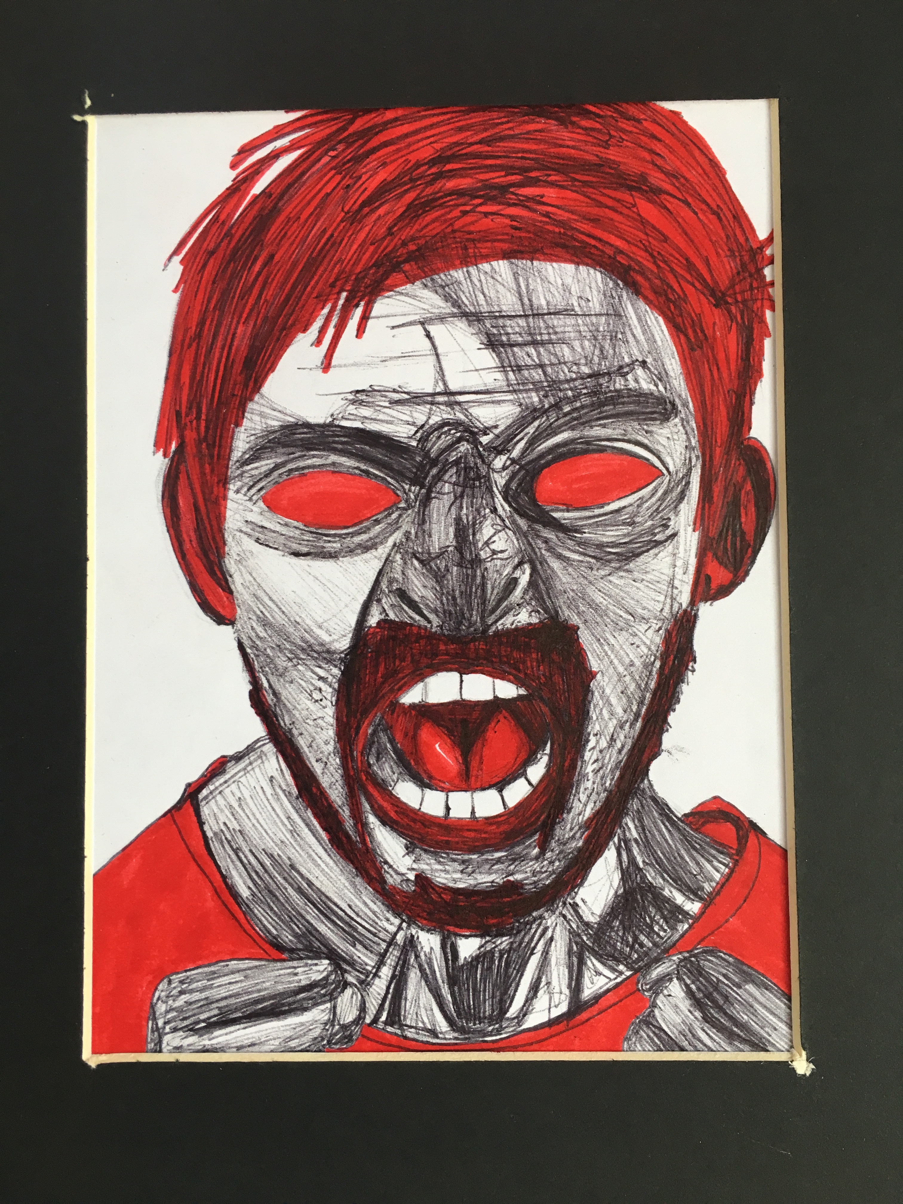

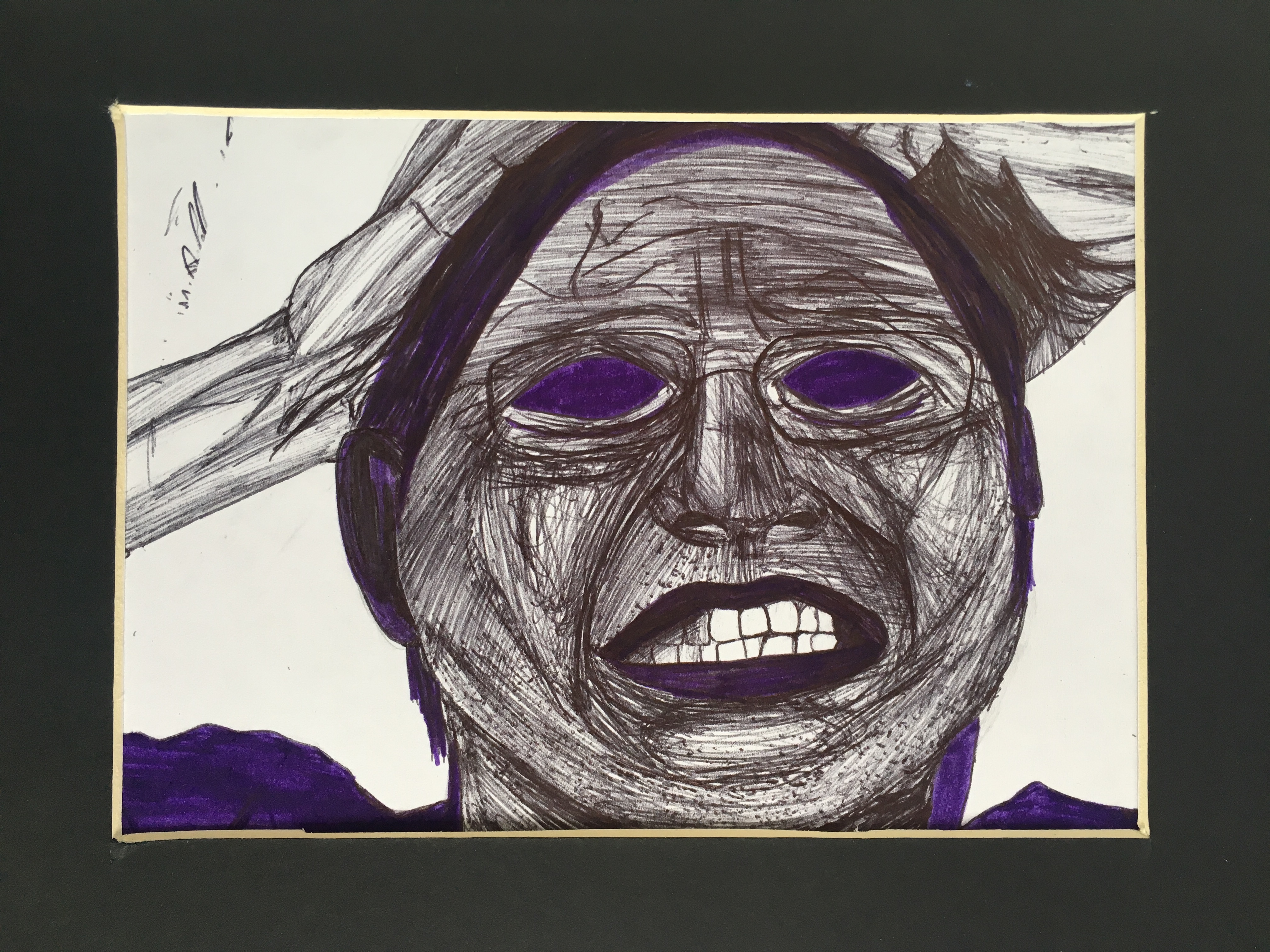
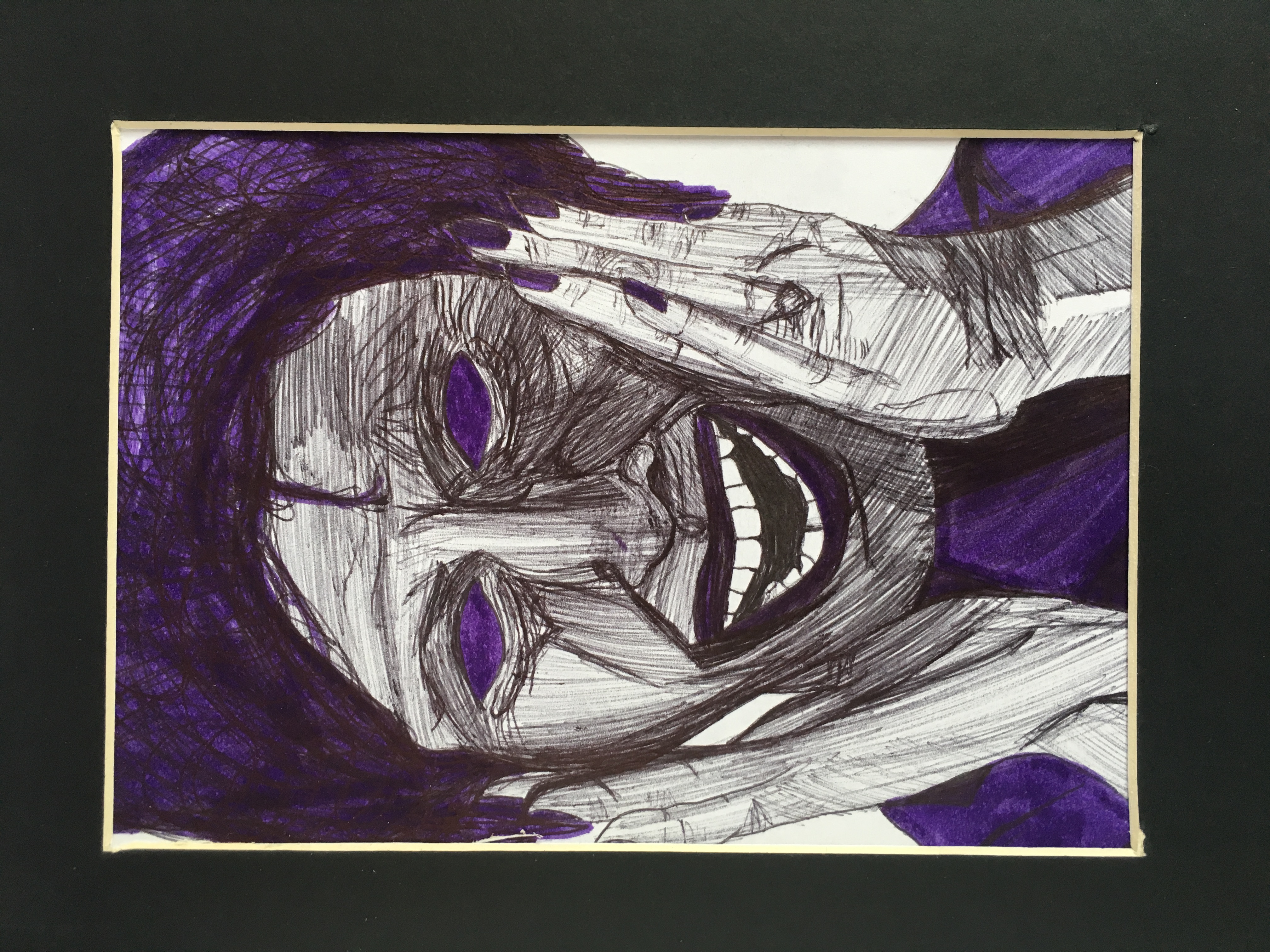

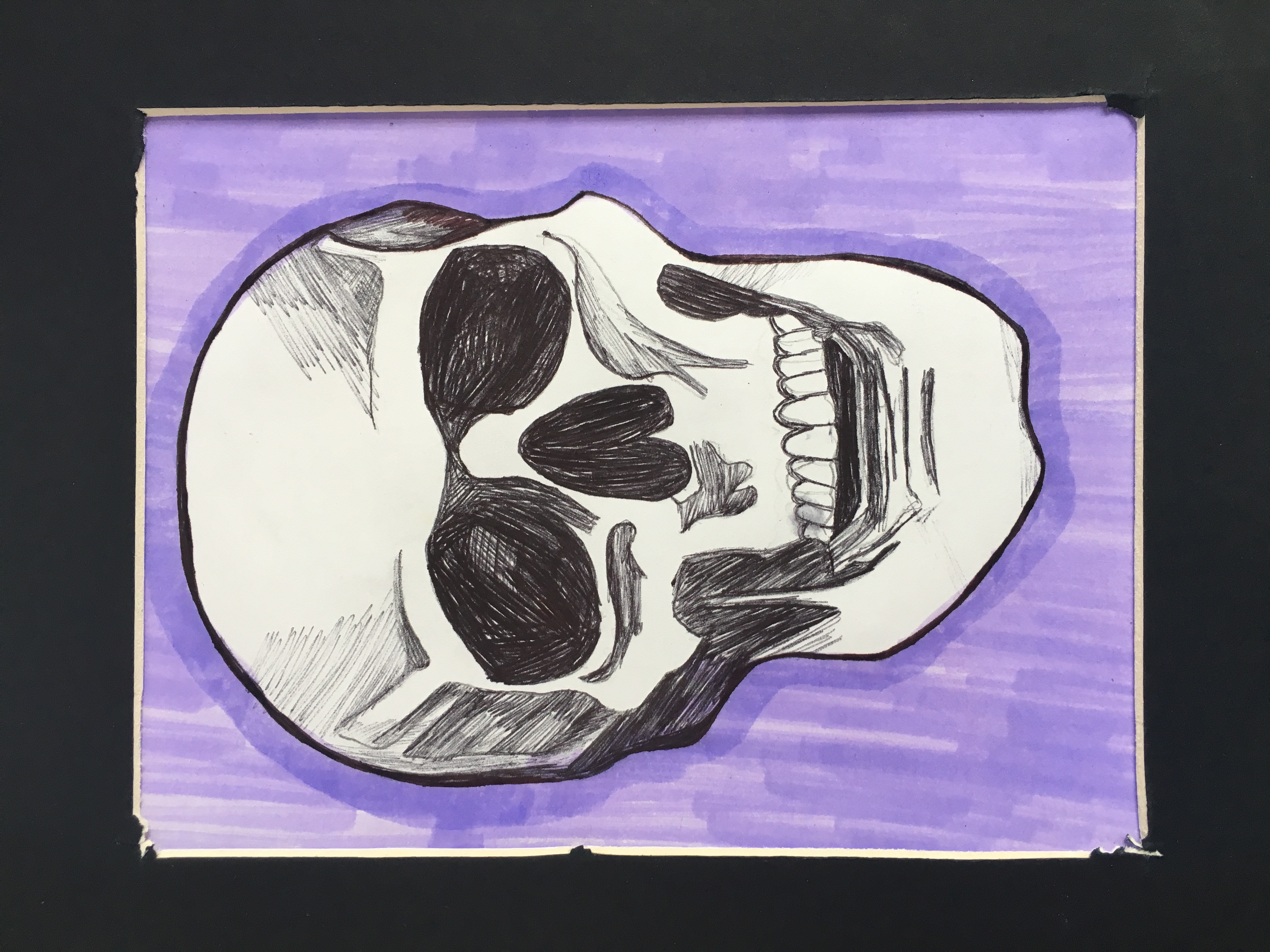

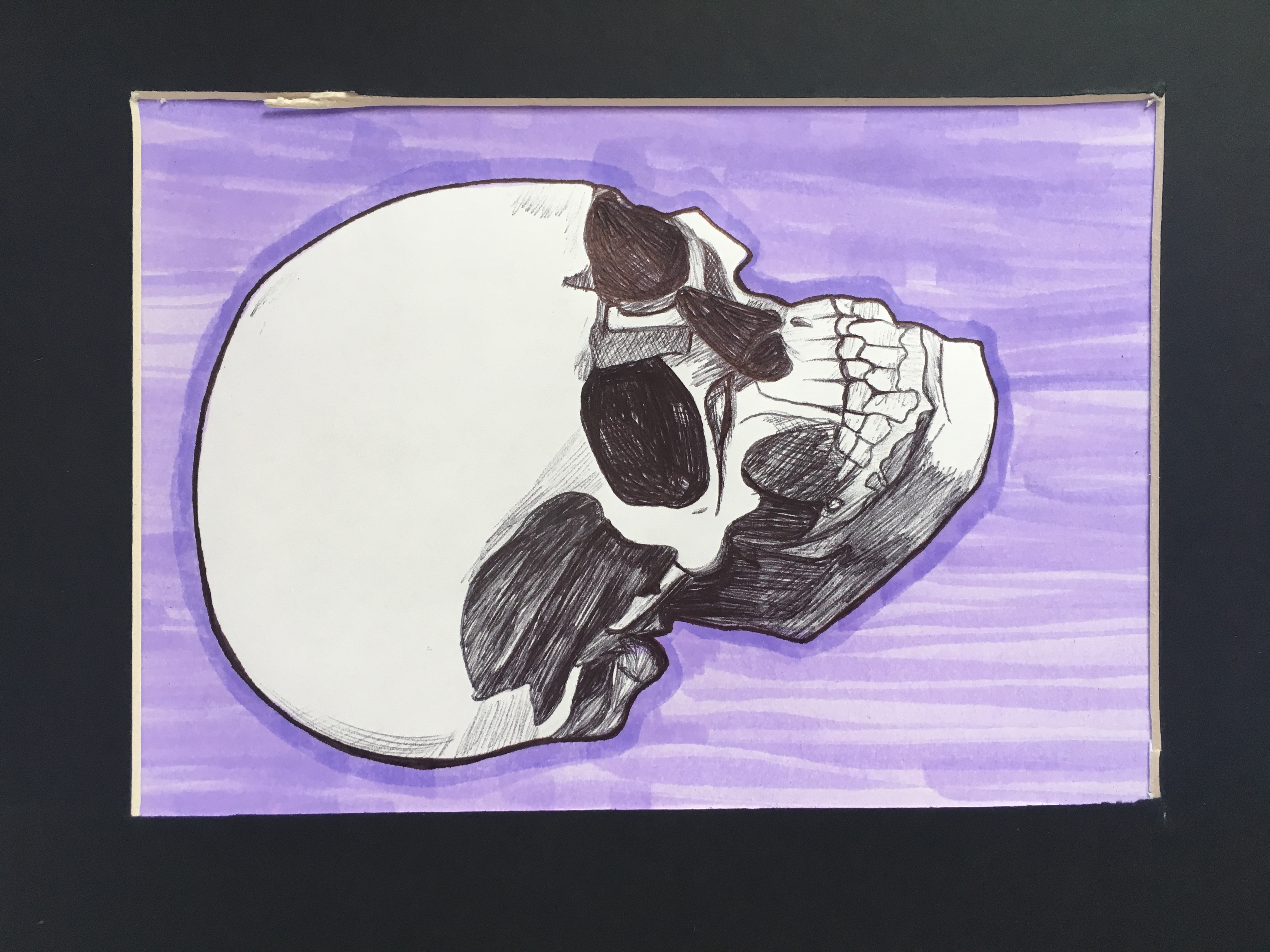
For this series, each color corresponds to a different emotion through aging. I heavily researched colors and how they represent emotions accurately.
This series begins with the babies in the color yellow, for happy. Then it's followed by children who are orange, representative of curiosity. Next, it leads into blue for teenage angst. This is followed by adults who are red for anger. It then ages into elderly, who are purple to represent fear. And it ends with a skull, for death in lavender. This represents peace; the cycle repeats. Markers and pen on 5 inches x 7 inches Bristol paper.
This series begins with the babies in the color yellow, for happy. Then it's followed by children who are orange, representative of curiosity. Next, it leads into blue for teenage angst. This is followed by adults who are red for anger. It then ages into elderly, who are purple to represent fear. And it ends with a skull, for death in lavender. This represents peace; the cycle repeats. Markers and pen on 5 inches x 7 inches Bristol paper.
MY SELF PORTRAIT
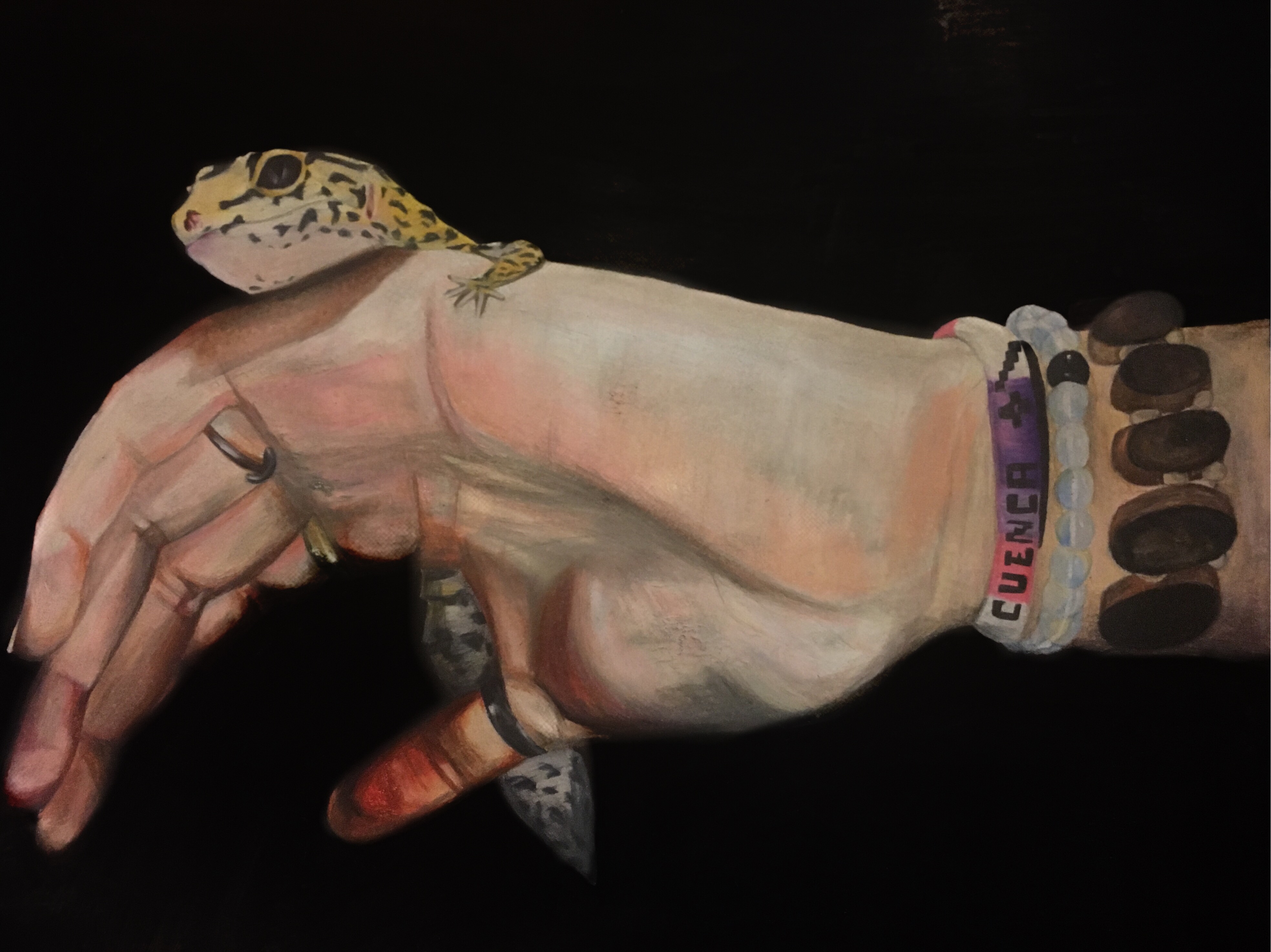
The white bead bracelet was a gift from my mom. I tend to wear bracelets until they start ripping off and deteriorating because I get emotionally attatched to it. My rings are also always on my fingers until they start to turn green.
My leopard gecko is an important part of myself and she’s become someone people associate me with. Even though my face isn’t visible, the accessories and my pet are a part of my identity.
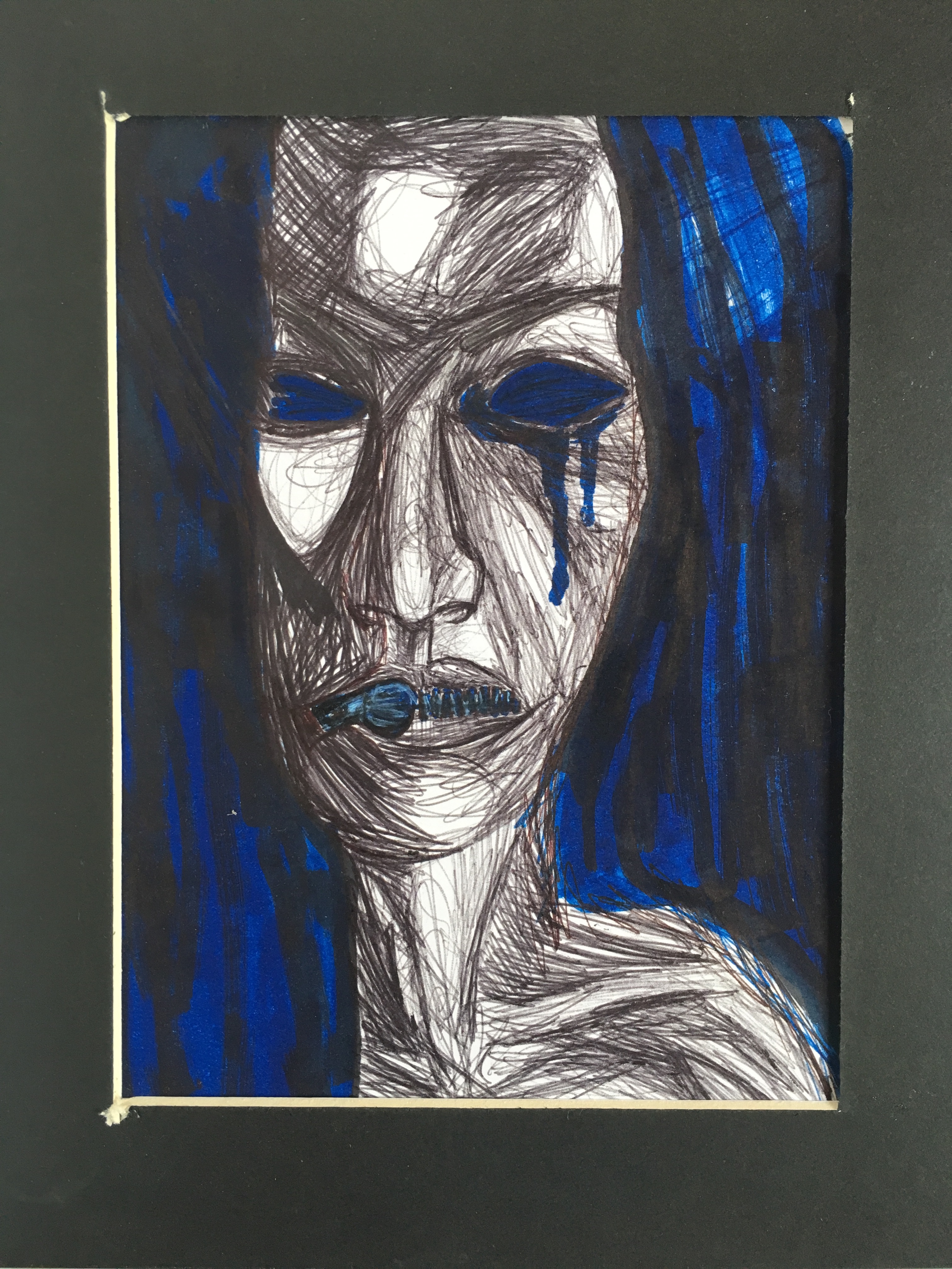
CAN’T SLEEP. NO TIME
![]()
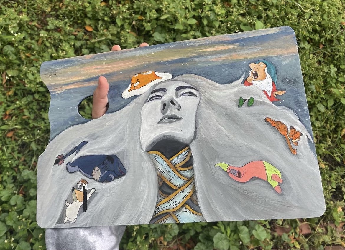
I painted this piece on a paint palette to give the illusion that I’m holding my reflection. This was during a time where I wouldn’t allow myself to sleep and I overworked myself to my core.
When I’m starting to get exhausted, I roll my head back into my chair, hence the rolling eyes and spread out hair.
I wanted to illustrate this very low point in a comedic way. The inspiration behind this surreal portrayl was inspired by Salvador Dali’s famous piece The Persistence of Time.
The sky is similar and the symbolic clocks are choking me in a literal way, just as they would choke me figuratively in reality. There are small cartoon characters frolicking on my head, all famous for being sleepy and dopey.
ISABELLA MOSAIC
ISABELLA MOSAIC
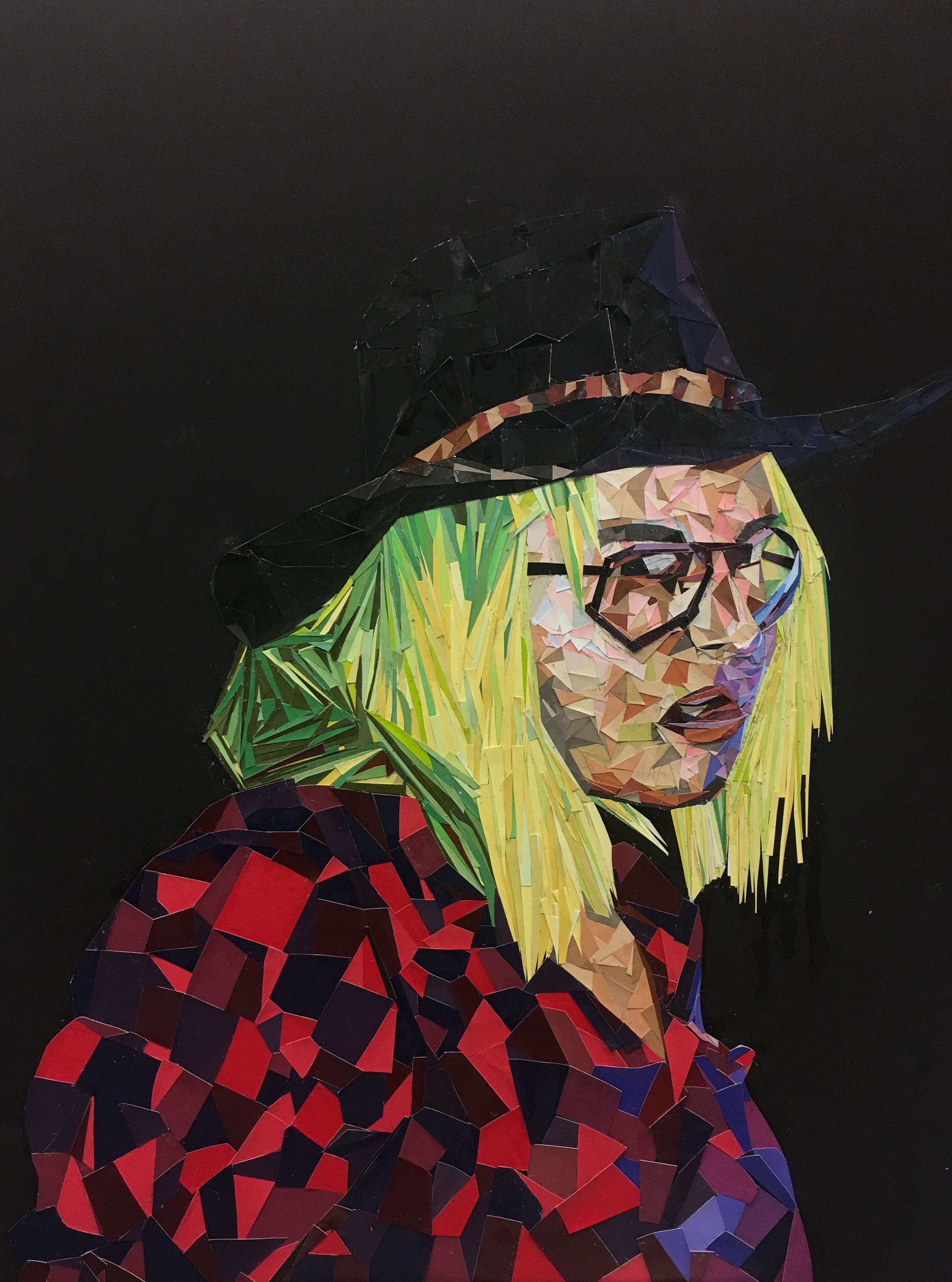
I wanted to experiment with materials outside of the conventional way of illustrating. My friend Isabella gave me this photograph of her and I was really eager to paint it.
The neon yellow hair and red flannel, with the black cowboy hat and touch of blue light was so vivacious.
I went to Home Depot and collected stacks of paint samples to cut up. The choice of a black background allowed all the pieces to be showcased vibrantly.
The neon yellow hair and red flannel, with the black cowboy hat and touch of blue light was so vivacious.
I went to Home Depot and collected stacks of paint samples to cut up. The choice of a black background allowed all the pieces to be showcased vibrantly.
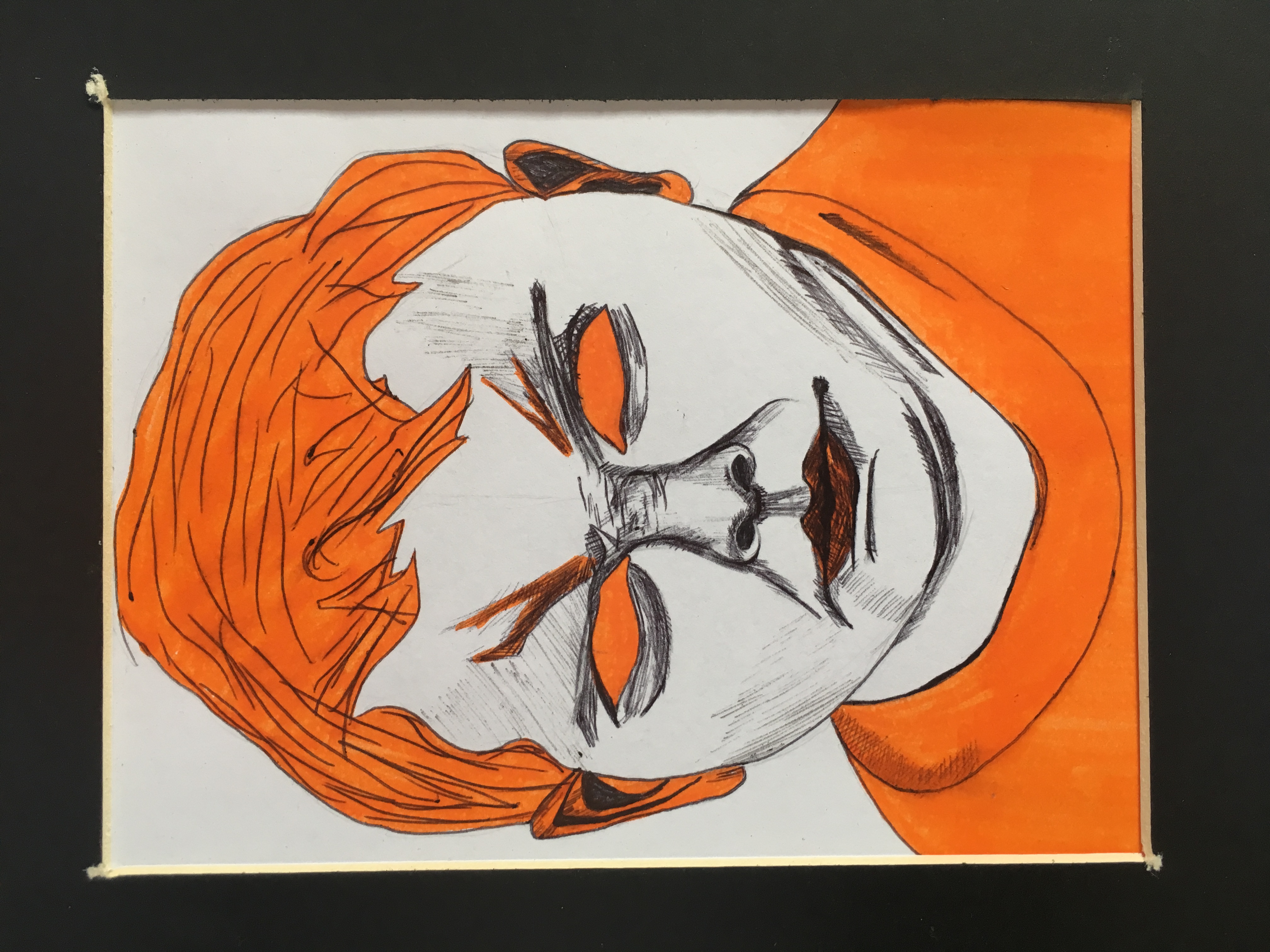
MYSTERY WOMAN
MYSTERY WOMAN

We shouldn’t assume people’s emotions through their external appearance because sometimes we aren’t even sure what our emotions are.
I relied soley on the complimentary color scheme of orange and blue with an oil pastel medium. This specific color scheme was meant to show the emotion behind my drawing. Orange is most associated with the sun and happiness considering it’s a bright color. Blue, however is considered a sad color which can also be seen in Picasso’s “Blue Period”. Could she be laughing? Crying? Possibly stressed?
I relied soley on the complimentary color scheme of orange and blue with an oil pastel medium. This specific color scheme was meant to show the emotion behind my drawing. Orange is most associated with the sun and happiness considering it’s a bright color. Blue, however is considered a sad color which can also be seen in Picasso’s “Blue Period”. Could she be laughing? Crying? Possibly stressed?
IN PIECES, ECUADOR
IN PIECES, ECUADOR
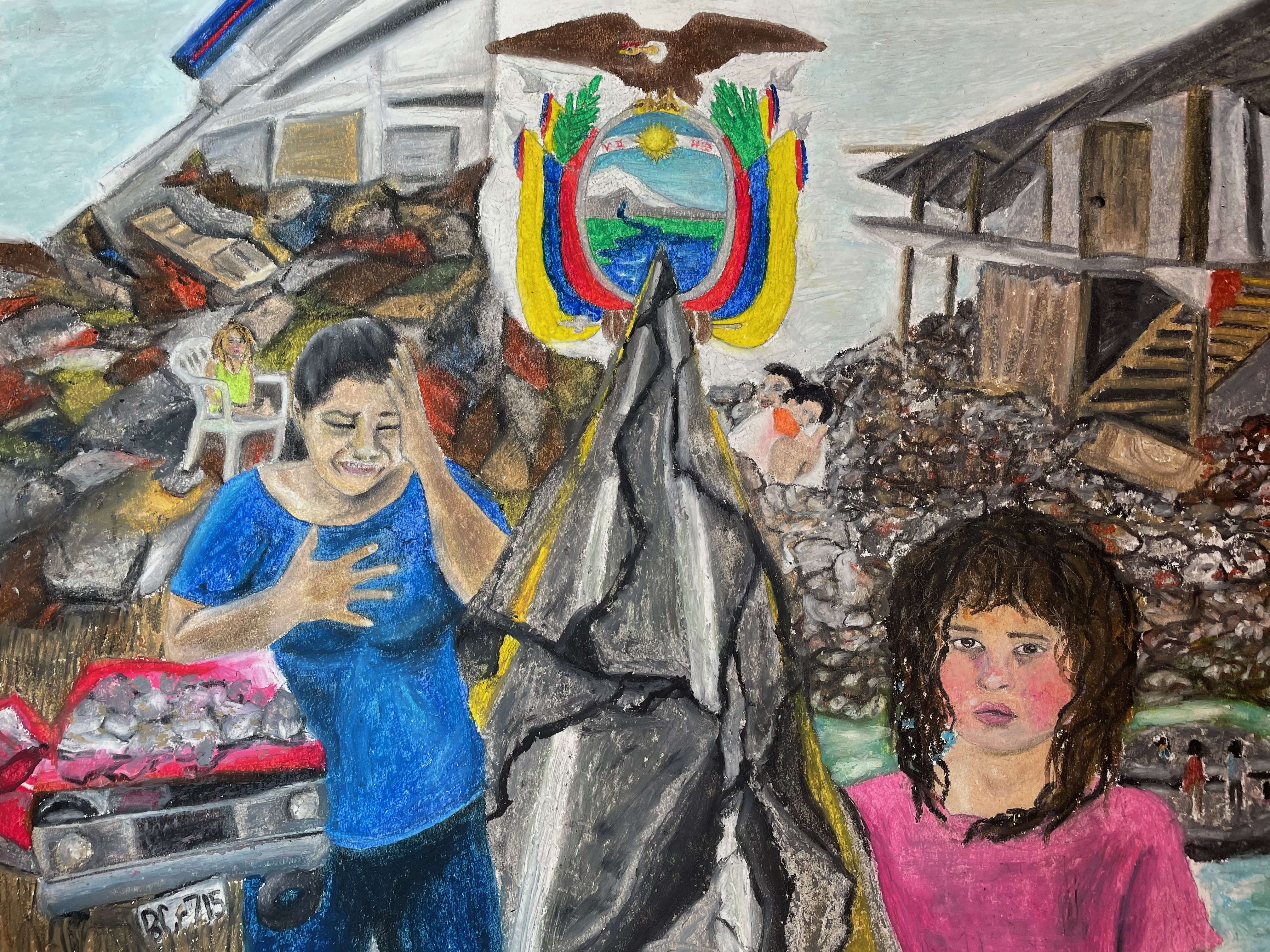
Ecuador is victim to the emotional trauma and infrastructural impact caused by this earthquake in 2016.
The coastal areas of Ecuador had been greatly impacted. And as a result, there was an increase in mobility to nearby cities including Cuenca. This caused overcapacity in hotels and houses, decrease of food in markets, decrease in gasoline sales, and debt. These factors had caused great effect on the cities that hadn't undergone the legitimate earthquake.
I felt especially connected to this natural disaster in Ecuador for this reason and I think there needs to be more awareness regarding earthquakes affecting Ecuador. And especially, the way it affects all people residing or from Ecuador.
TOUCH OF VIBRANCE![]()
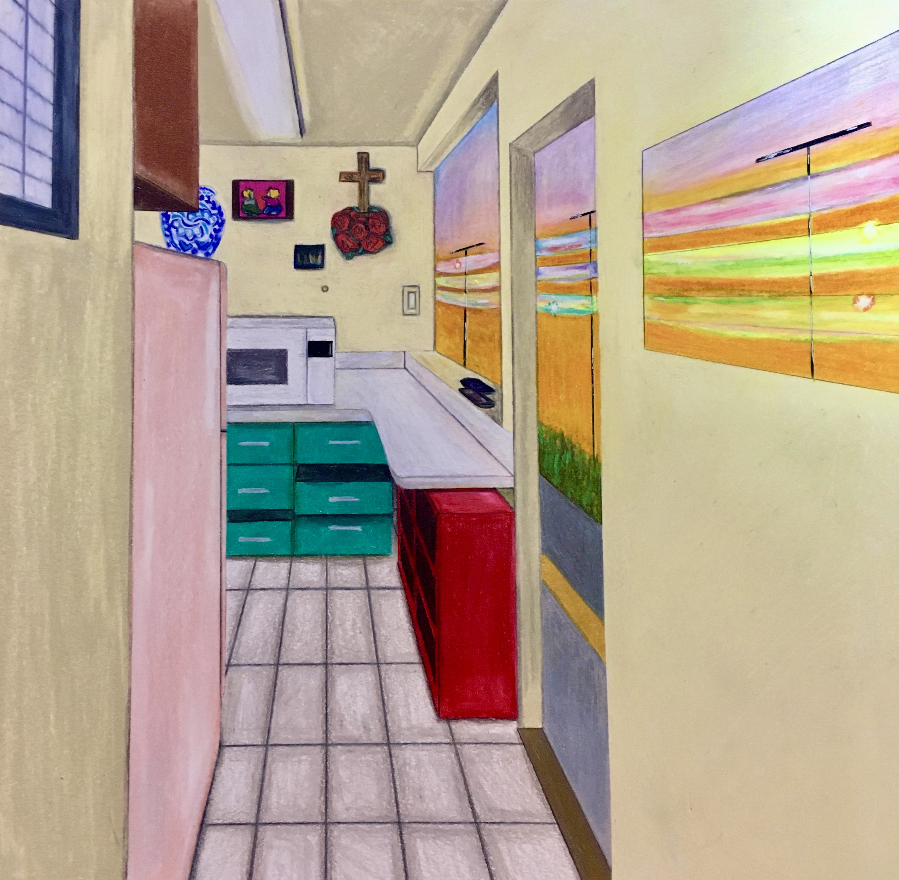
The experimentation of colors completely transformed my home kitchen space into a different reality.
Instead, I went for a surrealism landscape vibe. And on the wall, there was originally a flat painting hung. I chose to make it somewhat of a window that connected the landscape between scenes.
I have lived in this house for 16 years and I’ve grown up walking through this hallway and into this kitchen. But I didn’t dwell on it while growing up because I felt free in my living space. Now, with the product of quarantine and schooling via zoom, I have no freedom to be outdoors exploring and living. I call this piece, Surviving vs Living.
ANIMAL PLAY CARDS
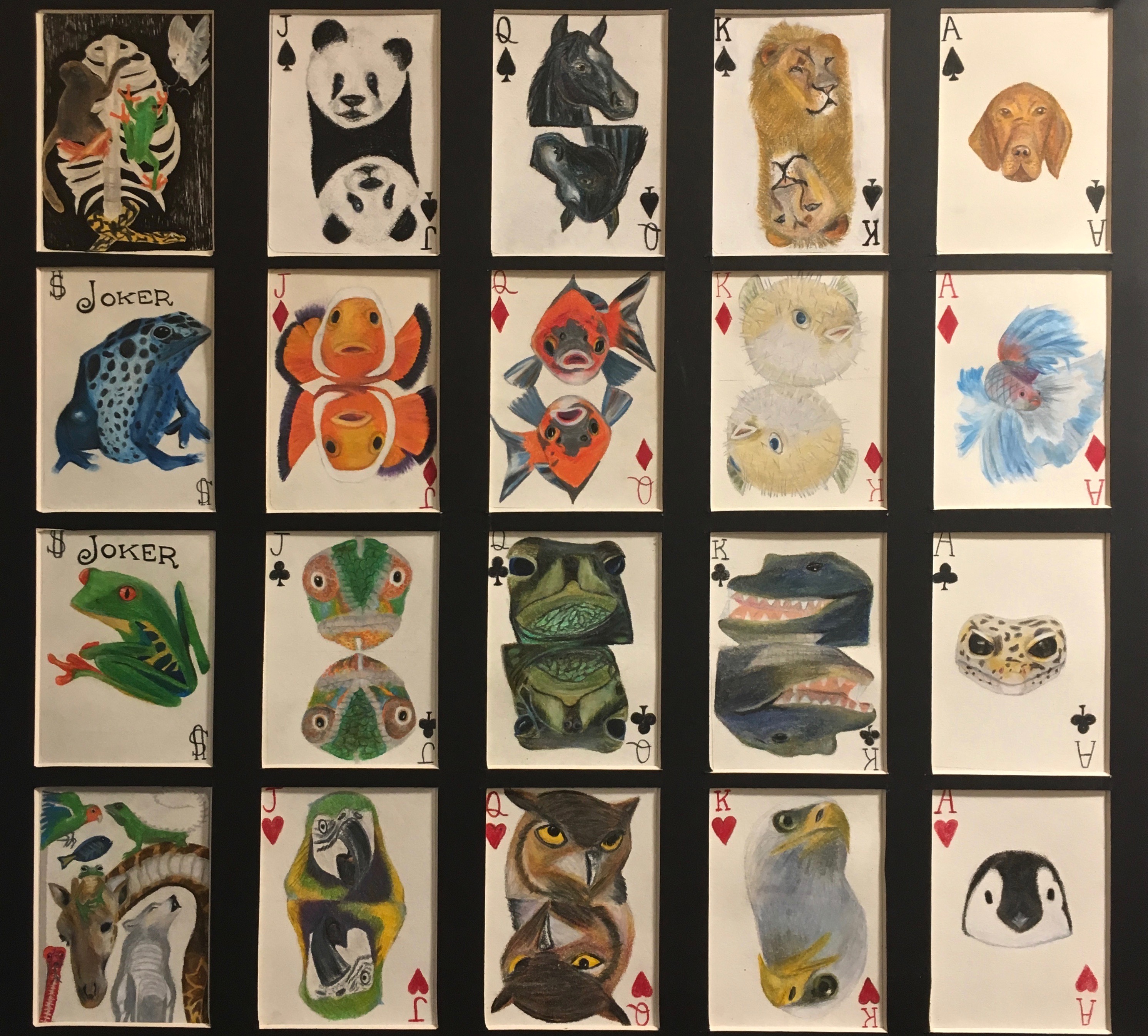
The spades set show mammals, the diamonds show fish, the clovers show reptiles, and the hearts show birds.
WHAT IS MY MIND?![]()
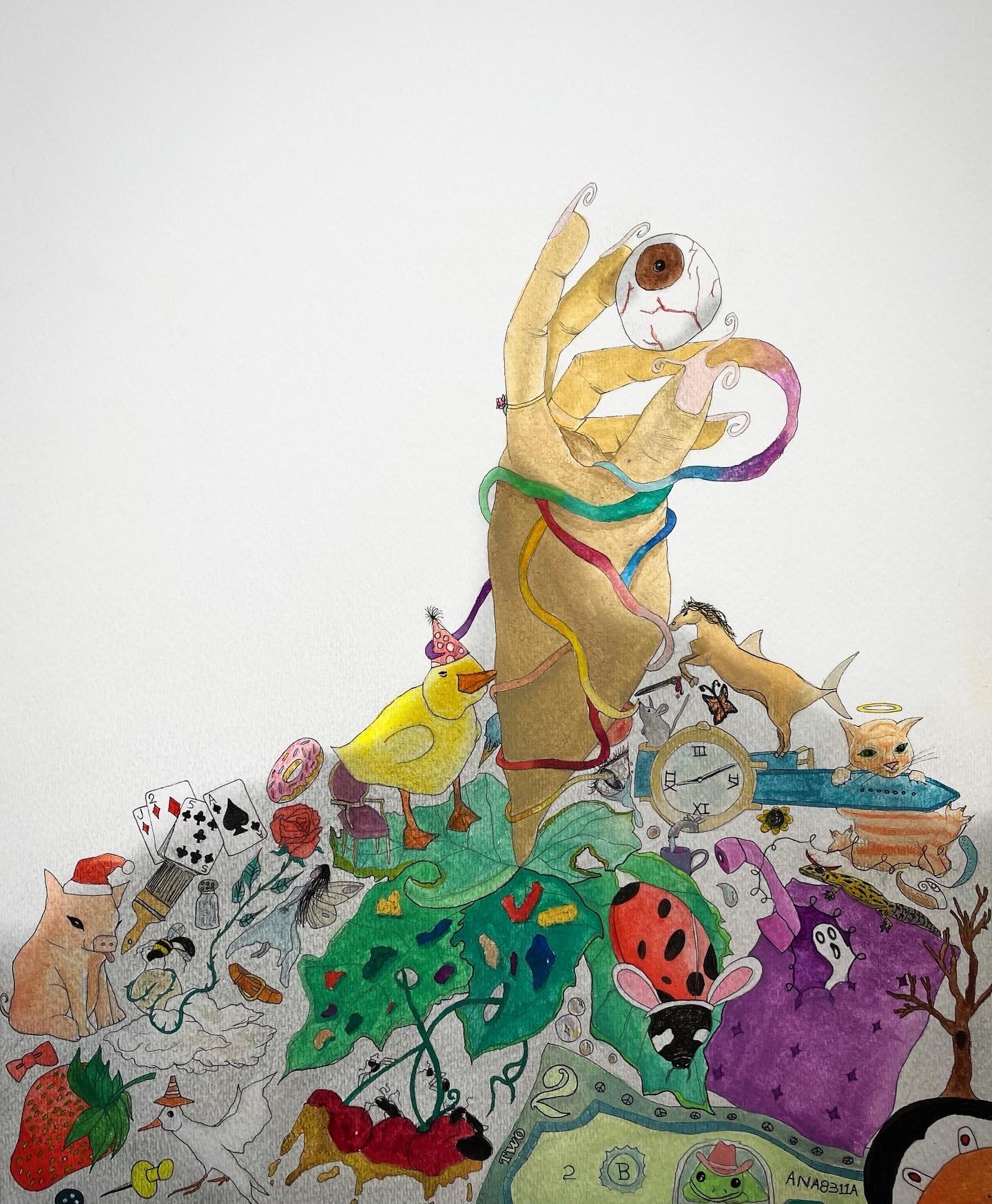
Miraculous figures and character details are piled with a hand sticking its way through. This is illustrative of my creative mind jumbling millions of ideas and strange thoughts together.
The hand extending out from the pile of things is popping from outside my brain into the reality. That’s why there’s a shadow on the pile, because it’s being left behind in my mind.
The hand extending out from the pile of things is popping from outside my brain into the reality. That’s why there’s a shadow on the pile, because it’s being left behind in my mind.
UNHAPPY MEAL
![]()

A self-portrait about feeling ashamed of my body. I wanted to add comedic details to this piece because the narrative isn’t positive.
The infamous McDonald’s happy meal box has always displayed a smiling french fry. We associate this chain to unhealthy fast food, which I thought would successfully capture this theme.
The infamous McDonald’s happy meal box has always displayed a smiling french fry. We associate this chain to unhealthy fast food, which I thought would successfully capture this theme.
THE LAST GOAL
THE LAST GOAL

My dad making his final goal for his soccer team in Ecuador in 1999. It was his last day in the country and on the team before flying out to New York to give my 5 year old brother a better life and later have me.
The reaction of the crowd as he completes his last successful kick is so elevating. I wanted to recapture this great memory he has and the action shot that was photographed during his last goal.
The reaction of the crowd as he completes his last successful kick is so elevating. I wanted to recapture this great memory he has and the action shot that was photographed during his last goal.